kage
kage
takweemai.com
Design analysis
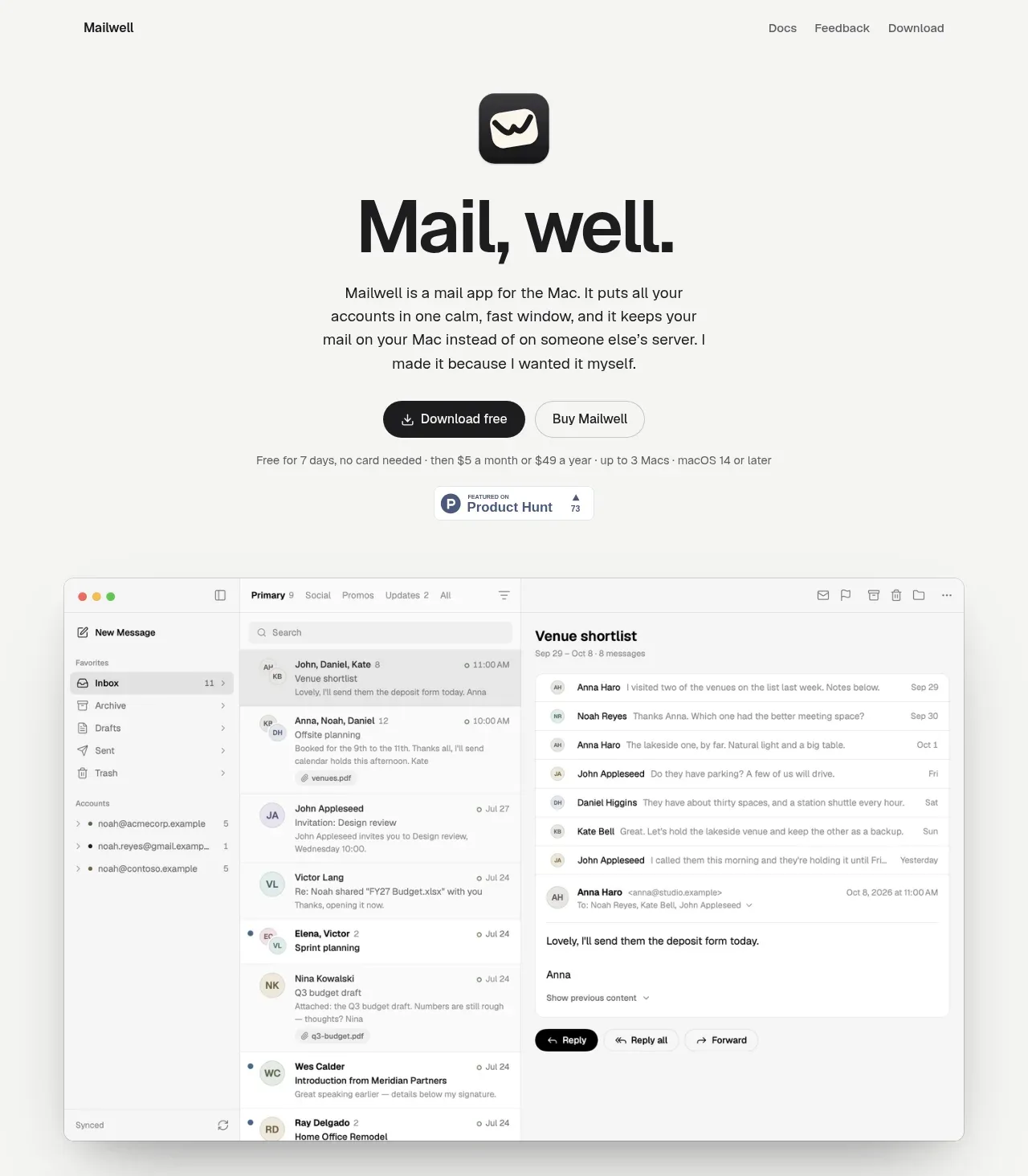
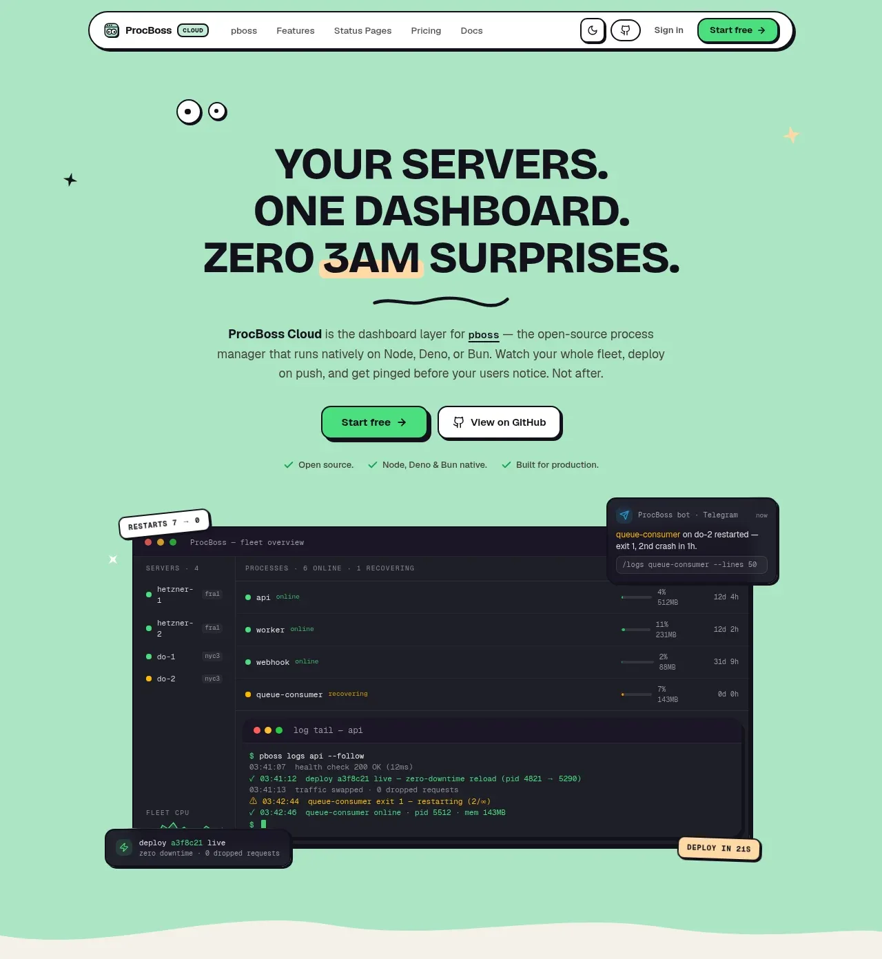
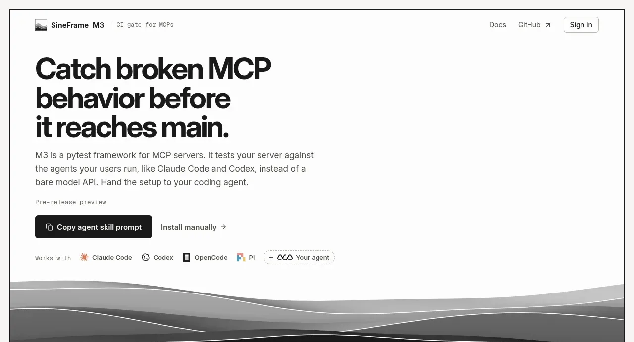
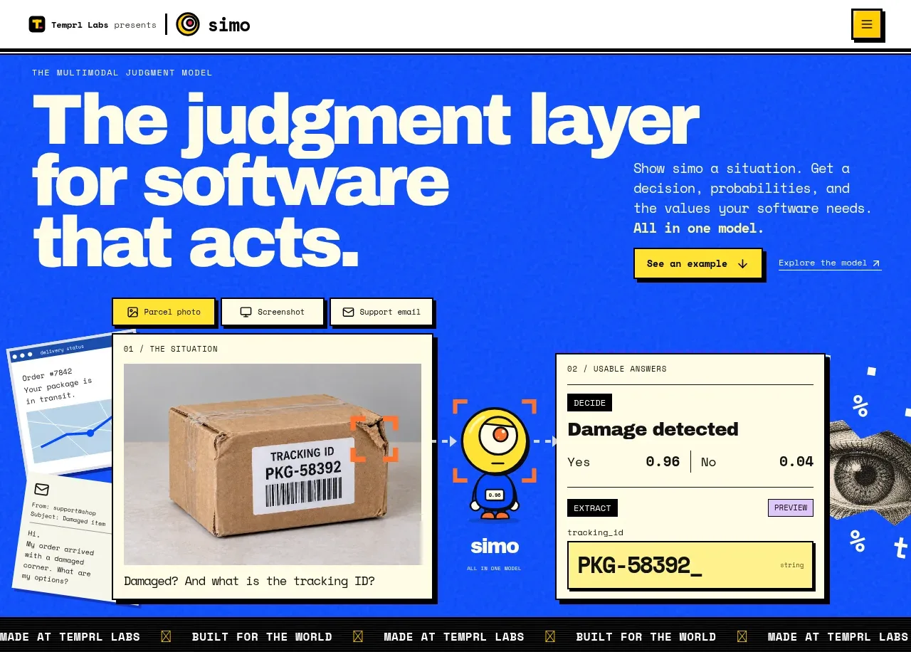
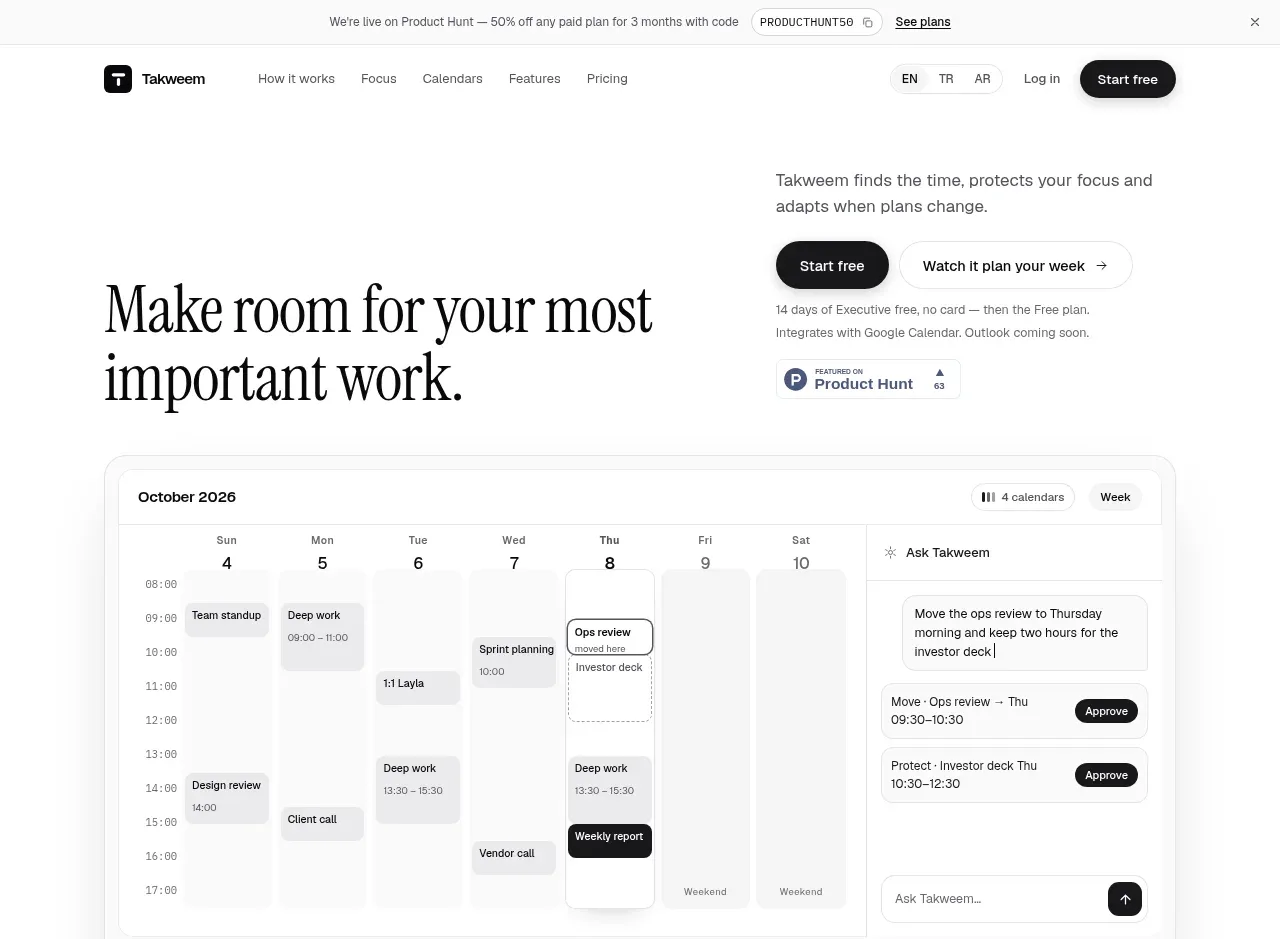
A split hero pairs a large editorial headline and supporting conversion copy with a wide interactive calendar product visual, making the product promise tangible immediately.
Prompt preview
## Reference images

Study these alongside the description below: hierarchy, rhythm, spacing, colour. Build for the product you are asked about, using this design language.

- Component: https://kage-design-assets.t3.tigrisfiles.io/components/takweem-ai/0f53cdf8-216d-4033-bf99-d7586d054974-1791439459-2.webp
- Full page it was cut from: https://kage-design-assets.t3.tigrisfiles.io/screenshots/takweem-ai/0f53cdf8-216d-4033-bf99-d7586d054974-1791439356553-full.webp
- Component on Kage: https://kage.design/component/takweem-hero

## Before you start
Ask the user what their product does, its clearest customer outcome, brand voice, and preferred call to action. Then design an original hero that follows these principles.

- Start directly below navigation with a spacious two-column composition: oversized editorial headline on the left and concise explanation plus two actions on the right.
- Use a high-contrast serif or display face for the headline and a small readable sans-serif for supporting copy.
- Place the main product visual beneath the copy as a wide, lightly elevated interface mockup; it should show the product’s core workflow, not decorative art.
- Use one dark filled pill CTA and one light or text-based secondary CTA. Add a small trust/proof note below if useful.
- Keep the layout airy: large top padding, a strong headline line height, and enough bottom spacing around the visual.
- Use warm white #fcfcfa, near-black #171717, muted gray #6f6f6b, subtle panel #f7f7f4, border #e6e6e1, and soft shadow rgba(20,20,20,.08). Use 14–18px corner radii for the product frame.
- On mobile, stack the copy and visual, keeping the headline readable and the primary CTA first.

Never: use logos, product names, copy, illustrations, or imagery from the reference.