kage
kage
takweemai.com
Design analysis
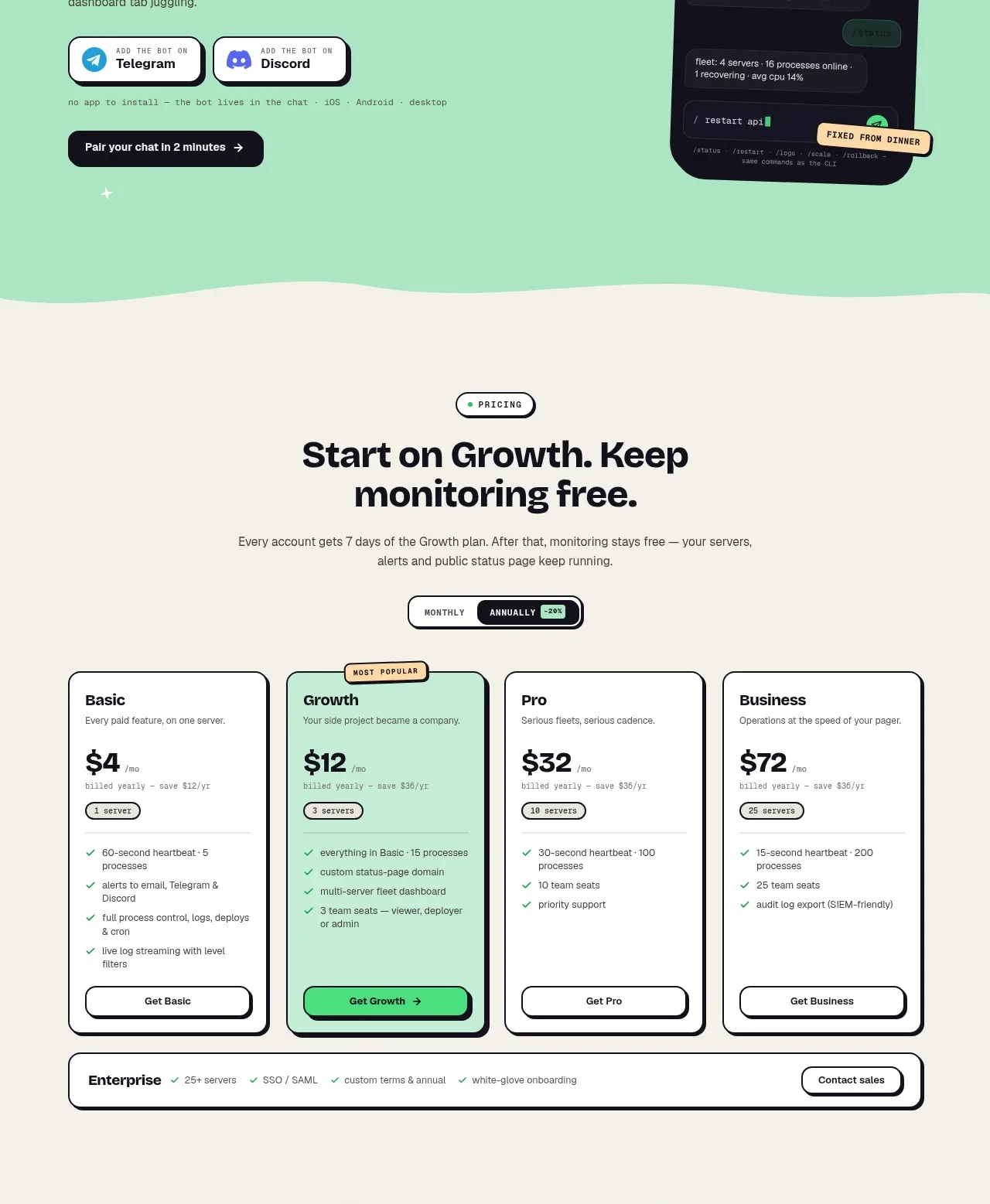
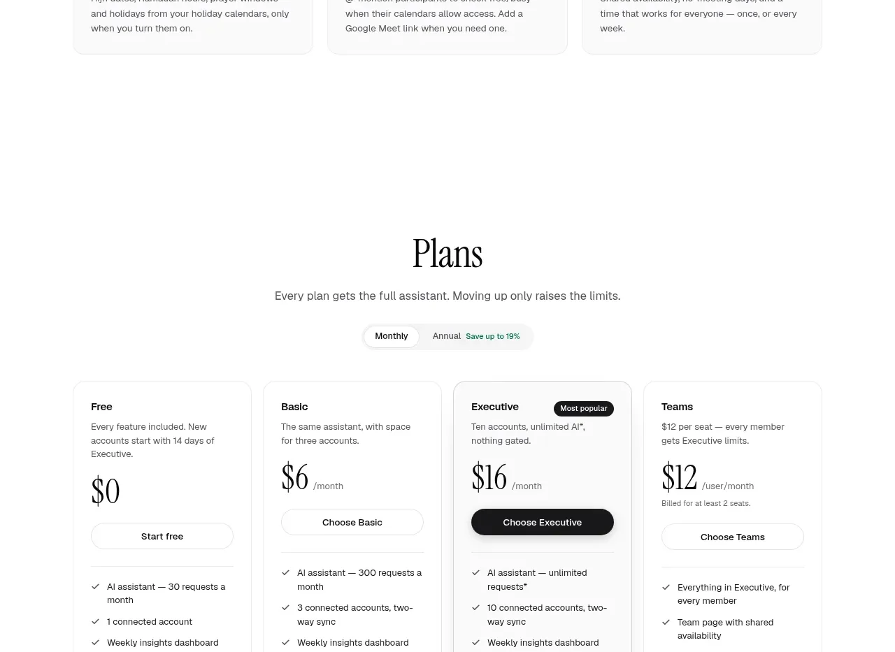
A centered pricing section presents a billing toggle and four comparable plans, with one highlighted recommendation and feature checklists.
Prompt preview
## Reference images

Study these alongside the description below: hierarchy, rhythm, spacing, colour. Build for the product you are asked about, using this design language.

- Component: https://kage-design-assets.t3.tigrisfiles.io/components/takweem-ai/0f53cdf8-216d-4033-bf99-d7586d054974-1791439461-7.webp
- Full page it was cut from: https://kage-design-assets.t3.tigrisfiles.io/screenshots/takweem-ai/0f53cdf8-216d-4033-bf99-d7586d054974-1791439356553-full.webp
- Component on Kage: https://kage.design/component/takweem-pricing-table

## Before you start
Ask the user about their pricing model, plan names, billing cadence, limits, audience, and preferred conversion action. Then create an original pricing table using these principles.

- Center a concise section heading and supporting sentence above a monthly/annual segmented toggle.
- Use four equal plan columns on desktop with clear plan labels, short descriptions, price, billing unit, CTA, and feature checklist.
- Visually emphasize one recommended plan using a slightly darker border, elevated treatment, or badge—never overwhelming the other plans.
- Keep the table vertically aligned so prices, buttons, and feature lists can be compared quickly.
- Use near-white background, white cards, #171717 text, #676762 secondary text, #e4e4df borders, and a dark pill for the highlighted CTA; radius 14–18px.
- Include compact billing/legal notes below the cards.
- On mobile, allow horizontal scrolling or stack cards while preserving the recommended plan’s prominence.

Never: use logos, product names, copy, illustrations, or imagery from the reference.