 kage
kage
thestory.run
Design analysis
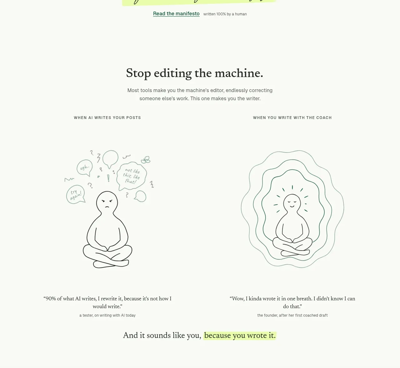
A short heading and subtitle introduce two side-by-side states: anxious, fragmented work versus calm, intentional work. Simple hand-drawn illustrations and testimonial captions make the contrast emotional and easy to scan.
Prompt preview
## Reference images

Study these alongside the description below: hierarchy, rhythm, spacing, colour. Build for the product you are asked about, using this design language.

- Component: https://kage-design-assets.t3.tigrisfiles.io/components/thestory-run/30e08e83-50b8-4774-b650-1d7663d8d1f5-1790143353-4.webp
- Full page it was cut from: https://kage-design-assets.t3.tigrisfiles.io/screenshots/thestory-run/30e08e83-50b8-4774-b650-1d7663d8d1f5-1790143267493-full.webp
- Component on Kage: https://kage.design/component/thestory-run-feature-grid-2

## Before you start
Ask what transformation the user's product creates and what the undesirable and desirable states look like in real life. Use that transformation as the organising principle.

Build a two-column comparison section. Start with a centered serif heading and one explanatory sentence. Give each column a tiny uppercase label, a large simple monochrome illustration or diagram, and a short quote with a small attribution. The left side should feel busier through irregular marks and the right side calmer through concentric or ordered forms. Keep the palette off-white, charcoal, pale grey-green, and deep green, with thin hand-drawn-looking strokes rather than polished gradients. Align both columns to a shared baseline and add generous whitespace between the heading, visuals, and quotes.

Never use logos, product names, copy, illustrations, or imagery from the reference.
More components

 Spend visibility and daily-cost breakdown
Subscrr · Feature grid
Spend visibility and daily-cost breakdown
Subscrr · Feature grid
 Reminders and simple setup flow
Subscrr · Feature grid
Reminders and simple setup flow
Subscrr · Feature grid

 Security and permissions cards
NotchPop · Feature grid
Security and permissions cards
NotchPop · Feature grid
 Focused feature cards
NotchPop · Feature grid
Focused feature cards
NotchPop · Feature grid
 Interactive product demonstration
NotchPop · Feature grid
Interactive product demonstration
NotchPop · Feature grid
 Quiet information cards
NotchPop · Feature grid
Quiet information cards
NotchPop · Feature grid