 kage
kage
thestory.run
Design analysis
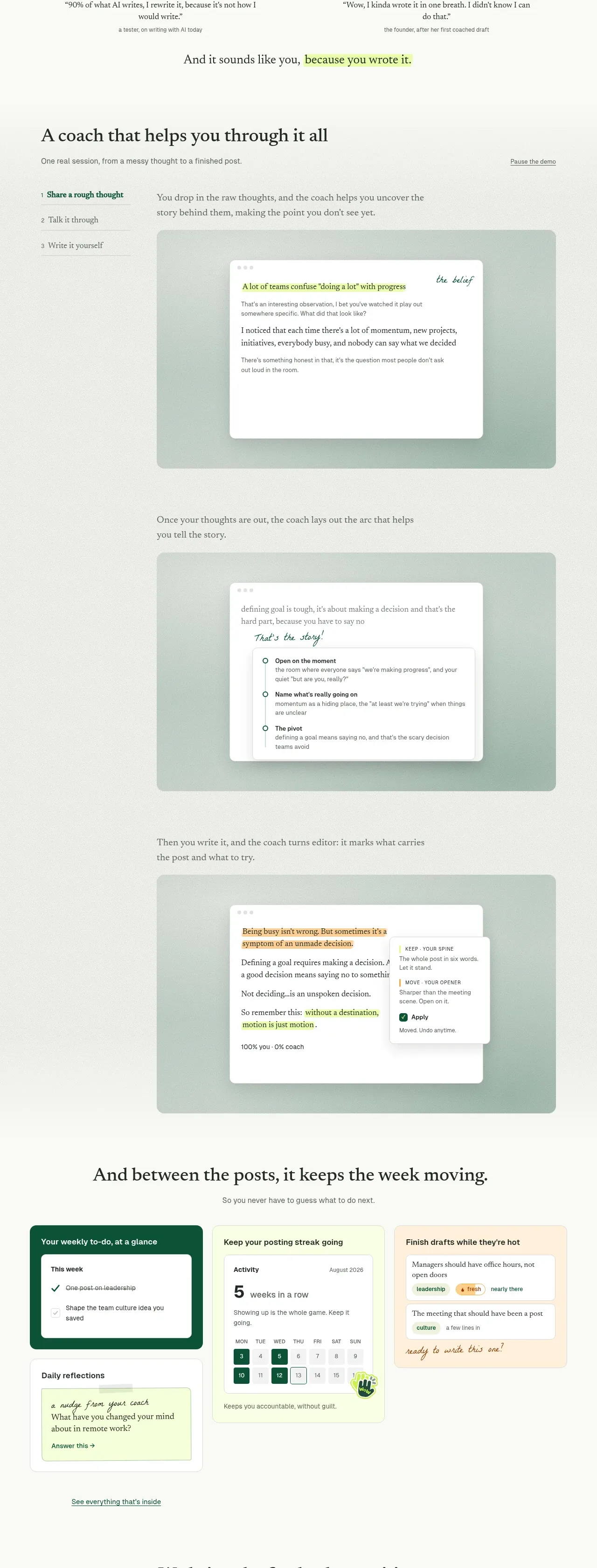
A long demonstration section explains a three-step process with a left-side step list and three large stacked interface examples. Each example pairs a short explanation with a calm green-tinted product frame.
Prompt preview
## Reference images

Study these alongside the description below: hierarchy, rhythm, spacing, colour. Build for the product you are asked about, using this design language.

- Component: https://kage-design-assets.t3.tigrisfiles.io/components/thestory-run/30e08e83-50b8-4774-b650-1d7663d8d1f5-1790143354-5.webp
- Full page it was cut from: https://kage-design-assets.t3.tigrisfiles.io/screenshots/thestory-run/30e08e83-50b8-4774-b650-1d7663d8d1f5-1790143267493-full.webp
- Component on Kage: https://kage.design/component/thestory-run-feature-grid-3

## Before you start
Ask what the user's product workflow is, how many meaningful stages it has, and what screen or artifact best proves each stage. Build the section around that workflow.

Create a long workflow demonstration. Begin with a left-aligned serif heading, a short explanatory subtitle, and a compact vertical step navigator with three numbered steps. The active step should use deep green text and a subtle underline or rule. To the right, stack three generous demonstrations vertically; each has a short paragraph above a large rounded screenshot frame. Use pale sage backgrounds (`#dce8df`), white inner panels, very soft borders (`#d8ddd5`), 14–20px corner radii, and subtle shadows. Preserve generous space between stages and make the active step state interactive: clicking a step should scroll to or reveal its corresponding demonstration. Use an editorial serif for headings and a neutral sans-serif for UI labels.

Never use logos, product names, copy, illustrations, or imagery from the reference.
More components

 Spend visibility and daily-cost breakdown
Subscrr · Feature grid
Spend visibility and daily-cost breakdown
Subscrr · Feature grid
 Reminders and simple setup flow
Subscrr · Feature grid
Reminders and simple setup flow
Subscrr · Feature grid

 Security and permissions cards
NotchPop · Feature grid
Security and permissions cards
NotchPop · Feature grid
 Focused feature cards
NotchPop · Feature grid
Focused feature cards
NotchPop · Feature grid
 Interactive product demonstration
NotchPop · Feature grid
Interactive product demonstration
NotchPop · Feature grid
 Quiet information cards
NotchPop · Feature grid
Quiet information cards
NotchPop · Feature grid