 kage
kage
thestory.run
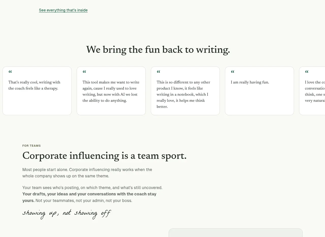
Design analysis
A centered heading introduces a small dashboard-like arrangement of colourful cards showing planning, streaks, drafts, and reflections. The cards make the product benefit tangible without requiring a dense feature list.
Prompt preview
## Reference images

Study these alongside the description below: hierarchy, rhythm, spacing, colour. Build for the product you are asked about, using this design language.

- Component: https://kage-design-assets.t3.tigrisfiles.io/components/thestory-run/30e08e83-50b8-4774-b650-1d7663d8d1f5-1790143354-6.webp
- Full page it was cut from: https://kage-design-assets.t3.tigrisfiles.io/screenshots/thestory-run/30e08e83-50b8-4774-b650-1d7663d8d1f5-1790143267493-full.webp
- Component on Kage: https://kage.design/component/thestory-run-feature-grid-4

## Before you start
Ask what recurring habit or outcome the user's product helps maintain and which few interface moments demonstrate that outcome. Use those moments to design the cards.

Build a compact product-benefit section with a centered serif heading, one supporting line, and a three-column card composition. Mix one deep-green card with pale lime, warm cream, and white cards to create hierarchy. Include short UI-like labels, checkmarks, dates, tags, or progress indicators, but keep each card simple and legible. Use 14–18px radii, thin neutral borders, subtle shadows, and a responsive stacked layout on narrow screens. Add a small understated link below the cards for deeper exploration.

Never use logos, product names, copy, illustrations, or imagery from the reference.
More components

 Spend visibility and daily-cost breakdown
Subscrr · Feature grid
Spend visibility and daily-cost breakdown
Subscrr · Feature grid
 Reminders and simple setup flow
Subscrr · Feature grid
Reminders and simple setup flow
Subscrr · Feature grid

 Security and permissions cards
NotchPop · Feature grid
Security and permissions cards
NotchPop · Feature grid
 Focused feature cards
NotchPop · Feature grid
Focused feature cards
NotchPop · Feature grid
 Interactive product demonstration
NotchPop · Feature grid
Interactive product demonstration
NotchPop · Feature grid
 Quiet information cards
NotchPop · Feature grid
Quiet information cards
NotchPop · Feature grid