 kage
kage
thestory.run
Design analysis
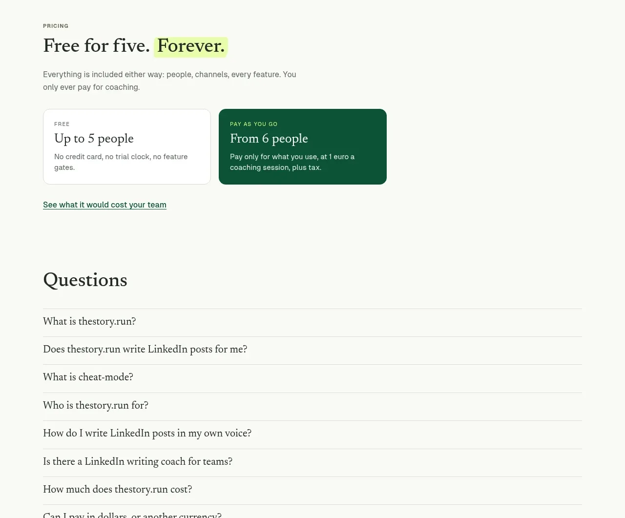
An editorial team-focused section pairs explanatory copy and accordion-like subtopics with a calm product illustration or preview. It shifts the story from individual writing to shared organisational practice.
Prompt preview
## Reference images

Study these alongside the description below: hierarchy, rhythm, spacing, colour. Build for the product you are asked about, using this design language.

- Component: https://kage-design-assets.t3.tigrisfiles.io/components/thestory-run/30e08e83-50b8-4774-b650-1d7663d8d1f5-1790143355-8.webp
- Full page it was cut from: https://kage-design-assets.t3.tigrisfiles.io/screenshots/thestory-run/30e08e83-50b8-4774-b650-1d7663d8d1f5-1790143267493-full.webp
- Component on Kage: https://kage.design/component/thestory-run-feature-grid-5

## Before you start
Ask whether the user's product is used by individuals, teams, or both, and what shared workflow matters most. Make the content support that audience rather than copying the reference.

Build a team feature section with a small uppercase eyebrow, a large serif heading, two short paragraphs, and a handwritten-style supporting line. Place a right-side product preview or abstract interface card inside a pale sage rounded panel. Beneath or beside the copy, use three horizontal expandable rows for related capabilities; each row has a serif label, a short description when open, and a fine divider. Keep alignment to a centered max-width grid, use deep green accents, charcoal body text, warm off-white background, and restrained rounded corners. The accordion should be keyboard accessible and animate height gently.

Never use logos, product names, copy, illustrations, or imagery from the reference.
More components

 Spend visibility and daily-cost breakdown
Subscrr · Feature grid
Spend visibility and daily-cost breakdown
Subscrr · Feature grid
 Reminders and simple setup flow
Subscrr · Feature grid
Reminders and simple setup flow
Subscrr · Feature grid

 Security and permissions cards
NotchPop · Feature grid
Security and permissions cards
NotchPop · Feature grid
 Focused feature cards
NotchPop · Feature grid
Focused feature cards
NotchPop · Feature grid
 Interactive product demonstration
NotchPop · Feature grid
Interactive product demonstration
NotchPop · Feature grid
 Quiet information cards
NotchPop · Feature grid
Quiet information cards
NotchPop · Feature grid