kage
kage
thestory.run
Design analysis
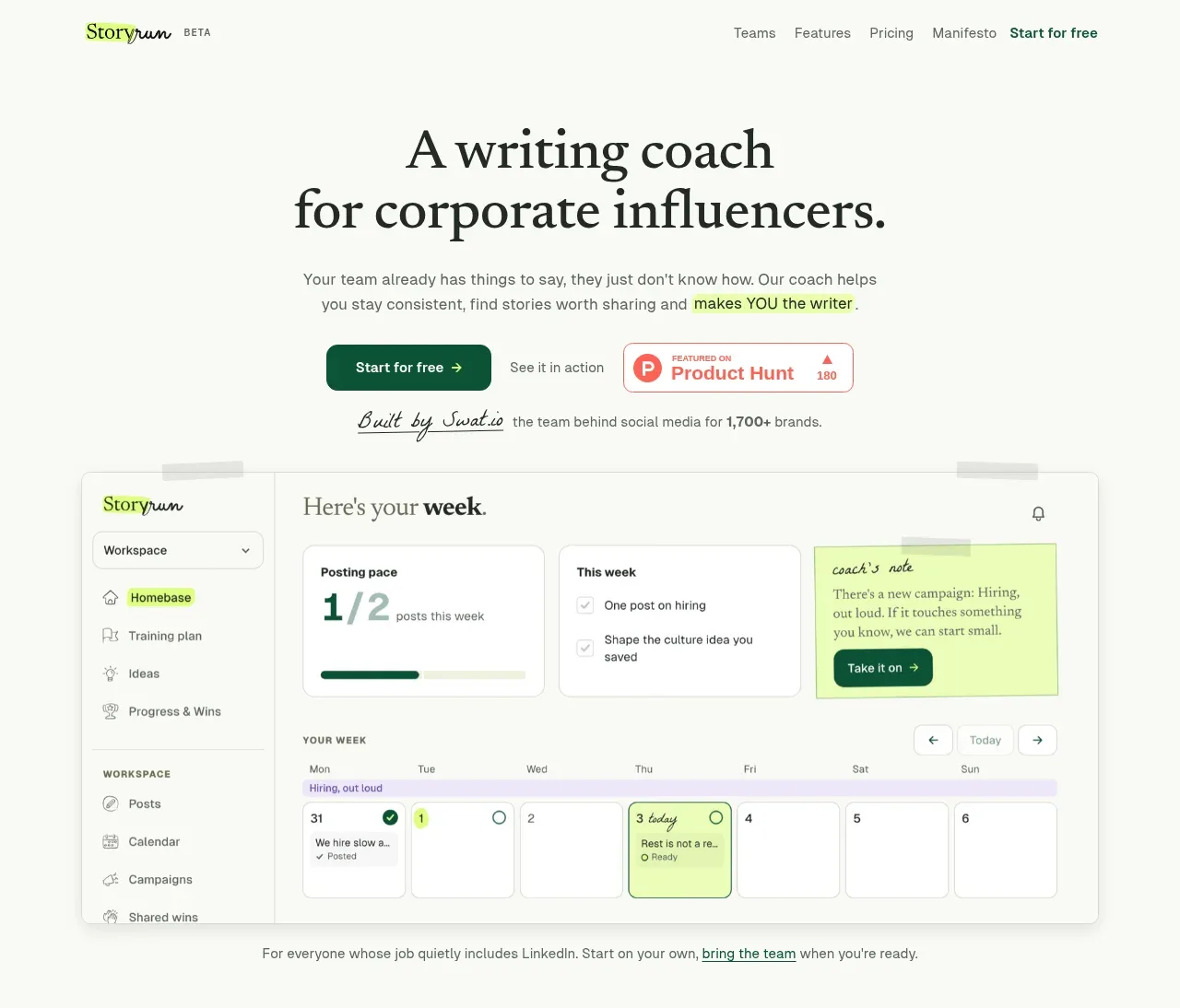
A large centered serif headline states the category and audience, followed by concise explanatory copy, two contrasting actions, social proof, and a wide product preview. The pale canvas and lime accents make the interface feel human rather than clinical.
Prompt preview
## Reference images

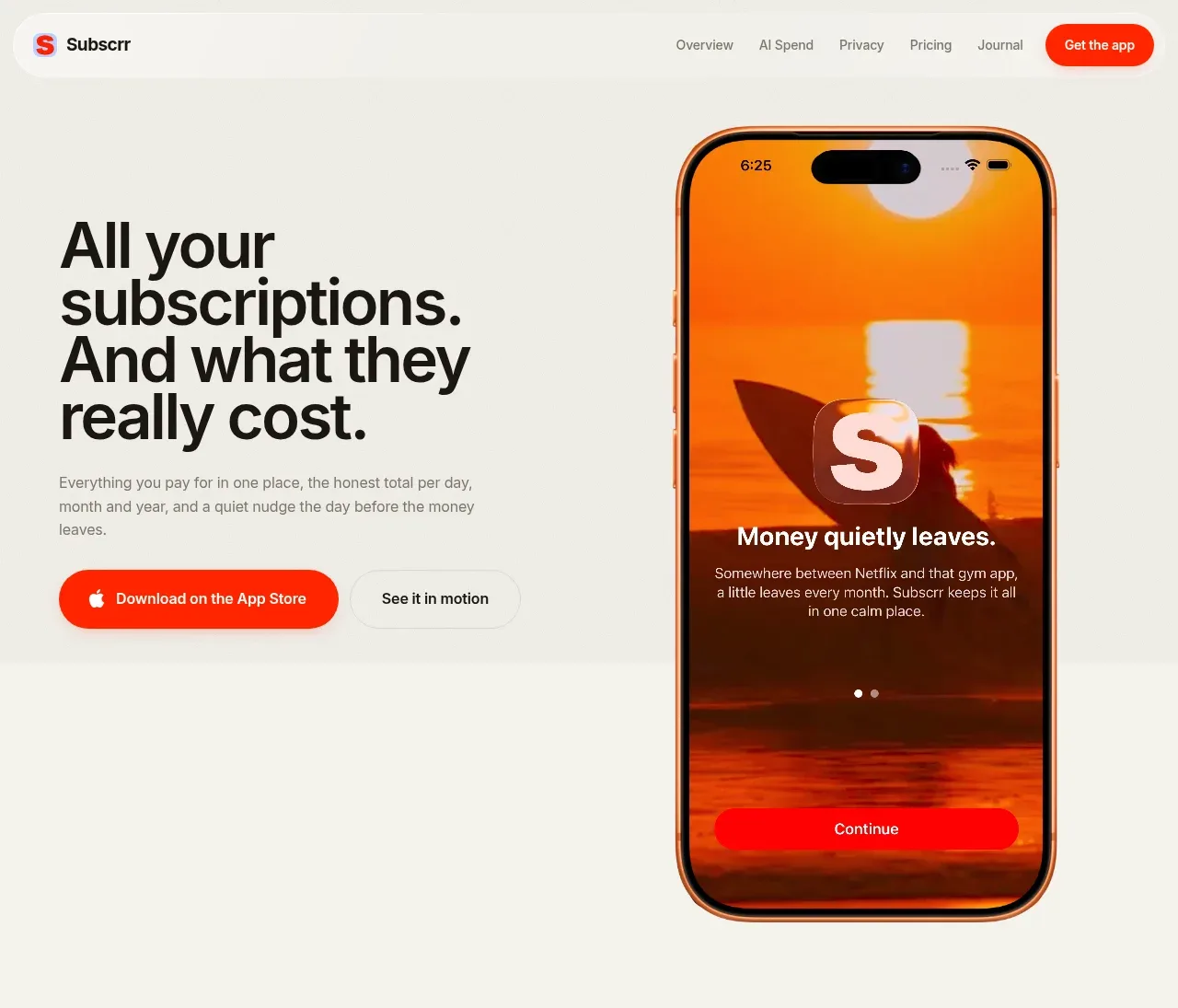
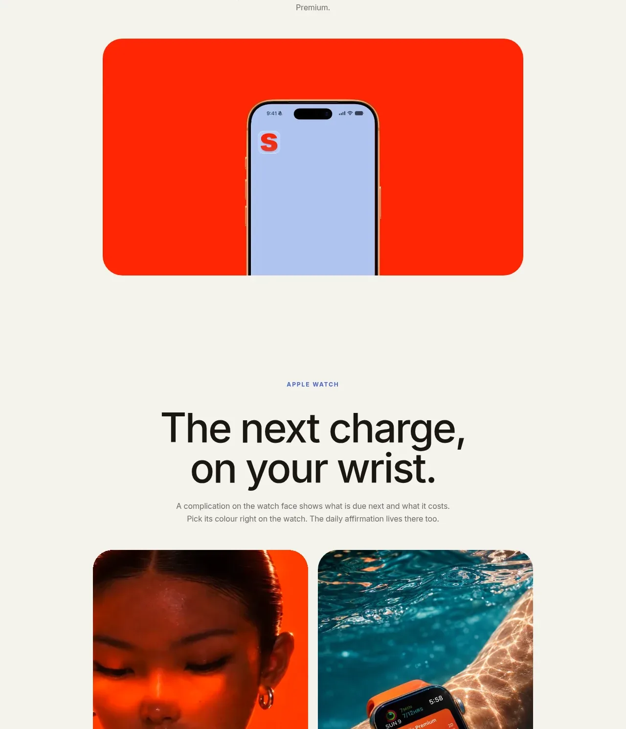
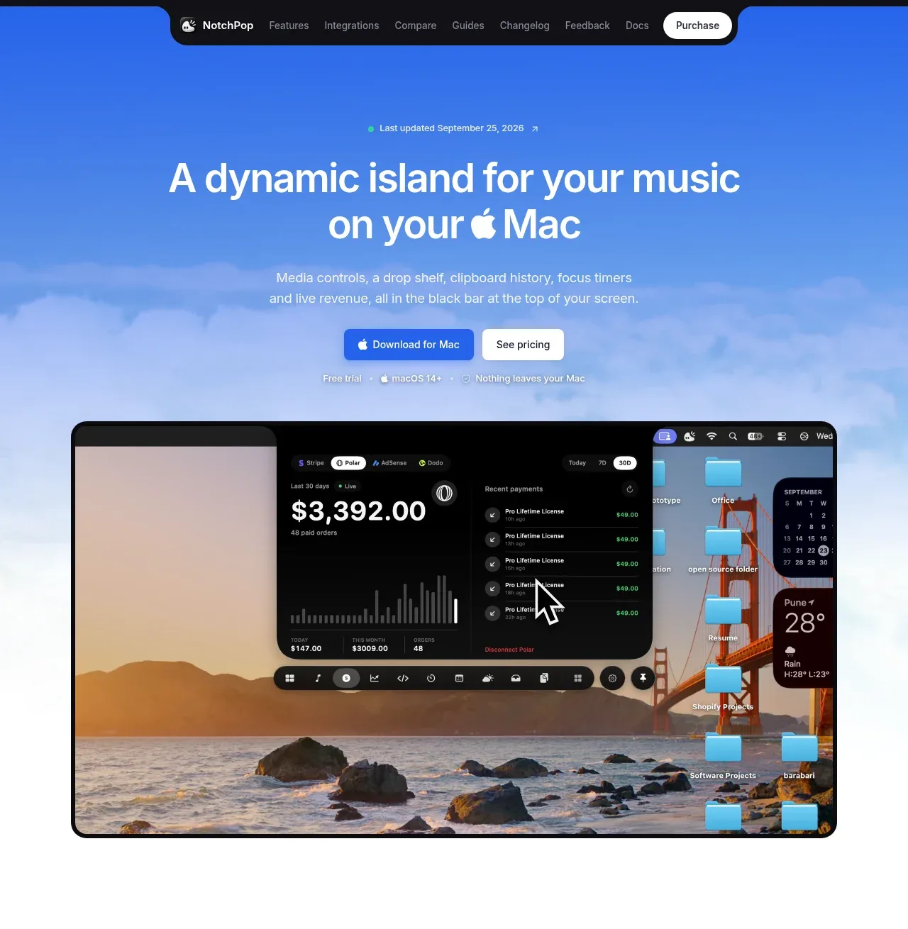
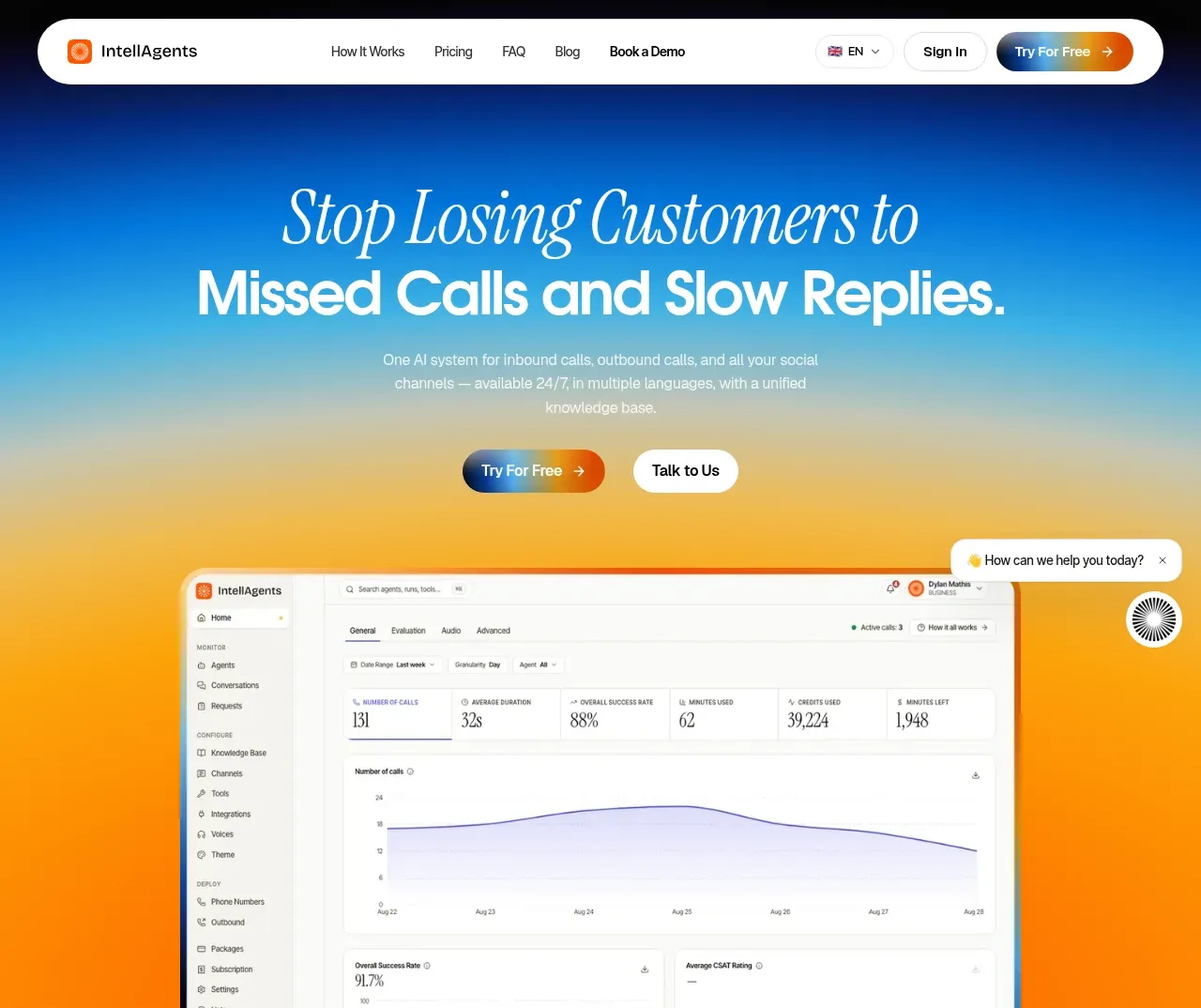
Study these alongside the description below: hierarchy, rhythm, spacing, colour. Build for the product you are asked about, using this design language.

- Component: https://kage-design-assets.t3.tigrisfiles.io/components/thestory-run/30e08e83-50b8-4774-b650-1d7663d8d1f5-1790143352-1.webp
- Full page it was cut from: https://kage-design-assets.t3.tigrisfiles.io/screenshots/thestory-run/30e08e83-50b8-4774-b650-1d7663d8d1f5-1790143267493-full.webp
- Component on Kage: https://kage.design/component/thestory-run-hero

## Before you start
Ask what the user's product does, who the ideal customer is, and what proof or product visual they can provide. Apply these principles to their brand.

Create a tall centered hero beneath the navigation. Use a large two-line editorial serif headline, a short sans-serif supporting paragraph, and a primary dark-green pill/button beside a quieter secondary action. Add a small trust or launch-proof element near the CTAs, then a short handwritten-style attribution line. Place a wide rounded product screenshot or abstract product preview below, allowing it to overlap the lower whitespace slightly. Use an off-white background (`#f8f9f2`), charcoal text (`#252620`), deep green (`#075b3f`), pale lime highlight (`#e8ffa2`), and muted grey-green UI surfaces (`#dfe9e1`). Keep the hero max-width around 710px, use generous vertical rhythm, and let the visual carry roughly the lower half. Buttons should have clear hover and focus states.

Never use logos, product names, copy, illustrations, or imagery from the reference.