 kage
kage
thestory.run
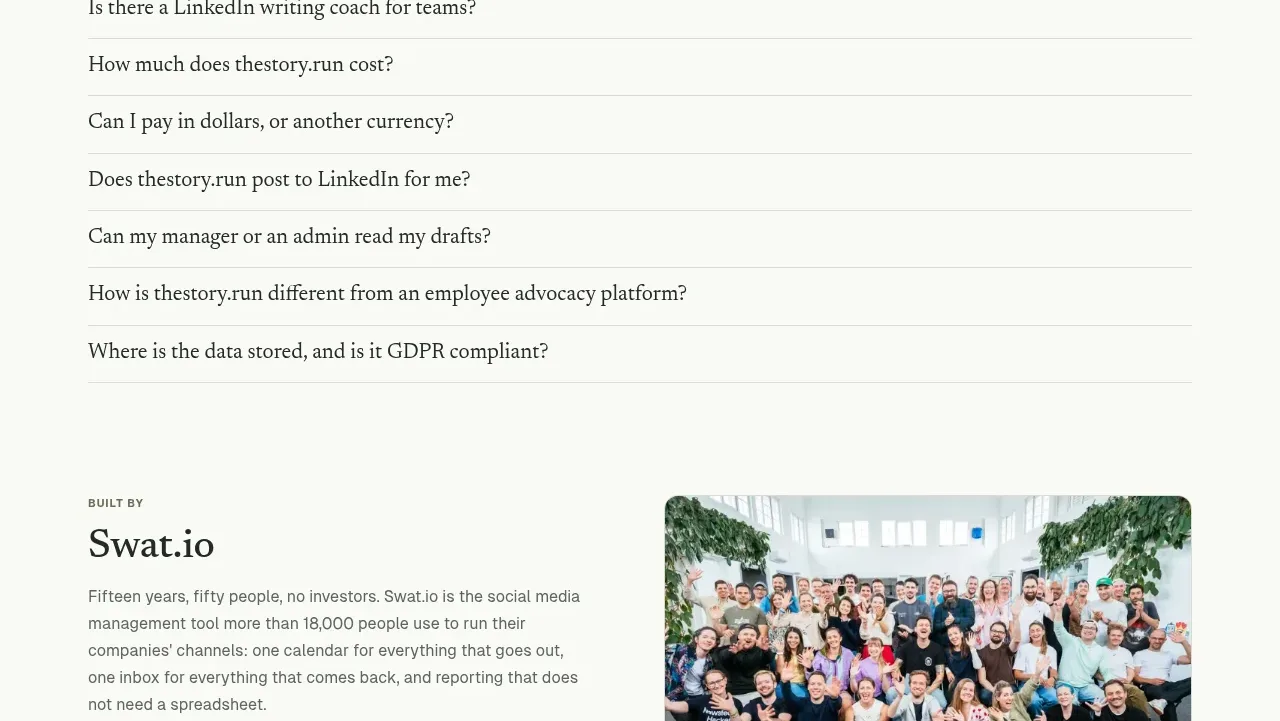
Design analysis
The pricing section leads with an uncomplicated promise, then shows two transparent choices: a free allowance and a usage-based paid option. A single follow-up link handles the more detailed team conversation.
Prompt preview
## Reference images

Study these alongside the description below: hierarchy, rhythm, spacing, colour. Build for the product you are asked about, using this design language.

- Component: https://kage-design-assets.t3.tigrisfiles.io/components/thestory-run/30e08e83-50b8-4774-b650-1d7663d8d1f5-1790143356-9.webp
- Full page it was cut from: https://kage-design-assets.t3.tigrisfiles.io/screenshots/thestory-run/30e08e83-50b8-4774-b650-1d7663d8d1f5-1790143267493-full.webp
- Component on Kage: https://kage.design/component/thestory-run-pricing-table

## Before you start
Ask what the user's pricing model, free allowance, billing unit, and conversion action are. Make the pricing honest and easy to compare.

Create a pricing section with a small uppercase eyebrow, a large serif heading, a short explanatory paragraph, and two equal-width pricing cards. Use a white outlined card for the free tier and a deep-green filled card for the paid tier, with high-contrast text in the latter. Each card should show a small plan label, a clear price or pricing rule, one sentence of terms, and no distracting feature wall. Add one understated link beneath for custom or team pricing. Use 16px radii, subtle borders, generous card padding, and responsive stacking. Ensure colour contrast and make the primary card actionable without aggressive sales styling.

Never use logos, product names, copy, illustrations, or imagery from the reference.
More components
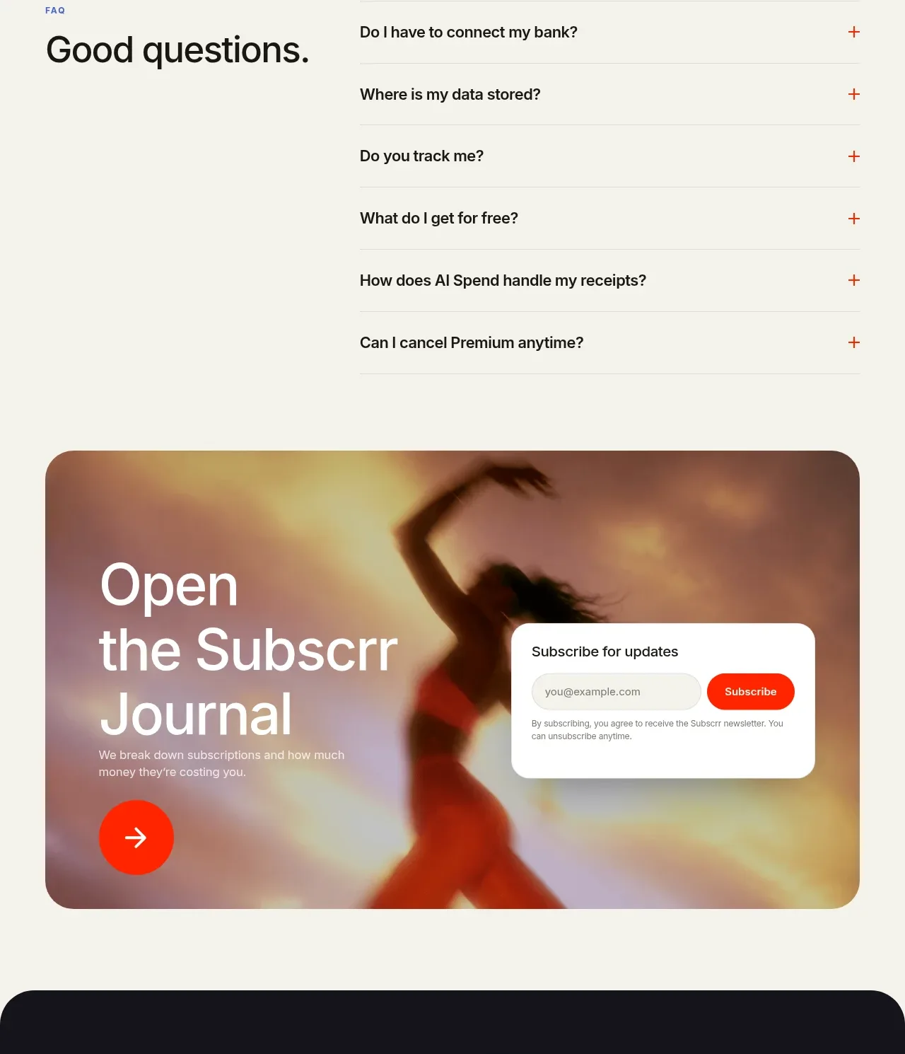
 Free and premium pricing comparison
Subscrr · Pricing table
Free and premium pricing comparison
Subscrr · Pricing table
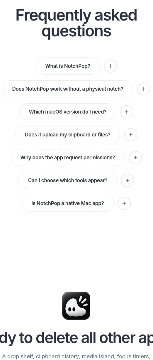
 One-time purchase pricing
NotchPop · Pricing table
One-time purchase pricing
NotchPop · Pricing table
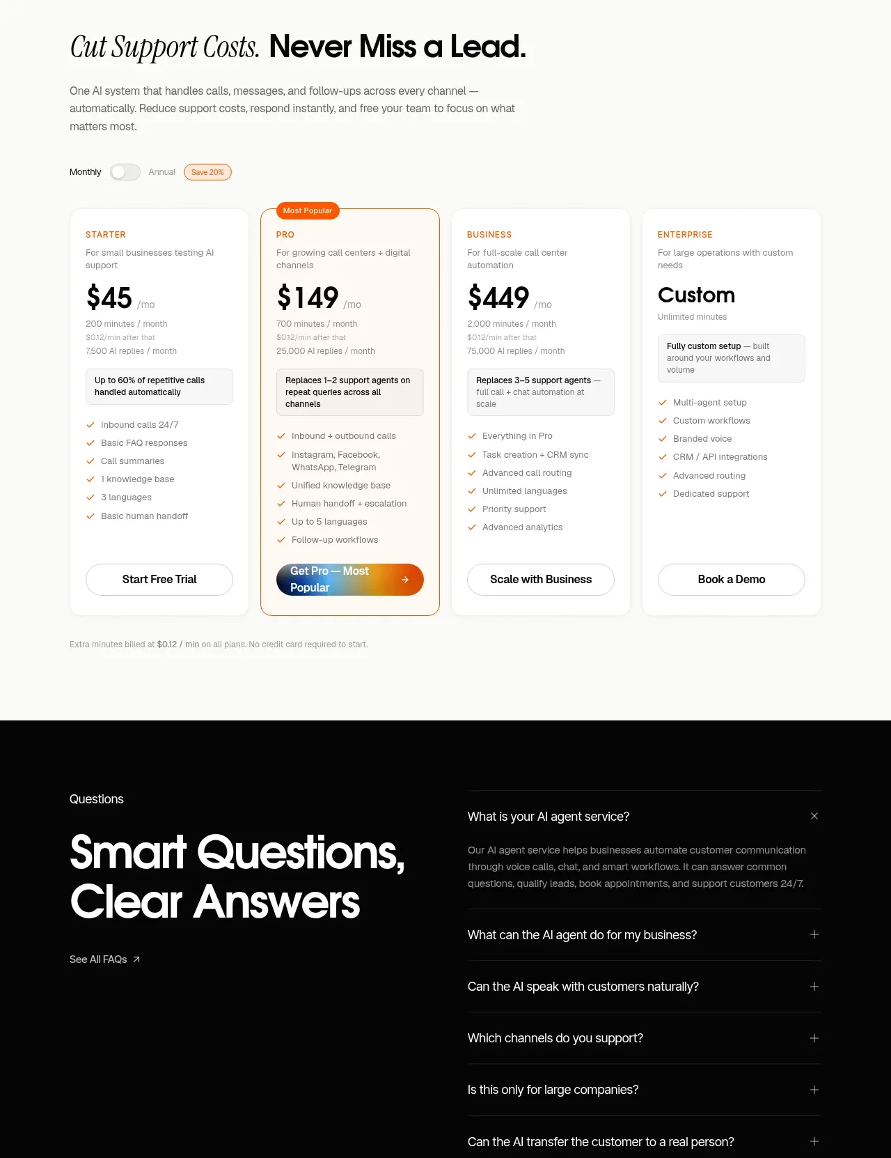
 Support plan pricing
IntellAgents.io · Pricing table
Support plan pricing
IntellAgents.io · Pricing table
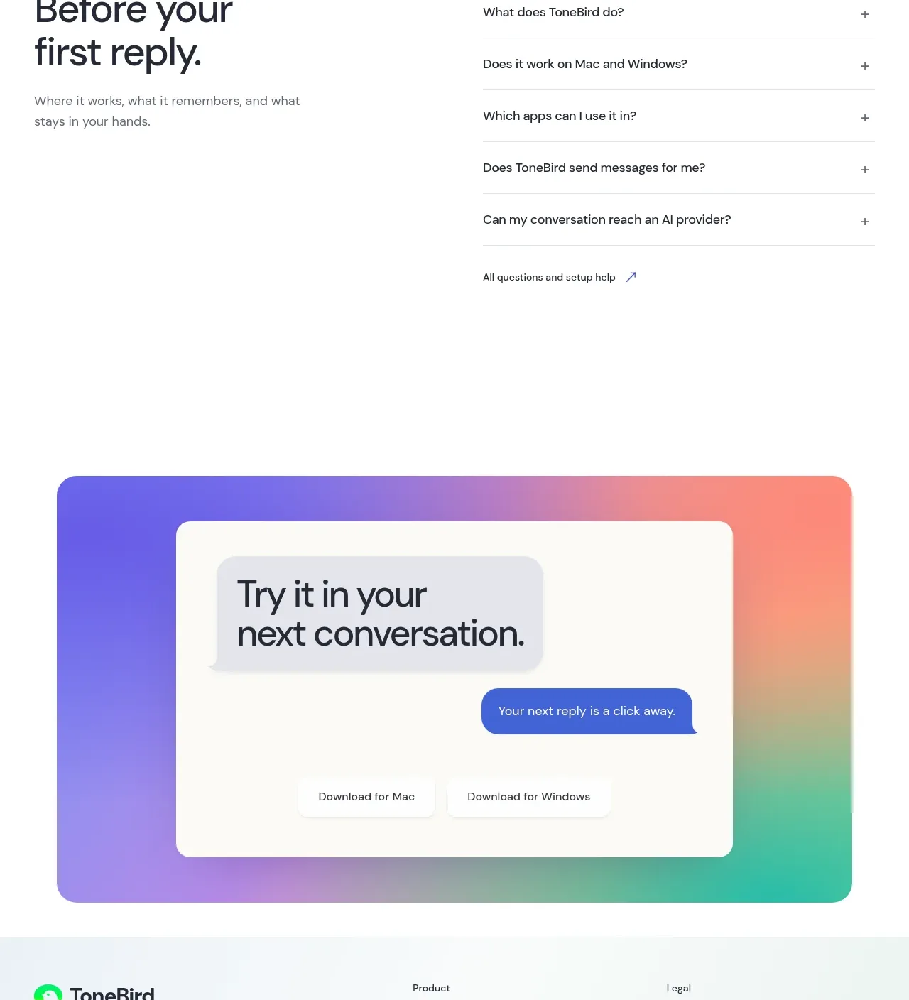
 Four-tier pricing table
ToneBird · Pricing table
Four-tier pricing table
ToneBird · Pricing table
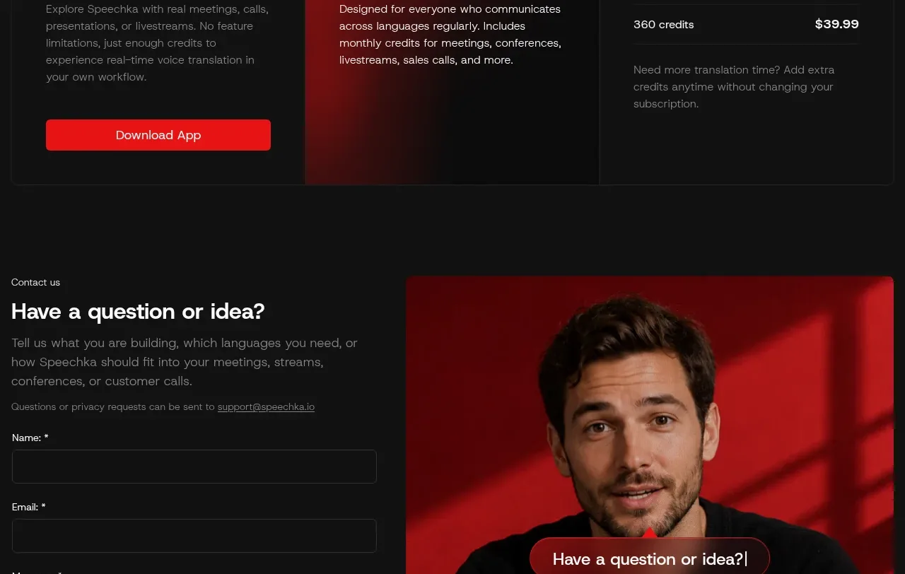
 Trial and subscription plans
Speechka · Pricing table
Trial and subscription plans
Speechka · Pricing table
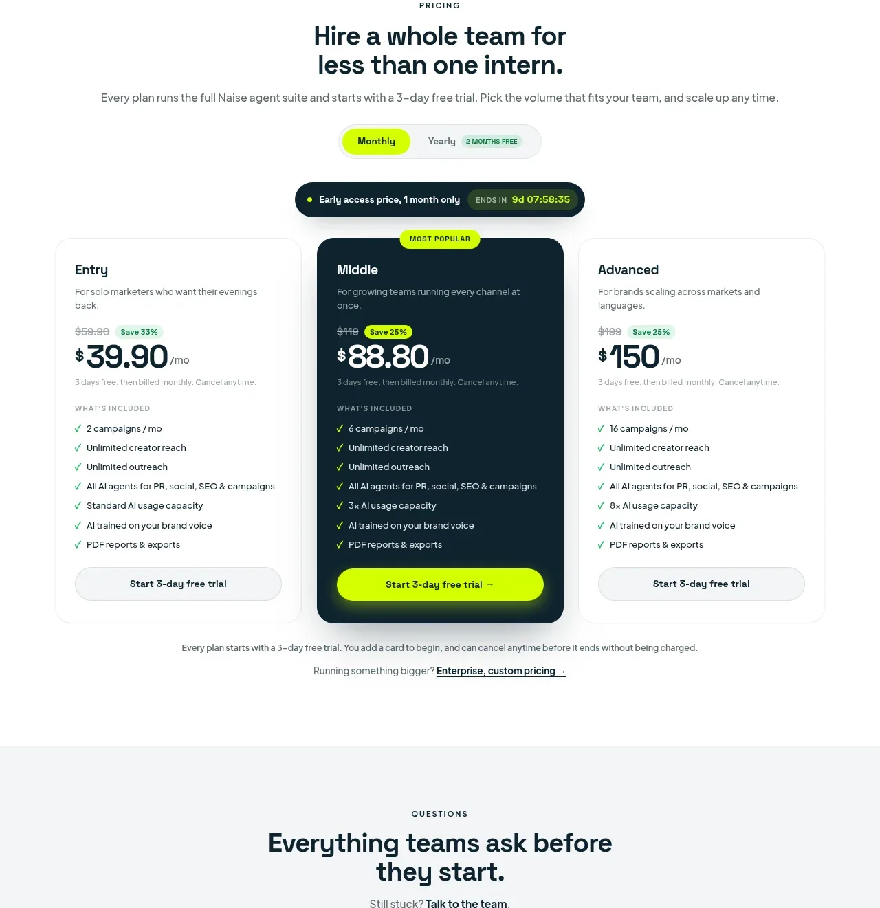
 Three-tier pricing plans
Naise AI · Pricing table
Three-tier pricing plans
Naise AI · Pricing table