kage
kage
thestory.run
Design analysis
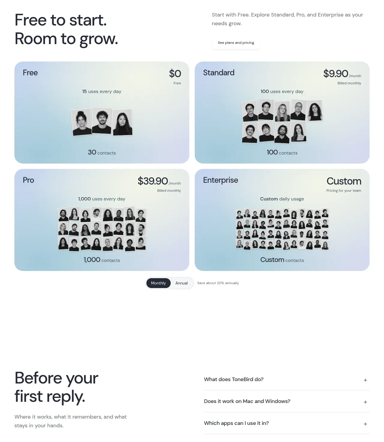
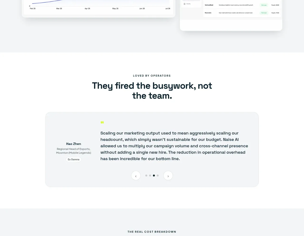
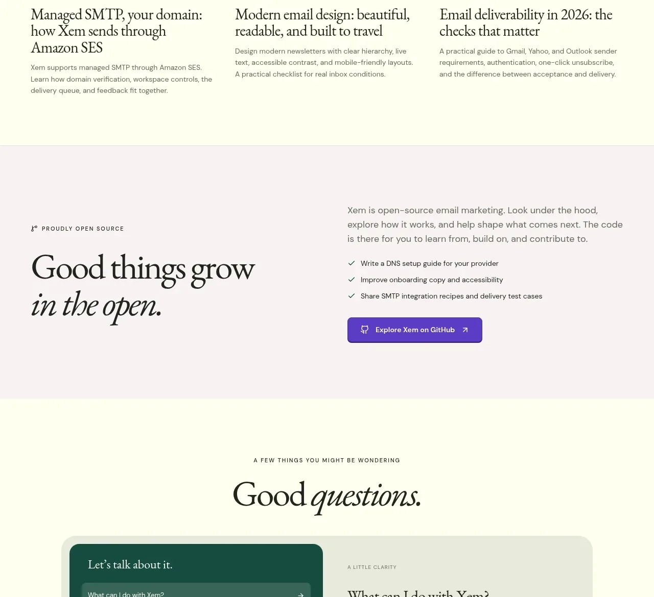
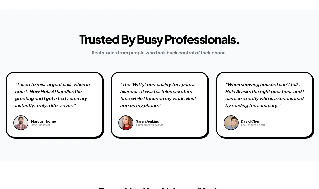
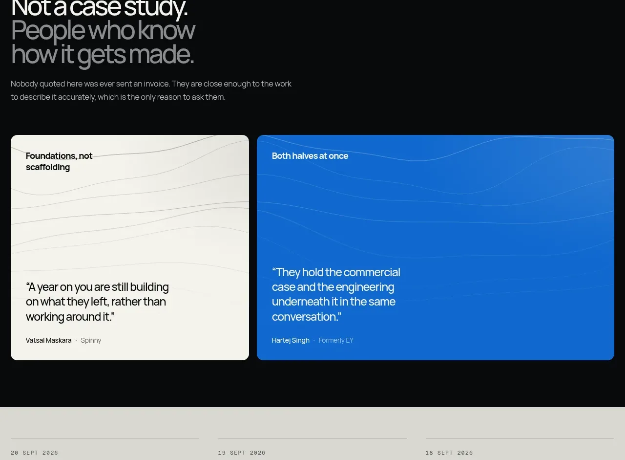
A quiet heading introduces a horizontal row of short quote cards. The varied card lengths and generous spacing make the proof feel conversational rather than like a formal testimonial wall.
Prompt preview
## Reference images

Study these alongside the description below: hierarchy, rhythm, spacing, colour. Build for the product you are asked about, using this design language.

- Component: https://kage-design-assets.t3.tigrisfiles.io/components/thestory-run/30e08e83-50b8-4774-b650-1d7663d8d1f5-1790143355-7.webp
- Full page it was cut from: https://kage-design-assets.t3.tigrisfiles.io/screenshots/thestory-run/30e08e83-50b8-4774-b650-1d7663d8d1f5-1790143267493-full.webp
- Component on Kage: https://kage.design/component/thestory-run-testimonials

## Before you start
Ask who the most credible users of the product are and what specific outcome they would naturally praise. Use authentic, concise proof rather than generic claims.

Create a testimonial section with a centered serif heading, an optional small discovery link above it, and a horizontally arranged row of 4–5 quote cards. Use white cards on an off-white background, thin light-grey borders, modest 12–16px radii, and oversized green opening quotation marks. Keep quotes short, vary their lengths naturally, and show a small attribution only where useful. On smaller screens, convert the row into a horizontally scrollable carousel with visible focus states and optional pagination dots.

Never use logos, product names, copy, illustrations, or imagery from the reference.