kage
kage
Design analysis
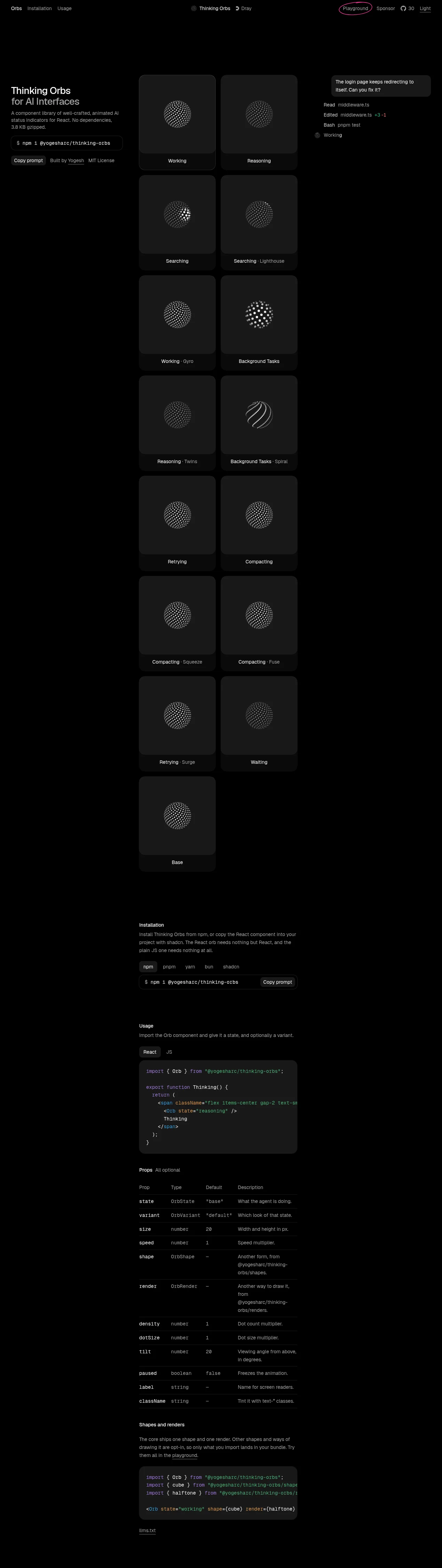
A dark, near-monochrome component-library landing page whose entire visual weight is carried by the product itself: glowing dot-matrix orbs rendered on near-black cards, organised in a strict two-column gallery. The left rail is a sparse three-part composition — small wordmark-and-badge header, two-step serif-inclined title, a copyable install pill — while the central column does the heavy lifting with a long scroll of labelled demos. The right rail doubles as contextual colour: a salmon-orange assistant-style chat bubble and a terminal-feed of syntax-tinted log lines, which gives the page its only saturated moments. Documentation sections below (tabbed install commands, a syntax-highlighted usage block, a dense prop table, a shapes/renders snippet) repeat the same narrow column, thin hairline rules and muted gray type, so the page reads like an interactive README elevated by a single luminous asset.
Prompt preview
## Reference images

Study these alongside the description below: hierarchy, rhythm, spacing, colour. Build for the product you are asked about, using this design language.

- Full page: https://kage-design-assets.t3.tigrisfiles.io/screenshots/thinking-orbs/1e178b90-85cc-40c4-86e5-bc16130bc9ab-1791180214590-full.webp
- Above the fold: https://kage-design-assets.t3.tigrisfiles.io/screenshots/thinking-orbs/1e178b90-85cc-40c4-86e5-bc16130bc9ab-1791180211517.webp
- Design on Kage: https://kage.design/designs/thinking-orbs-landing-page

## Before you start
Ask the user what they are building, who it is for, and what brand assets (name, colours, type) they already have — then wait for the answers. Everything below is a design language to apply to *their* product, not a reproduction of the reference page. If they have no palette, the default here is a near-black canvas (#0d0e10–#111214) with warm gray text (#9a9a95) and white accents; one saturated accent (salmon-orange, ~#e8865a) is reserved for chat/contextual UI and syntax colours (green ~#7bb662, red ~#d96a5a, blue ~#6f9bd6) come from code highlighting only.

## Page structure
- **Top nav bar**: single 40–48px row spanning full width — small lowercase wordmark left, inline text links beside it, centred product name with a tiny badge and a companion badge, right side holding a hand-drawn-circled CTA link, a text link, a GitHub star count with icon, and a theme toggle. No backgrounds, no dividers, hairline-free.
- **Left intro rail** (sticky-positioned narrow column at the page top-left): three-part stack — two-line product title in two sizes with a line break between, a two-sentence description quoting the bundle size, then a pill-shaped copyable install command (`$` prompt + monospace command) with a "Copy" affordance, and beneath it a row of three small metadata items (author, licence) at small muted size.
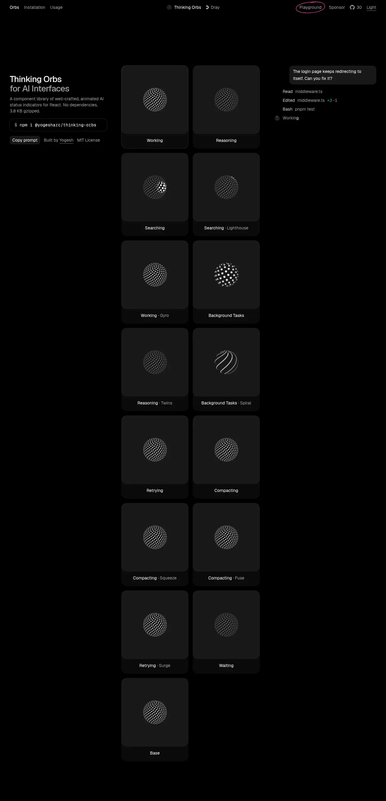
- **Demo gallery** (central column, the hero of the page): a two-column grid of square-ish dark cards (#161719) each containing one animated product demo and a caption row beneath — the state name in white, an optional variant name in muted text after a thin separator. Roughly fourteen cards stacked in pairs, flowing down most of the page; each card's interior is pure near-black so the glowing element reads as the only light source.
- **Right context rail** (same top band as gallery start): a chat-bubble-styled tooltip card with a plain-language user question, followed by a terminal-style feed of log lines ("Read …", "Edited … +3 −1", "Bash …") with syntax colours on the diff, and a status line pairing an orb with the word "Working". This rail demonstrates the product *in context* and provides the page's only saturated colour.
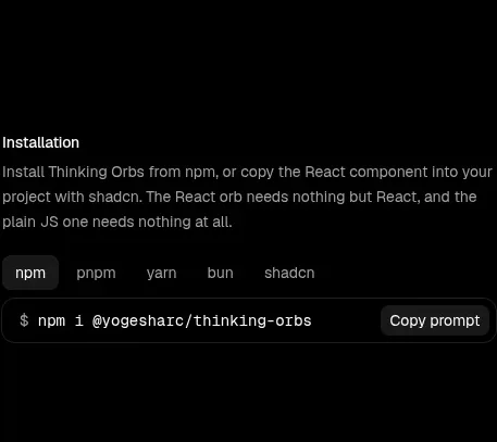
- **Installation section**: below the gallery, still in the central column — small white section heading, a short muted paragraph, a row of tab pills (npm / pnpm / yarn / bun / shadcn) with the active one boxed, then a dark command bar with monospace command and a right-aligned copy button.
- **Usage section**: heading, one-line muted explanation, a React/JS language toggle as two small boxed tabs, then a syntax-highlighted code block with generous line spacing and token colours (purple keywords, orange strings, blue types).
- **Props reference table**: heading with a muted "(All optional)" suffix, then a four-column table (Prop / Type / Default / Description) with thin hairline row rules, monospace prop names and types, muted values, and full-width hairlines above and below the header.
- **Shapes and renders section**: heading, a paragraph noting tree-shaking with a single underlined inline link, then a second syntax-highlighted code block showing imports and JSX usage.
- **Footer**: single muted monospace link (e.g. a licence/feeds file), left-aligned, small.

## Design language
- **One luminous subject, everything else recedes**: the entire page is a dark neutral field (#0d0e10 page, #161719 cards) so that any glowing, animated or colourful element instantly becomes the focal point. Rule: choose one hero artefact per page and starve everything else of colour.
- **Hierarchy via size steps, not weight**: the title uses two sizes with a line break ("Product Name" large, "descriptor" smaller, same lightness); headings elsewhere are small (~14px) and white while body copy is 12–13px warm gray (#9a9a95). Never use bold to create hierarchy — use size and lightness steps.
- **Three-rail asymmetry**: a narrow left intro rail, a wide central content/gallery column (~600px), and a short right context rail that terminates early. The gallery's long scroll dominates; rails exist to frame it, not compete.
- **Gallery rhythm**: strict two-column card grid, each card ~square with interior padding, caption row below the visual separated by a hairline; a monotonous, meditative repetition is intentional — variation comes from the demos themselves, not from layout changes. Cards have 10–14px radius, no borders, no shadows; the card is defined solely by being one step lighter than the page.
- **Colour discipline**: white for names/values, warm gray for descriptions, and exactly one accent (salmon-orange ~#e8865a) reserved for human/contextual elements (chat bubbles). Syntax colours (green, red, blue, purple, orange) appear only inside code and log lines — never as UI chrome.
- **Type pairing**: one geometric/neutral sans (Inter-like) for all UI text, one monospace for commands, code, prop names and footer links; monospace also carries the `$` prompt motif in install pills. Code blocks use relaxed line-height (~1.7) with token colouring.
- **Surfaces and lines**: hairline rules (#2a2b2e) only where separation is semantic (table rows, caption dividers); no card borders, no drop shadows anywhere. Radius ~10–14px on cards, pills and buttons; command bars use a slightly darker fill (#131416) inside the section.
- **Copyable things look copyable**: install commands are always pill/bar-shaped with a leading `$`, monospace type, and an explicit Copy button or affordance — a recurring pattern across hero and docs.
- **Tabs and toggles**: language/package toggles are small boxed text chips, active state gets a filled pill or border, inactive stay muted text.
- **Density shift down the page**: airy and sparse at top (huge whitespace around gallery), progressively denser into the docs zone — tighter headings, tables, code — ending with a minimal monospace footer. Motion is confined to the product demos; the page chrome itself is static.
- **Contextual storytelling**: pair the abstract component with a realistic usage vignette (a chat bubble, a log feed) in the first viewport so visitors see the artefact inside a real interface, using that vignette to introduce the page's only accent colour.

## Never
- No reference product names, wordmarks, taglines, copy, author credits, licence wording, or the specific orb artwork/animation set.
- No copying the salmon-orange chat bubble's exact wording or the terminal log entries verbatim.
- Do not clone the exact card grid content list (state/variant names); derive equivalent demo labels from the user's actual product.
- Never present the result as the reference product or reuse its illustration style; rebuild the aesthetic from the rules above with the user's own brand assets.
Components from this page
All components
 Minimal dark documentation navigation
Thinking Orbs · Navigation
Minimal dark documentation navigation
Thinking Orbs · Navigation
 Interactive orb gallery hero
Thinking Orbs · Hero
Interactive orb gallery hero
Thinking Orbs · Hero
 Installation instructions
Thinking Orbs · Code block
Installation instructions
Thinking Orbs · Code block
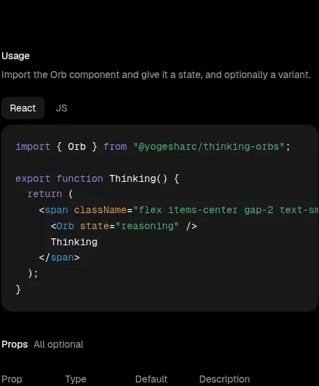 Usage example
Thinking Orbs · Code block
Usage example
Thinking Orbs · Code block
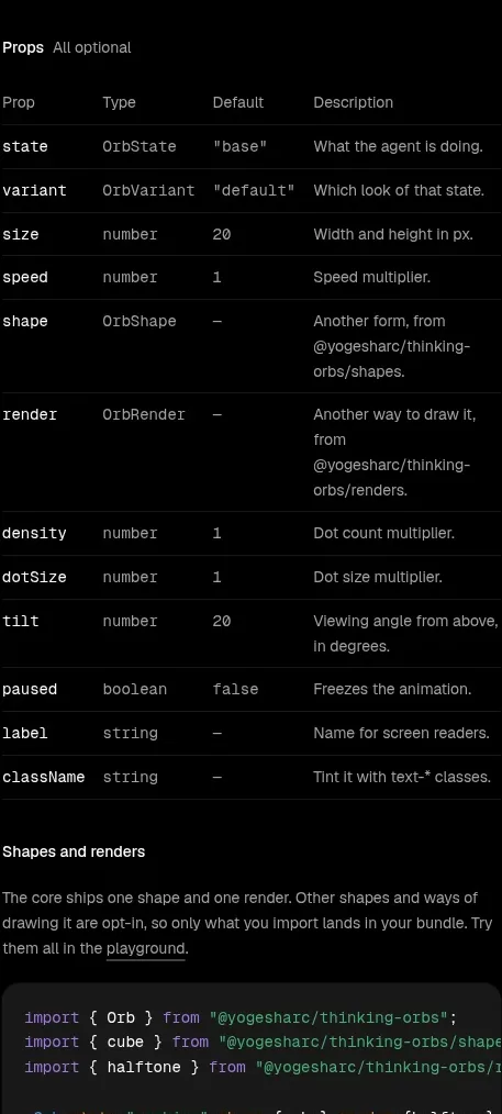 Component props reference
Thinking Orbs · Table
Component props reference
Thinking Orbs · Table
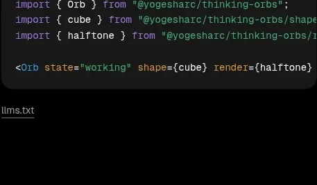 Shapes and render extensions
Thinking Orbs · Code block
Shapes and render extensions
Thinking Orbs · Code block