 kage
kage
thinkingorbs.com
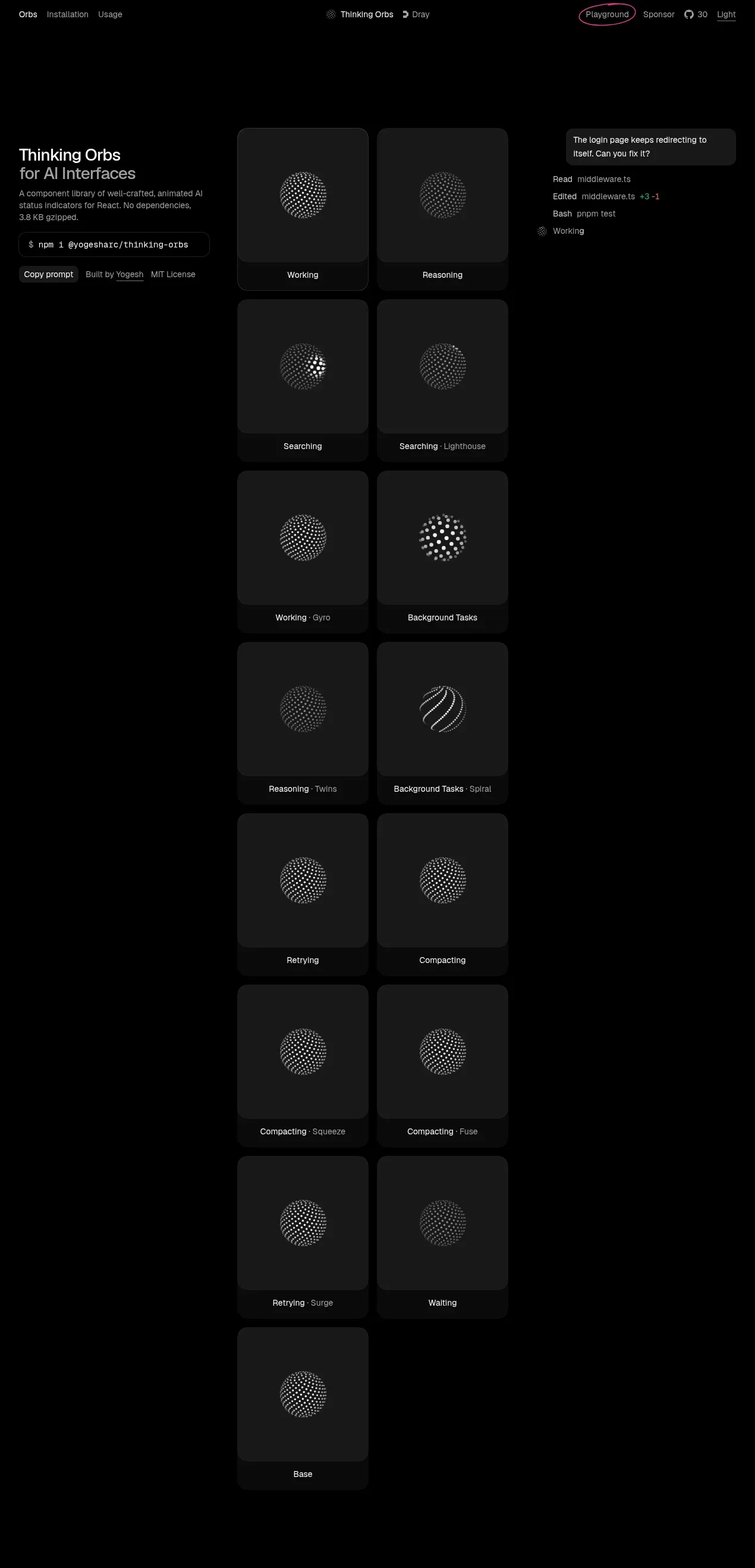
Design analysis
The hero combines a left-aligned product introduction with a large, sparse two-column gallery of animated state cards and a small status/readout panel. The oversized black canvas and restrained gray cards make the luminous dotted orbs the focal point.
Prompt preview
## Reference images

Study these alongside the description below: hierarchy, rhythm, spacing, colour. Build for the product you are asked about, using this design language.

- Component: https://kage-design-assets.t3.tigrisfiles.io/components/thinking-orbs/1e178b90-85cc-40c4-86e5-bc16130bc9ab-1791180317-1.webp
- Full page it was cut from: https://kage-design-assets.t3.tigrisfiles.io/screenshots/thinking-orbs/1e178b90-85cc-40c4-86e5-bc16130bc9ab-1791180214590-full.webp
- Component on Kage: https://kage.design/component/thinking-orbs-hero

## Before you start
Ask what the user's product and brand are, then apply the principles below to that product rather than reproducing the reference.

Create a full-width dark hero for a developer-facing visual component library. Use a black background (#030303) and a centered max-width layout. Place a narrow introductory column on the left with a 22–24px white heading, a muted supporting paragraph, a compact monospace install/prompt chip, and two small secondary actions. Beside it, build a spacious two-column gallery of interactive cards: cards should be approximately square, use charcoal surfaces (#171717), 1px subtly lighter borders (#242424), 12–14px radius, and a darker label strip at the bottom. Center an abstract animated visual in each card, but generate an original visual appropriate to the user's product. Include a small contextual status panel near the upper-right of the gallery using tiny muted rows and a restrained success accent.

Use a responsive grid: stack the intro above the gallery on narrow screens, preserve generous vertical gaps, and keep card labels legible. Typography should be a neutral sans-serif with 12–14px body text, 10–11px metadata, and high contrast only for the main heading. Add hover lift, focus outlines, and pause/reduced-motion support for animated visuals. Keep the composition intentionally sparse and let the gallery continue vertically as a showcase rather than forcing everything above the fold.

Never: use logos, product names, copy, illustrations, or imagery from the reference.
More components
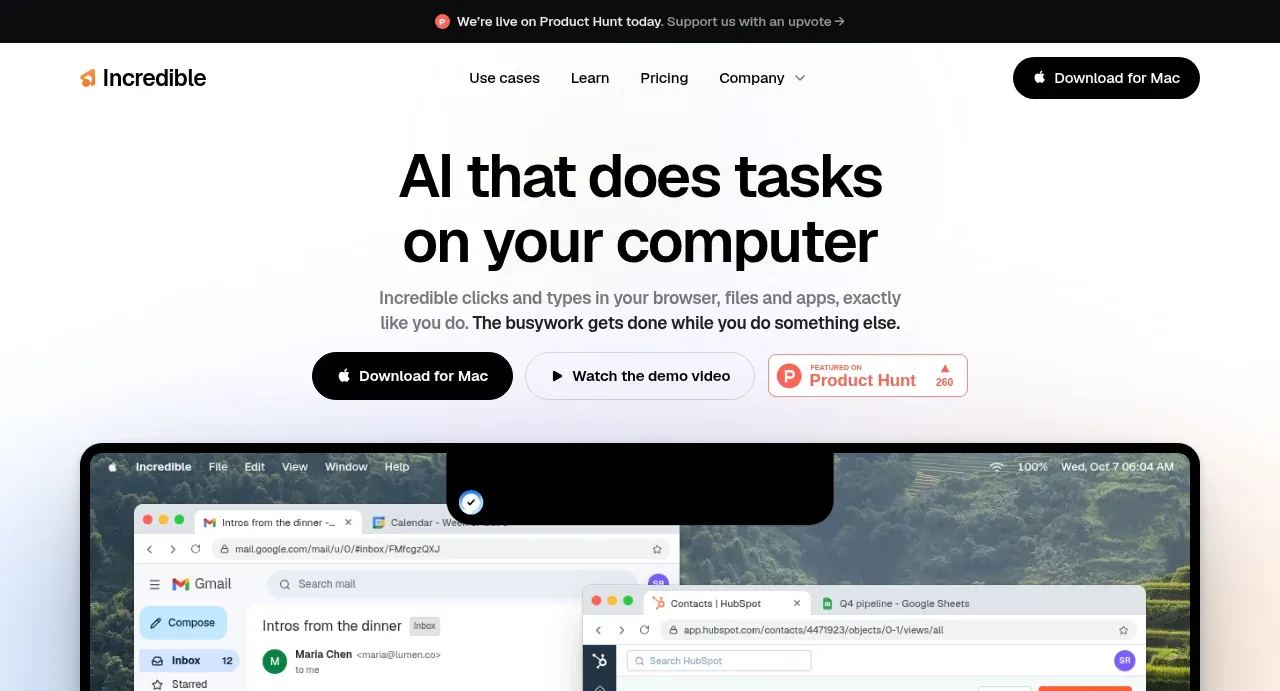
 AI workflow hero
Incredible · Hero
AI workflow hero
Incredible · Hero
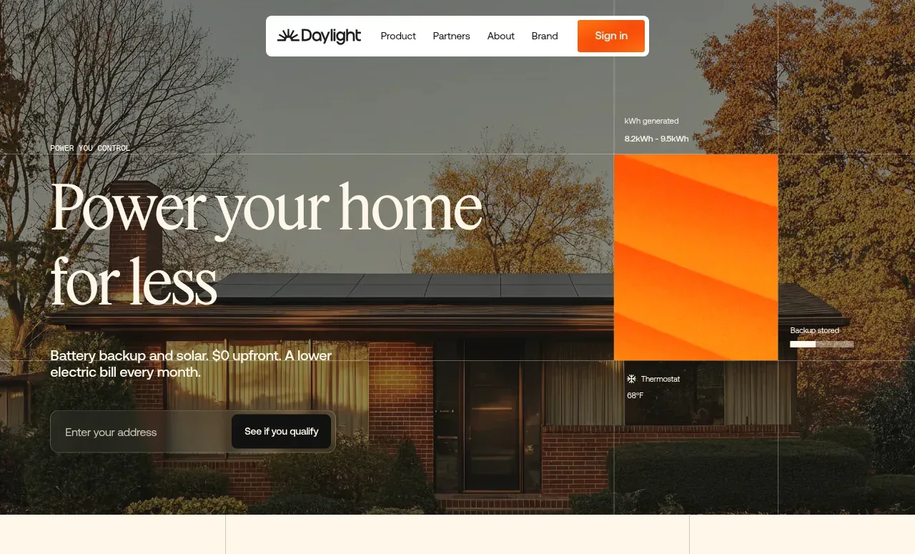
 Photographic power-home hero
godaylight.com · Hero
Photographic power-home hero
godaylight.com · Hero
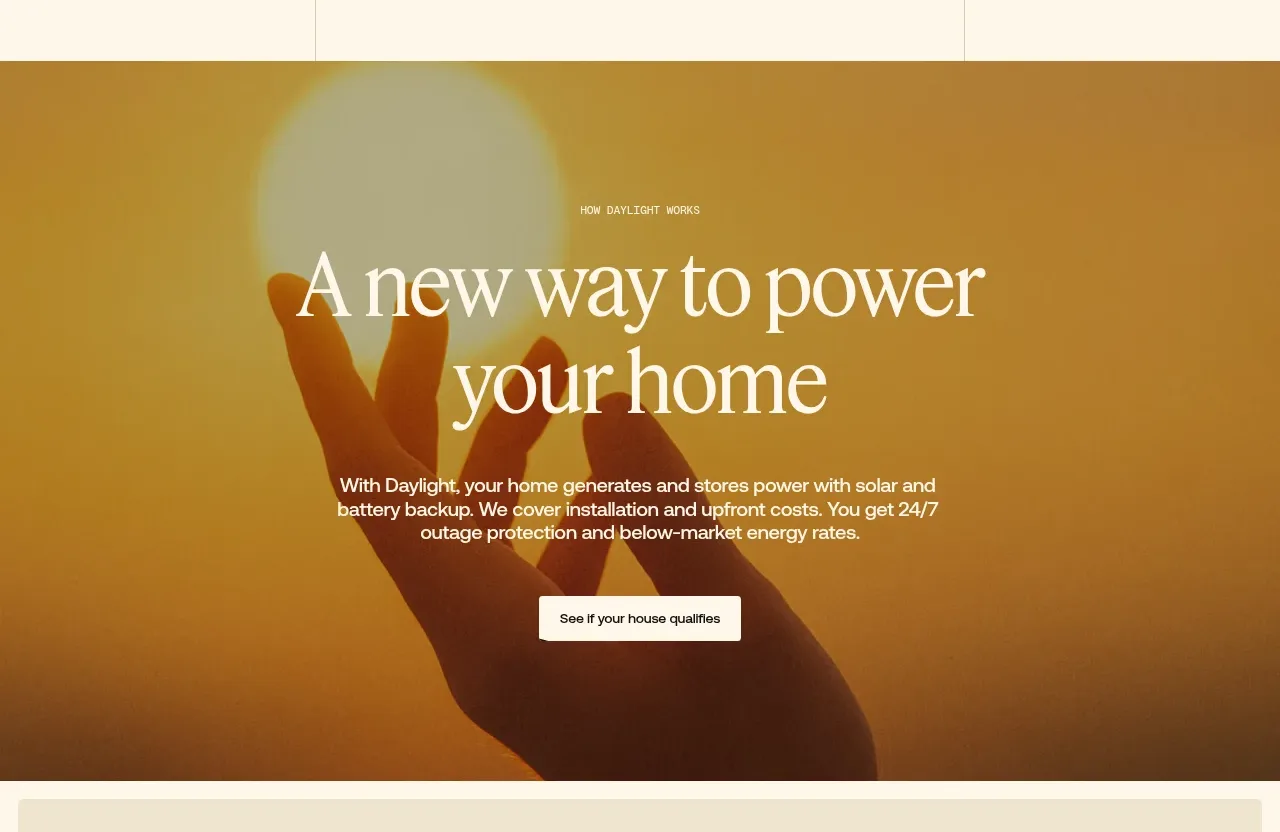 Warm mission statement panel
godaylight.com · Hero
Warm mission statement panel
godaylight.com · Hero
 Grid problem statement
godaylight.com · Hero
Grid problem statement
godaylight.com · Hero
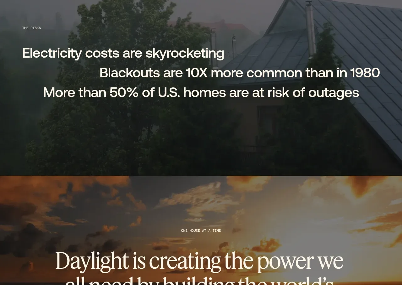 Decentralized energy statement
godaylight.com · Hero
Decentralized energy statement
godaylight.com · Hero
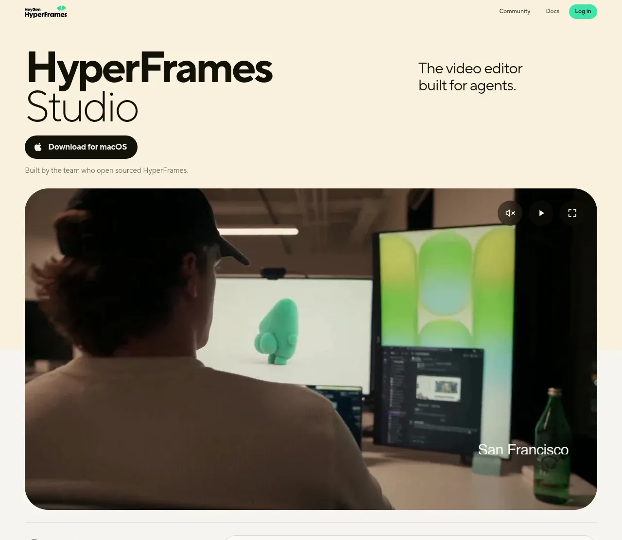
 Product hero with download action and video
HyperFrames Studio (Desktop) · Hero
Product hero with download action and video
HyperFrames Studio (Desktop) · Hero