kage
kage
tinykpi.app
Design analysis
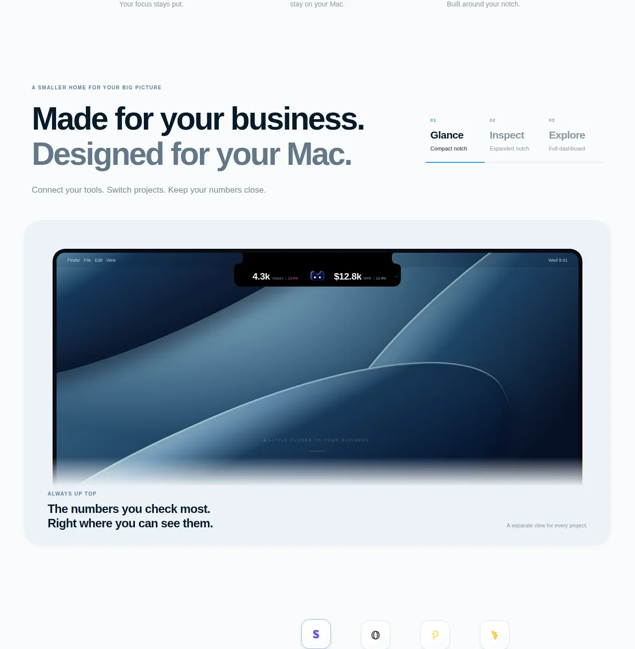
A feature section introduces a strong left-aligned headline and a compact three-step selector, followed by a large pale showcase card containing a product screenshot and caption. The numbered selector creates a simple narrative from overview to detail.
Prompt preview
## Reference images

Study these alongside the description below: hierarchy, rhythm, spacing, colour. Build for the product you are asked about, using this design language.

- Component: https://kage-design-assets.t3.tigrisfiles.io/components/tinykpi/a5c6b072-2fc8-4798-bcd8-9bd0bf616d58-1789711472-3.webp
- Full page it was cut from: https://kage-design-assets.t3.tigrisfiles.io/screenshots/tinykpi/a5c6b072-2fc8-4798-bcd8-9bd0bf616d58-1789711371888-full.webp
- Component on Kage: https://kage.design/component/tinykpi-card

## Before you start
Ask what the user's product, brand, feature story, and preferred interaction model are, then apply these principles to that product.

Create a feature showcase section with a small uppercase eyebrow, a large two-line heading, and a short supporting sentence. Place a compact three-state tab or step selector aligned to the right of the heading, with tiny index labels, muted inactive states, and a thin accent underline for the active state. Below, use a very pale blue-gray showcase panel #eef4f7 with a 24px radius and generous padding. Put a large rounded product UI preview inside it and add a small caption row beneath. Typography should use a near-black #10202c heading, slate #667580 secondary line, 11px uppercase eyebrow, and restrained blue accent #3a91bd. The preview should change when tabs are selected, with a subtle fade or slide, but remain accessible with real buttons and keyboard focus.

Never use logos, product names, copy, illustrations, or imagery from the reference.