kage
kage
tinykpi.app
Design analysis
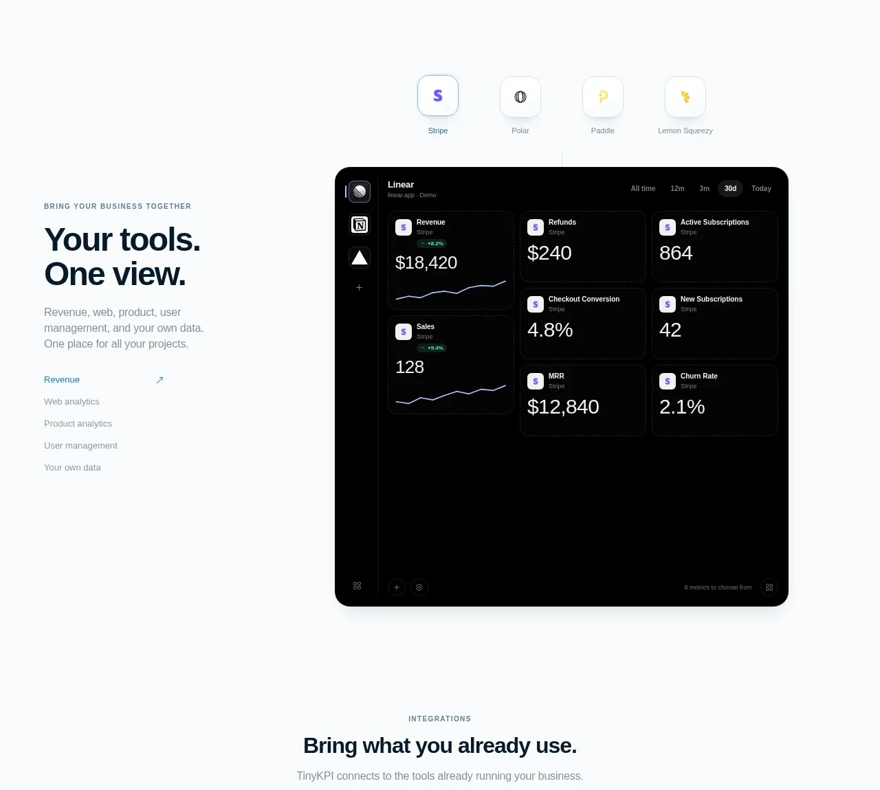
This split feature pairs a left narrative column with links or subtopics and a large dark dashboard preview on the right. A row of integration badges above the preview reinforces the promise of bringing multiple sources together.
Prompt preview
## Reference images

Study these alongside the description below: hierarchy, rhythm, spacing, colour. Build for the product you are asked about, using this design language.

- Component: https://kage-design-assets.t3.tigrisfiles.io/components/tinykpi/a5c6b072-2fc8-4798-bcd8-9bd0bf616d58-1789711472-4.webp
- Full page it was cut from: https://kage-design-assets.t3.tigrisfiles.io/screenshots/tinykpi/a5c6b072-2fc8-4798-bcd8-9bd0bf616d58-1789711371888-full.webp
- Component on Kage: https://kage.design/component/tinykpi-card-2

## Before you start
Ask what the user's product, data sources, and most important unified workflow are, then apply these principles to that product.

Build a split feature section for a unified analytics view. Use a narrow left column with a small eyebrow, a large two-line heading, short explanatory copy, and a vertical list of muted sub-links with one active accent link. Use the right side for a large near-black dashboard preview with 18–22px radius, a subtle border, dense but legible metric cards, and a few simple sparkline charts. Above the preview, center a row of four to six small circular or rounded-square integration chips. Keep the section aligned to a 900px page grid, with a 32/68 column ratio and 72px gap. Use #050607 for the preview, #f7f9fb page background, #13222d ink, #7c8992 secondary text, and a restrained violet/blue accent. On mobile, stack text above preview.

Never use logos, product names, copy, illustrations, or imagery from the reference.