kage
kage
tinykpi.app
Design analysis
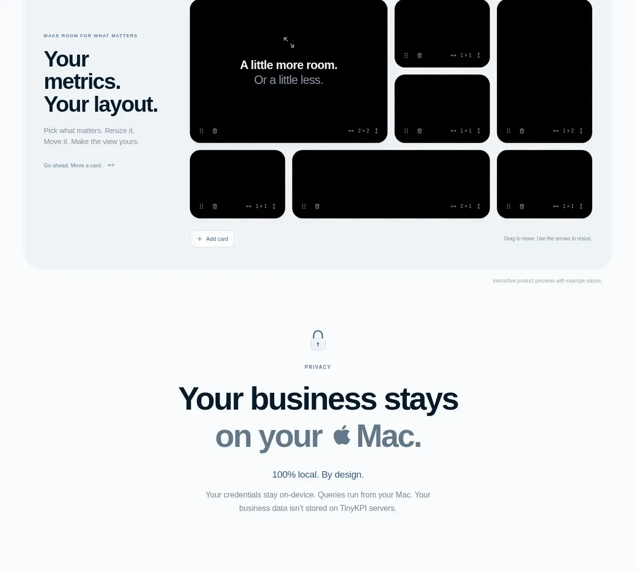
A pale rounded panel combines a left-side explanation with an interactive-looking dashboard canvas on the right. Multiple black tiles demonstrate flexible resizing and placement, making customization tangible rather than abstract.
Prompt preview
## Reference images

Study these alongside the description below: hierarchy, rhythm, spacing, colour. Build for the product you are asked about, using this design language.

- Component: https://kage-design-assets.t3.tigrisfiles.io/components/tinykpi/a5c6b072-2fc8-4798-bcd8-9bd0bf616d58-1789711473-6.webp
- Full page it was cut from: https://kage-design-assets.t3.tigrisfiles.io/screenshots/tinykpi/a5c6b072-2fc8-4798-bcd8-9bd0bf616d58-1789711371888-full.webp
- Component on Kage: https://kage.design/component/tinykpi-card-3

## Before you start
Ask what users can customize in the user's product and what the key interaction should be, then apply these principles to that product.

Build a customization showcase in a large pale blue-gray panel with 24px radius. Use a two-column layout: a left text block with a short eyebrow, oversized stacked heading, concise copy, and a small text action; and a right interactive canvas with a tiny toolbar/status row and a grid of dark metric tiles in varied sizes. Give tiles #020304 backgrounds, 14–18px radii, subtle borders, small drag handles, and resize affordances. Include a clearly visible add-card control below or beside the grid. Use #edf3f6 panel background, #0e1d28 ink, #77858e muted copy, and a restrained blue accent. Implement real keyboard-accessible controls and a responsive fallback that turns the grid into a simple stacked list on small screens.

Never use logos, product names, copy, illustrations, or imagery from the reference.