 kage
kage
tinykpi.app
Design analysis
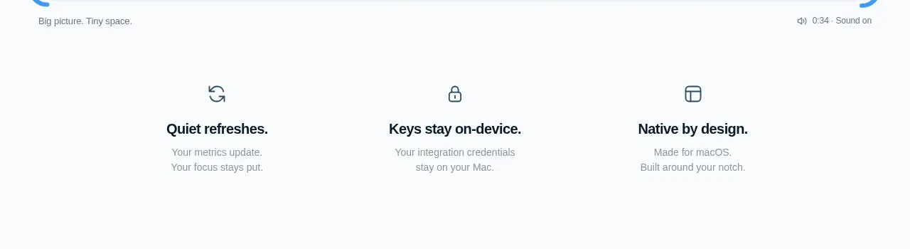
Three evenly spaced benefit columns translate the product promise into short, memorable claims with simple line icons and concise supporting text. The sparse treatment preserves the premium, utility-like feel.
Prompt preview
## Reference images

Study these alongside the description below: hierarchy, rhythm, spacing, colour. Build for the product you are asked about, using this design language.

- Component: https://kage-design-assets.t3.tigrisfiles.io/components/tinykpi/a5c6b072-2fc8-4798-bcd8-9bd0bf616d58-1789711472-2.webp
- Full page it was cut from: https://kage-design-assets.t3.tigrisfiles.io/screenshots/tinykpi/a5c6b072-2fc8-4798-bcd8-9bd0bf616d58-1789711371888-full.webp
- Component on Kage: https://kage.design/component/tinykpi-feature-grid

## Before you start
Ask what the user's product, brand, and three strongest benefits are, then apply these principles to that product.

Build a three-column benefit strip beneath a hero. Each column should have a small monochrome line icon, a compact bold title, and one or two short lines of muted explanation. Use equal-width columns inside a max-width 760px container, centered alignment, and generous 48–72px vertical padding. Keep icons understated, around 20px, with #42515c strokes; use #10202c for titles and #89939a for descriptions. Avoid cards and heavy borders; the whitespace and alignment should do the organizing. Stack columns vertically below 700px.

Never use logos, product names, copy, illustrations, or imagery from the reference.
More components

 AI-powered helpdesk feature section
intercom.com · Feature grid
AI-powered helpdesk feature section
intercom.com · Feature grid
 Integrations and ecosystem section
intercom.com · Feature grid
Integrations and ecosystem section
intercom.com · Feature grid
 AI agent capabilities section
intercom.com · Feature grid
AI agent capabilities section
intercom.com · Feature grid
 Unified support experience overview
intercom.com · Feature grid
Unified support experience overview
intercom.com · Feature grid

 Core invoicing capabilities
sendinvo.com · Feature grid
Core invoicing capabilities
sendinvo.com · Feature grid
 Audience and trade types
sendinvo.com · Feature grid
Audience and trade types
sendinvo.com · Feature grid