kage
kage
tinykpi.app
Design analysis
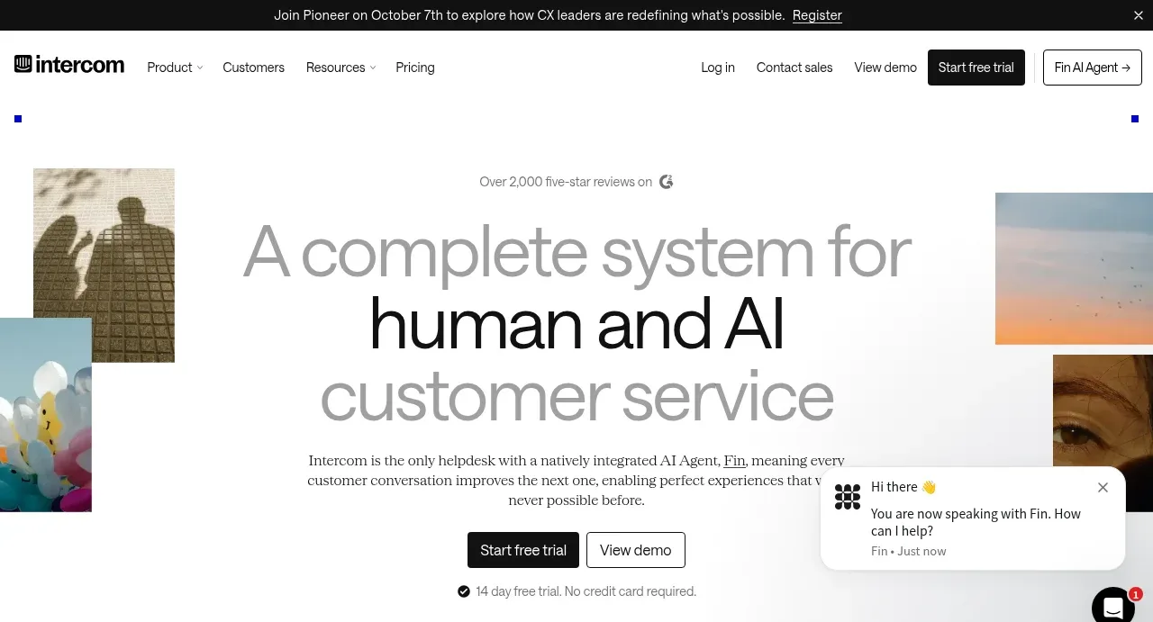
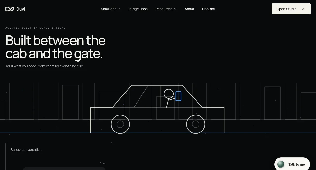
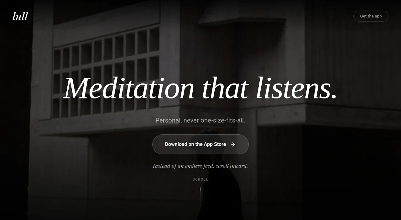
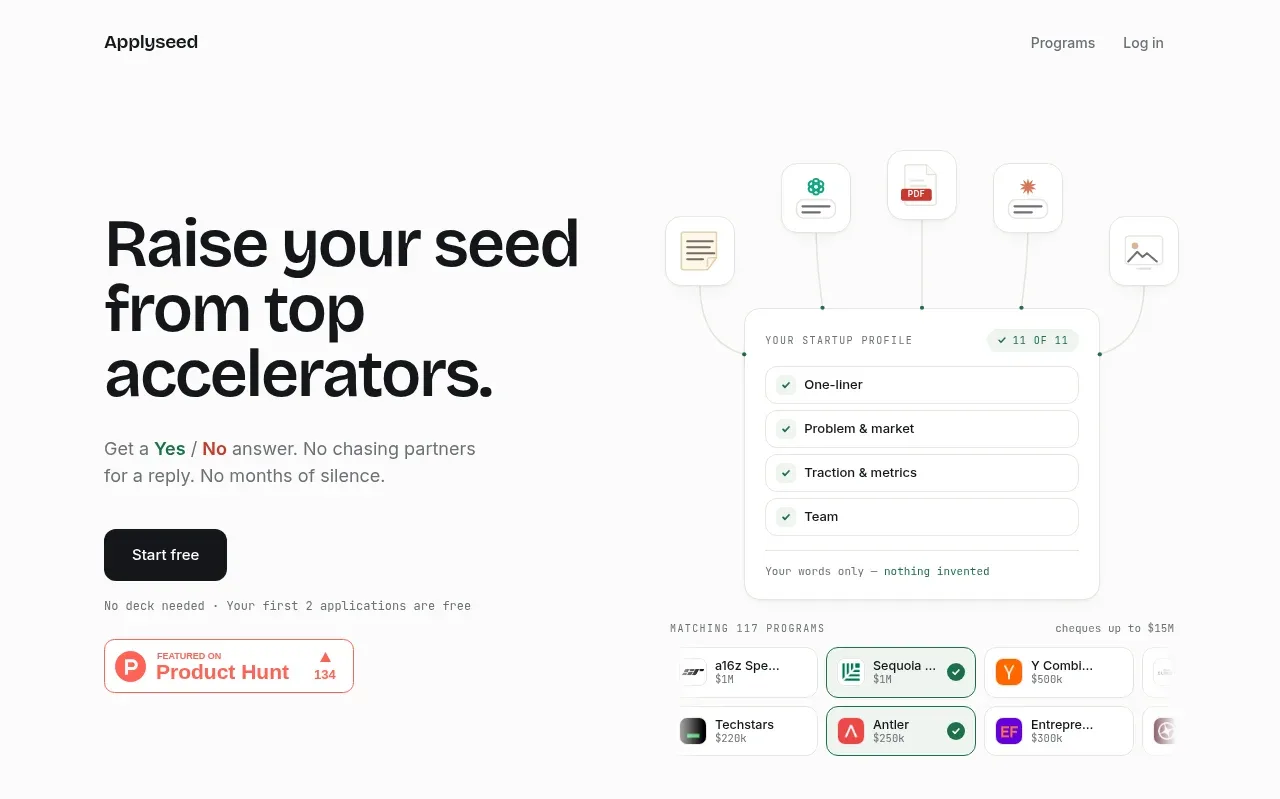
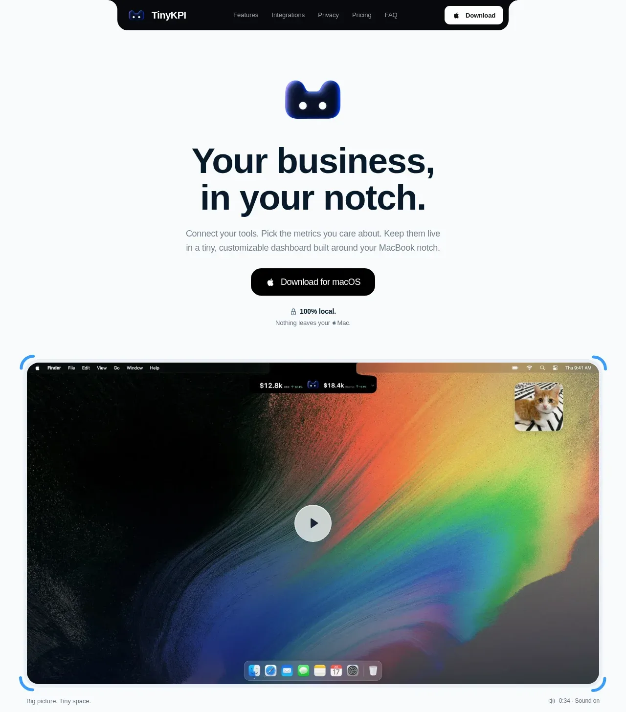
The hero stacks a distinctive product symbol, an oversized two-line promise, supporting explanation, download CTA, local/privacy reassurance, and a large rounded product video still. The dark media frame gives the otherwise pale page a strong visual anchor.
Prompt preview
## Reference images

Study these alongside the description below: hierarchy, rhythm, spacing, colour. Build for the product you are asked about, using this design language.

- Component: https://kage-design-assets.t3.tigrisfiles.io/components/tinykpi/a5c6b072-2fc8-4798-bcd8-9bd0bf616d58-1789711471-1.webp
- Full page it was cut from: https://kage-design-assets.t3.tigrisfiles.io/screenshots/tinykpi/a5c6b072-2fc8-4798-bcd8-9bd0bf616d58-1789711371888-full.webp
- Component on Kage: https://kage.design/component/tinykpi-hero

## Before you start
Ask what the user's product, brand, audience, and main conversion goal are, then apply these principles to that product.

Create a spacious centered hero for a desktop software product. Start below the navigation with a small abstract product mark, then a very large bold headline constrained to roughly 500px and split into two short lines. Follow it with a calm 16px supporting paragraph, a dark pill-shaped primary download button, and a tiny reassurance row beneath it. Place a large rounded media/demo frame below the copy, approximately 92% of the content width, with a 16–22px radius, dark edge, subtle colored corner accents, and a centered play control. Keep the page background cool white #f8fafc, headline ink #0b1722, body gray #7d8992, and CTA #050607. Use a clear vertical rhythm: 32px between headline and copy, 24px to CTA, 14px to reassurance, then 48–64px to media. Make the media responsive and preserve a 16:9-ish ratio.

Never use logos, product names, copy, illustrations, or imagery from the reference.