 kage
kage
tinykpi.app
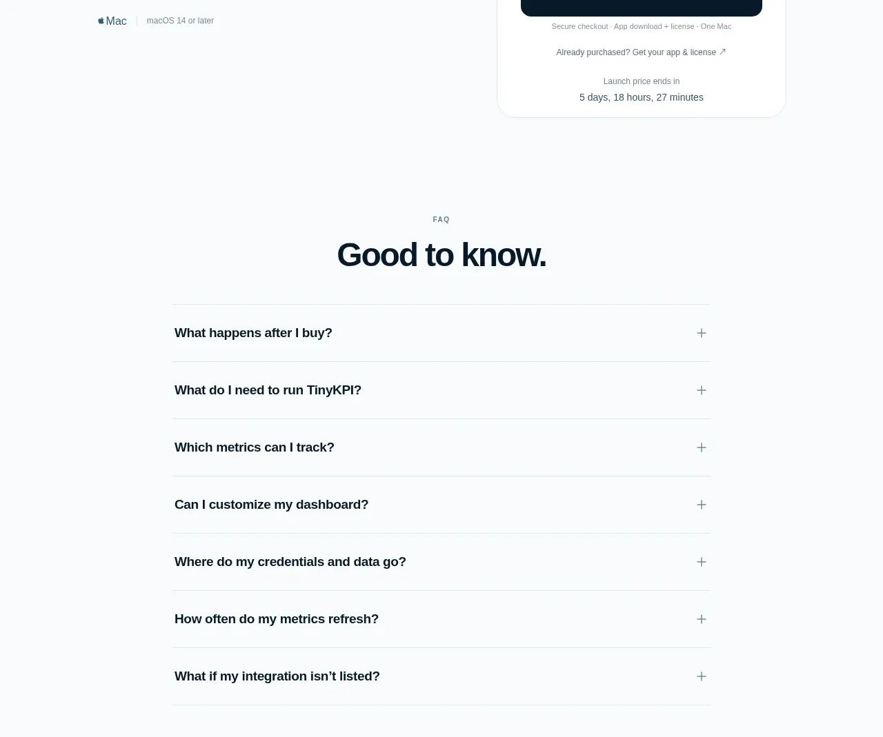
Design analysis
The pricing section balances a left editorial pitch against one prominent purchase card. A large launch price, secondary regular price, strong action, and urgency detail make the offer immediately scannable without competing tiers.
Prompt preview
## Reference images

Study these alongside the description below: hierarchy, rhythm, spacing, colour. Build for the product you are asked about, using this design language.

- Component: https://kage-design-assets.t3.tigrisfiles.io/components/tinykpi/a5c6b072-2fc8-4798-bcd8-9bd0bf616d58-1789711474-8.webp
- Full page it was cut from: https://kage-design-assets.t3.tigrisfiles.io/screenshots/tinykpi/a5c6b072-2fc8-4798-bcd8-9bd0bf616d58-1789711371888-full.webp
- Component on Kage: https://kage.design/component/tinykpi-pricing-table

## Before you start
Ask what the user's product costs, billing model, launch offer, and purchase constraints are, then apply these principles to that product.

Build a single-offer pricing section with a two-column layout. On the left, use a small pricing eyebrow, an oversized two-line value proposition, short supporting copy, and a compact platform/compatibility note. On the right, create a white pricing card with a very subtle #e1e7ea border, 20px radius, soft shadow, and generous padding. Show a small offer label, a large emphasized current price, a smaller regular price, billing clarification, one full-width dark CTA, reassurance text, and optional countdown/availability detail. Use #10202c ink, #6f7e88 secondary text, #061b28 CTA, and #ffffff card. Make price hierarchy dominant and ensure the card remains usable at narrow widths; avoid fake urgency unless the offer genuinely expires.

Never use logos, product names, copy, illustrations, or imagery from the reference.
More components
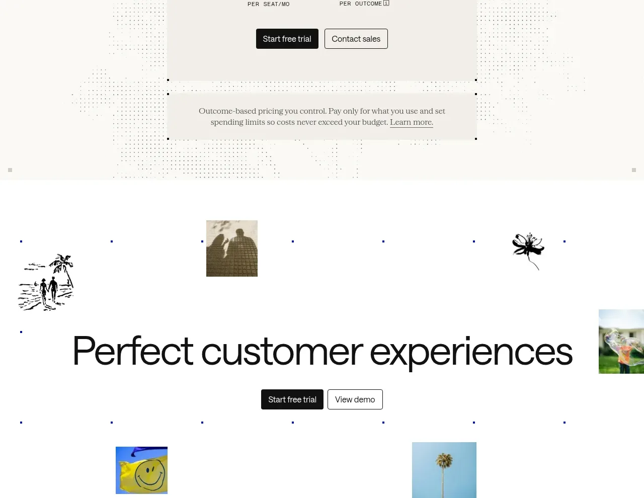
 Transparent pricing card
intercom.com · Pricing table
Transparent pricing card
intercom.com · Pricing table
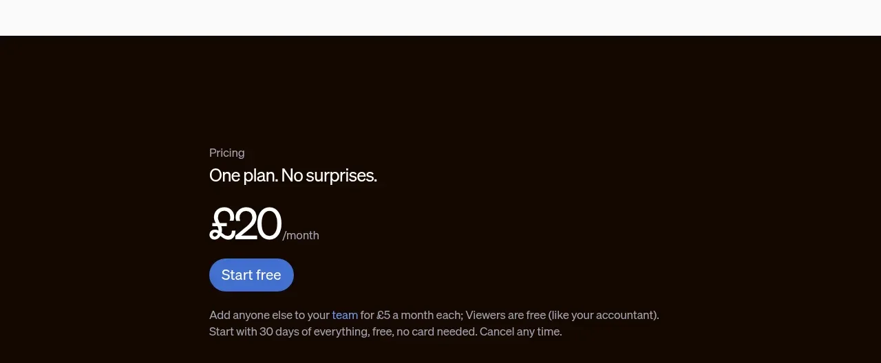
 Single-plan pricing offer
sendinvo.com · Pricing table
Single-plan pricing offer
sendinvo.com · Pricing table
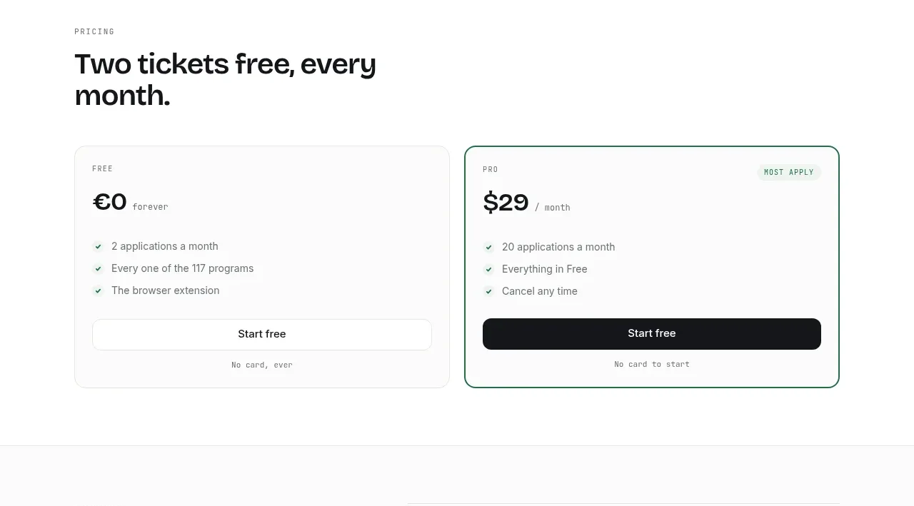
 Two-tier pricing table
ApplySeed · Pricing table
Two-tier pricing table
ApplySeed · Pricing table
F
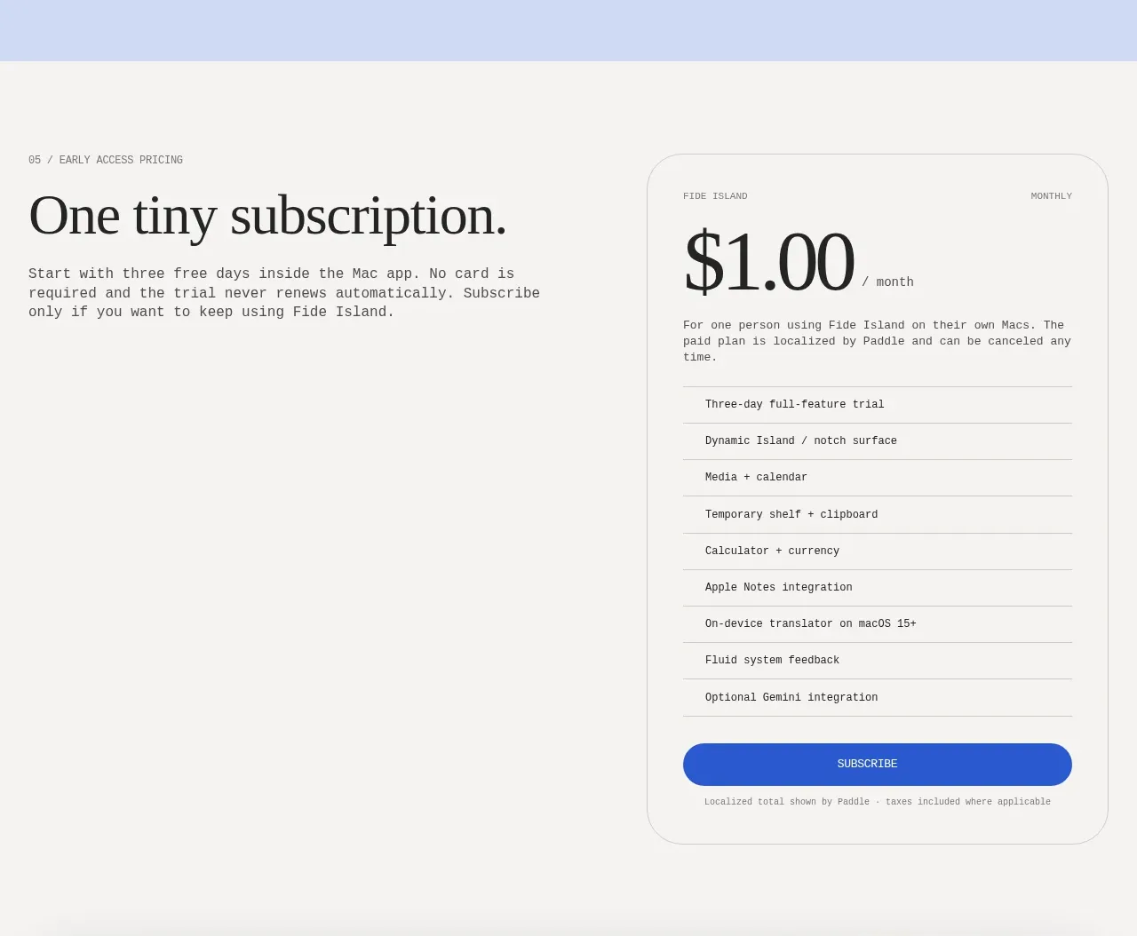
Single-plan early access pricing
Fide Island · Pricing table
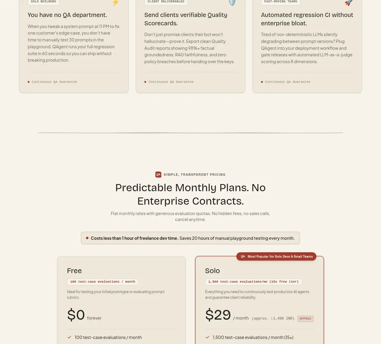
 Two-tier pricing table
QAgent · Pricing table
Two-tier pricing table
QAgent · Pricing table
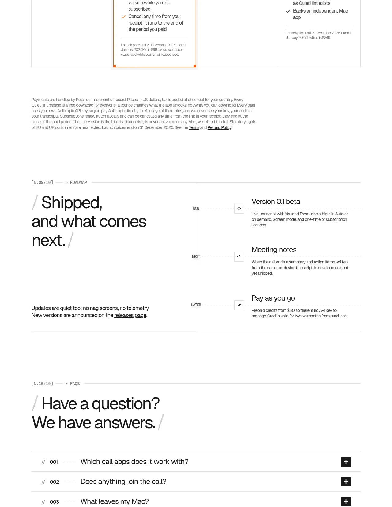
 Flexible four-plan pricing
QuietHint® · Pricing table
Flexible four-plan pricing
QuietHint® · Pricing table