kage
kage
tiun.io
Design analysis
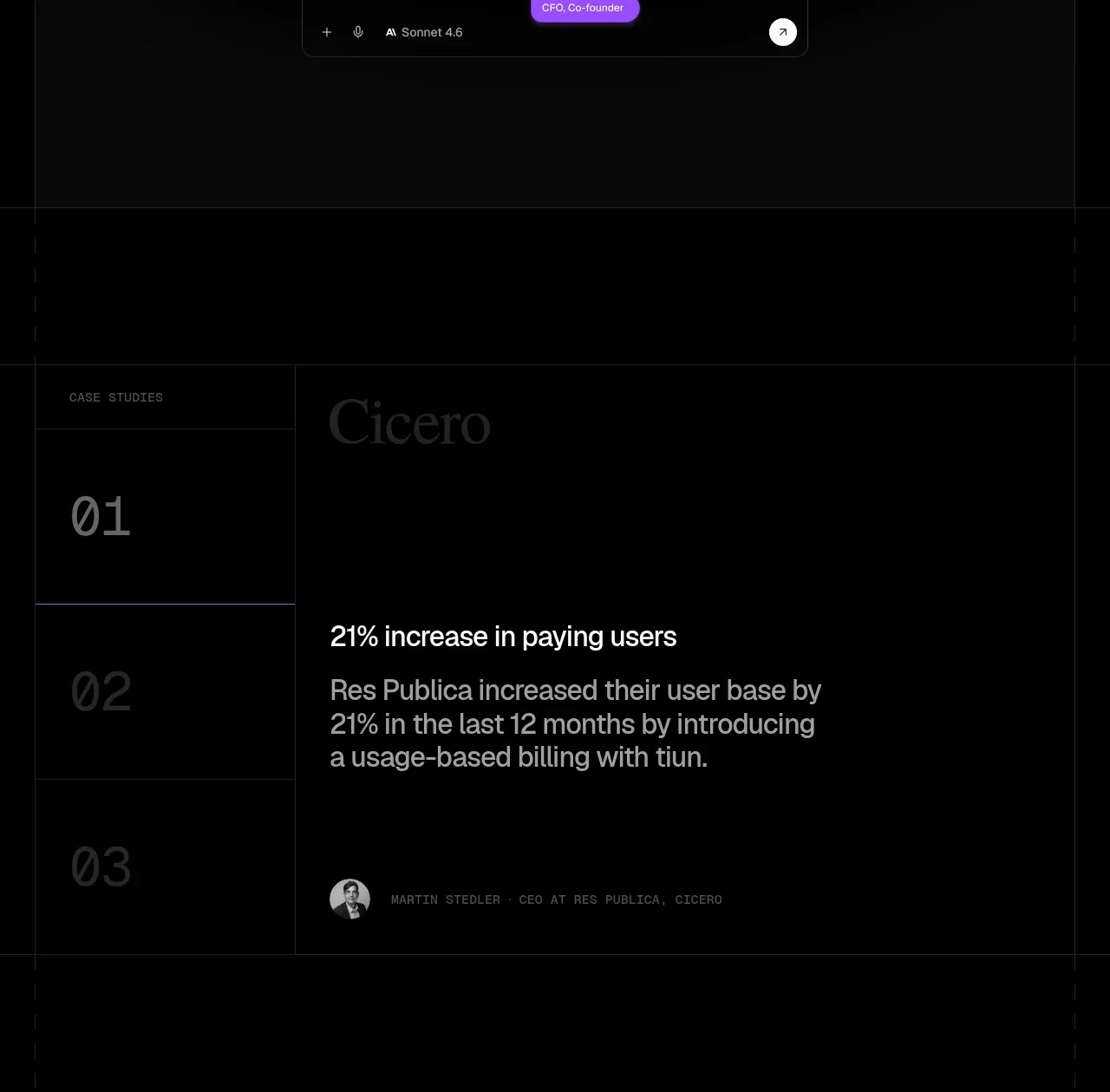
A case-study panel combines a customer label, large result metric, explanatory copy, and attribution in a restrained editorial layout.
Prompt preview
## Reference images

Study these alongside the description below: hierarchy, rhythm, spacing, colour. Build for the product you are asked about, using this design language.

- Component: https://kage-design-assets.t3.tigrisfiles.io/components/tiun/82cad29c-5bdb-4fc9-91ef-0bee36475f7f-1789538801-10.webp
- Full page it was cut from: https://kage-design-assets.t3.tigrisfiles.io/screenshots/tiun/82cad29c-5bdb-4fc9-91ef-0bee36475f7f-1789538671428-full.webp
- Component on Kage: https://kage.design/component/tiun-card

## Before you start
Ask which customer result can be substantiated and whether the user has permission to publish the customer identity. Use an original case study if not.

Build a case-study section with a small label, a simple numbered or tab-like index, a large outcome metric, supporting explanation, and compact customer attribution. Use a two-column editorial grid on desktop: narrow index rail and wide content panel. Keep the background black, use #171717 rules, white metric text around 28–40px, and gray explanatory copy around 16–20px. Add a subtle active violet rule or marker, but avoid excessive decoration. On mobile, turn the index into a compact horizontal selector above the content.

Never: use the reference logo, product name, exact copy, illustrations, or imagery.