 kage
kage
tiun.io

Design analysis
The page moves from a bold articulation of fragmented tooling to a concise solution claim and a visual systems diagram showing connected backend capabilities.
Prompt preview
## Reference images

Study these alongside the description below: hierarchy, rhythm, spacing, colour. Build for the product you are asked about, using this design language.

- Component: https://kage-design-assets.t3.tigrisfiles.io/components/tiun/82cad29c-5bdb-4fc9-91ef-0bee36475f7f-1789538798-3.webp
- Full page it was cut from: https://kage-design-assets.t3.tigrisfiles.io/screenshots/tiun/82cad29c-5bdb-4fc9-91ef-0bee36475f7f-1789538671428-full.webp
- Component on Kage: https://kage.design/component/tiun-feature-grid

## Before you start
Ask what fragmented workflow or operational pain the user's product resolves and what components it unifies. Use that information to create an original narrative and diagram.

Create a narrative feature section in three stages: a small eyebrow, a large left-aligned problem statement, then a solution statement paired with a lightweight systems diagram. Use wide black space between stages, a 12-column or simple centered content grid, and headings around 28–40px with tight line-height. Supporting copy should be gray and limited to readable measure. For the diagram, use thin gray lines, small pill labels, subtle green or violet status accents, and a faint grid or baseline; represent relationships rather than decorative illustration. Borders should be #151515, corner radii 8–12px, and spacing should feel editorial rather than dense.

Never: use the reference logo, product name, exact copy, illustrations, or imagery.
More components

 Billing and checkout capabilities
tiun. · Feature grid
Billing and checkout capabilities
tiun. · Feature grid
 Customer data and user management
tiun. · Feature grid
Customer data and user management
tiun. · Feature grid
 Integration and agent workflow
tiun. · Feature grid
Integration and agent workflow
tiun. · Feature grid
 Authentication product capabilities
tiun. · Feature grid
Authentication product capabilities
tiun. · Feature grid

 Receiving money channels
Payflip · Feature grid
Receiving money channels
Payflip · Feature grid
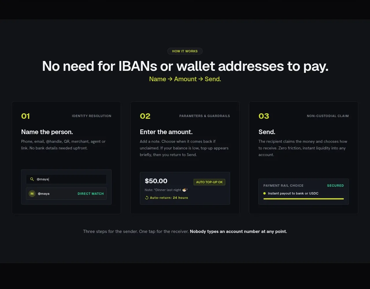 Three-step payment flow
Payflip · Feature grid
Three-step payment flow
Payflip · Feature grid