 kage
kage
tiun.io

Design analysis
A high-contrast integration banner leads into a six-cell capability grid, presenting the product as an easy layer for agents and existing tools.
Prompt preview
## Reference images

Study these alongside the description below: hierarchy, rhythm, spacing, colour. Build for the product you are asked about, using this design language.

- Component: https://kage-design-assets.t3.tigrisfiles.io/components/tiun/82cad29c-5bdb-4fc9-91ef-0bee36475f7f-1789538799-4.webp
- Full page it was cut from: https://kage-design-assets.t3.tigrisfiles.io/screenshots/tiun/82cad29c-5bdb-4fc9-91ef-0bee36475f7f-1789538671428-full.webp
- Component on Kage: https://kage.design/component/tiun-feature-grid-2

## Before you start
Ask which tools, protocols, APIs, or agent workflows the user's product supports and what action should follow this section. Build an original integration story around them.

Design a dark integration section with a wide split-tone banner: explanatory heading and CTAs on the left, and a soft violet halftone or radial glow on the right. Use #050505, white text, muted gray copy, and violet #8B5CF6 as the accent. Under the banner, place a simple 2x3 or 3x2 integration grid with evenly sized cells, sparse monochrome icons, thin #171717 dividers, and short labels. Use 20–32px internal padding, 24px corner radius for the banner, and pill-shaped buttons. Add restrained hover states that brighten icons or borders.

Never: use the reference logo, product name, exact copy, illustrations, or imagery.
More components

 Billing and checkout capabilities
tiun. · Feature grid
Billing and checkout capabilities
tiun. · Feature grid
 Customer data and user management
tiun. · Feature grid
Customer data and user management
tiun. · Feature grid
 Problem and unified solution narrative
tiun. · Feature grid
Problem and unified solution narrative
tiun. · Feature grid
 Authentication product capabilities
tiun. · Feature grid
Authentication product capabilities
tiun. · Feature grid

 Receiving money channels
Payflip · Feature grid
Receiving money channels
Payflip · Feature grid
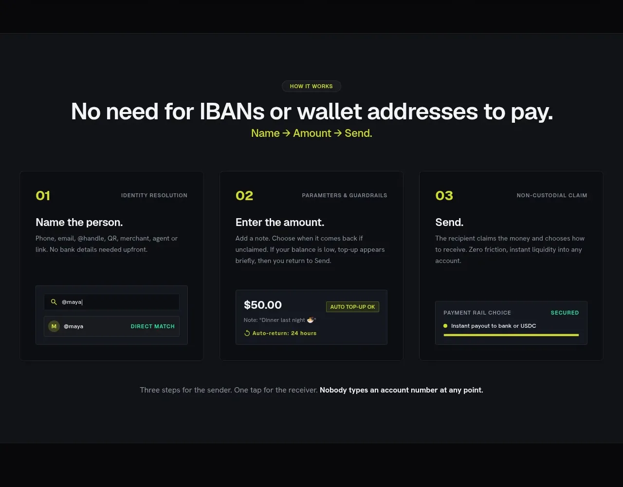 Three-step payment flow
Payflip · Feature grid
Three-step payment flow
Payflip · Feature grid