 kage
kage
tiun.io

Design analysis
An authentication chapter pairs a strong heading with large product UI examples and a lower capability strip, making abstract infrastructure tangible.
Prompt preview
## Reference images

Study these alongside the description below: hierarchy, rhythm, spacing, colour. Build for the product you are asked about, using this design language.

- Component: https://kage-design-assets.t3.tigrisfiles.io/components/tiun/82cad29c-5bdb-4fc9-91ef-0bee36475f7f-1789538800-6.webp
- Full page it was cut from: https://kage-design-assets.t3.tigrisfiles.io/screenshots/tiun/82cad29c-5bdb-4fc9-91ef-0bee36475f7f-1789538671428-full.webp
- Component on Kage: https://kage.design/component/tiun-feature-grid-3

## Before you start
Ask which authentication features the user's product offers and which interface states best demonstrate them. Apply this layout to the user's own product and UI language.

Build a product capability section with a small chapter label, a large heading, and two feature rows. Each row should have explanatory copy on the left and a dark UI mockup on the right; use realistic but invented interface content for the user's product. Add a bottom strip of compact capabilities or providers separated by thin vertical rules. Use black backgrounds, panels in #101010–#171717, 1px borders #242424, 12–16px radii, and white/gray typography. Keep screenshots or mockups crisp but subordinate to the narrative. Use responsive stacking on mobile and preserve generous 72–120px section spacing.

Never: use the reference logo, product name, exact copy, illustrations, or imagery.
More components

 Billing and checkout capabilities
tiun. · Feature grid
Billing and checkout capabilities
tiun. · Feature grid
 Customer data and user management
tiun. · Feature grid
Customer data and user management
tiun. · Feature grid
 Problem and unified solution narrative
tiun. · Feature grid
Problem and unified solution narrative
tiun. · Feature grid
 Integration and agent workflow
tiun. · Feature grid
Integration and agent workflow
tiun. · Feature grid

 Receiving money channels
Payflip · Feature grid
Receiving money channels
Payflip · Feature grid
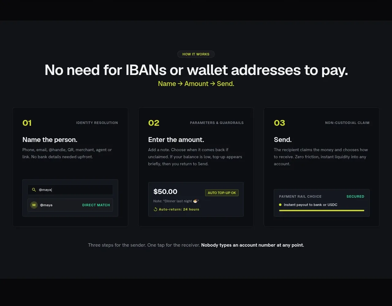 Three-step payment flow
Payflip · Feature grid
Three-step payment flow
Payflip · Feature grid