 kage
kage
tiun.io

Design analysis
The billing chapter shows pricing-plan controls, checkout UI, and a compact merchant-of-record comparison, connecting feature value to commercial outcomes.
Prompt preview
## Reference images

Study these alongside the description below: hierarchy, rhythm, spacing, colour. Build for the product you are asked about, using this design language.

- Component: https://kage-design-assets.t3.tigrisfiles.io/components/tiun/82cad29c-5bdb-4fc9-91ef-0bee36475f7f-1789538800-7.webp
- Full page it was cut from: https://kage-design-assets.t3.tigrisfiles.io/screenshots/tiun/82cad29c-5bdb-4fc9-91ef-0bee36475f7f-1789538671428-full.webp
- Component on Kage: https://kage.design/component/tiun-feature-grid-4

## Before you start
Ask what monetization, billing models, checkout flows, and commercial differentiators the user's product supports. Build the examples around those real product concepts.

Create a billing feature section with two alternating feature rows: descriptive copy beside a dark pricing or checkout interface mockup. Follow it with a comparison band or table that contrasts the user's approach with relevant alternatives. Use #050505 as the page color, #151515 panels, #262626 borders, white primary text, and gray secondary text. Highlight one recommended option with a subtle violet glow or thin violet border (#8B5CF6), not a loud fill. Inputs and cards should use 8–14px radii; comparison columns should have equal widths and clear labels. Include responsive horizontal scrolling or stacked comparison cards on mobile.

Never: use the reference logo, product name, exact copy, illustrations, or imagery.
More components

 Authentication product capabilities
tiun. · Feature grid
Authentication product capabilities
tiun. · Feature grid
 Customer data and user management
tiun. · Feature grid
Customer data and user management
tiun. · Feature grid
 Problem and unified solution narrative
tiun. · Feature grid
Problem and unified solution narrative
tiun. · Feature grid
 Integration and agent workflow
tiun. · Feature grid
Integration and agent workflow
tiun. · Feature grid

 Receiving money channels
Payflip · Feature grid
Receiving money channels
Payflip · Feature grid
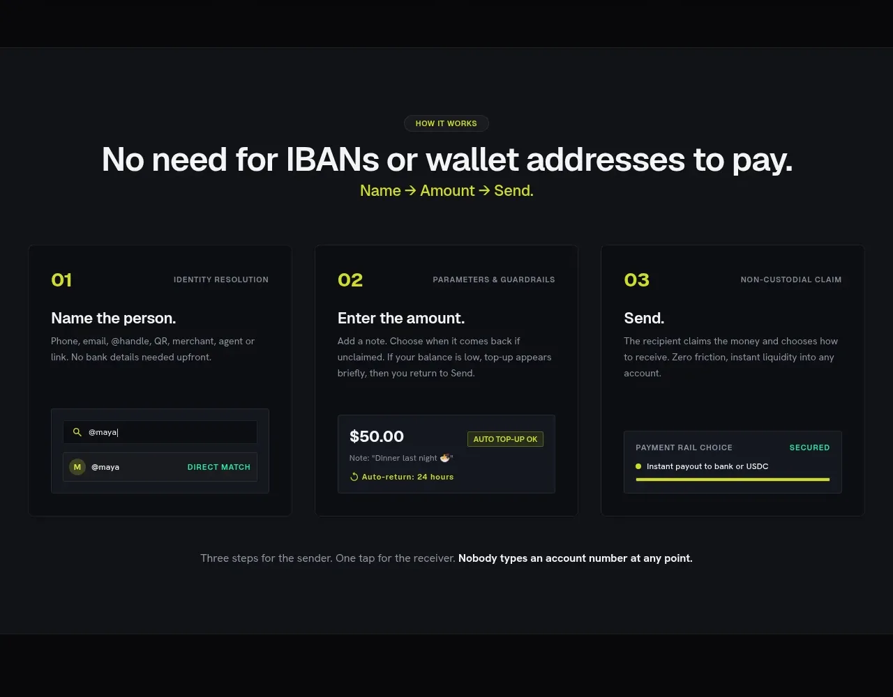 Three-step payment flow
Payflip · Feature grid
Three-step payment flow
Payflip · Feature grid