 kage
kage
tiun.io

Design analysis
A data-management chapter leads with a one-place promise, displays a dense admin dashboard, and finishes with a four-item capability grid.
Prompt preview
## Reference images

Study these alongside the description below: hierarchy, rhythm, spacing, colour. Build for the product you are asked about, using this design language.

- Component: https://kage-design-assets.t3.tigrisfiles.io/components/tiun/82cad29c-5bdb-4fc9-91ef-0bee36475f7f-1789538801-8.webp
- Full page it was cut from: https://kage-design-assets.t3.tigrisfiles.io/screenshots/tiun/82cad29c-5bdb-4fc9-91ef-0bee36475f7f-1789538671428-full.webp
- Component on Kage: https://kage.design/component/tiun-feature-grid-5

## Before you start
Ask what records, events, users, or operational data the user's product centralizes and which dashboard view proves that value. Create original UI content.

Build a data platform section with an eyebrow, a two-line headline, and a feature row containing concise copy plus a large dark admin-dashboard mockup. Beneath it, add four small feature cells in a 2x2 grid with simple line icons and short descriptions. Use a near-black canvas, dashboard surfaces around #111111, thin #202020 borders, and subtle green or violet highlights for status. Keep dashboard typography small but legible, with strong hierarchy between navigation, metrics, and table rows. Use 16px radii for the mockup and 0–1px dividers for the feature cells.

Never: use the reference logo, product name, exact copy, illustrations, or imagery.
More components

 Authentication product capabilities
tiun. · Feature grid
Authentication product capabilities
tiun. · Feature grid
 Billing and checkout capabilities
tiun. · Feature grid
Billing and checkout capabilities
tiun. · Feature grid
 Problem and unified solution narrative
tiun. · Feature grid
Problem and unified solution narrative
tiun. · Feature grid
 Integration and agent workflow
tiun. · Feature grid
Integration and agent workflow
tiun. · Feature grid

 Receiving money channels
Payflip · Feature grid
Receiving money channels
Payflip · Feature grid
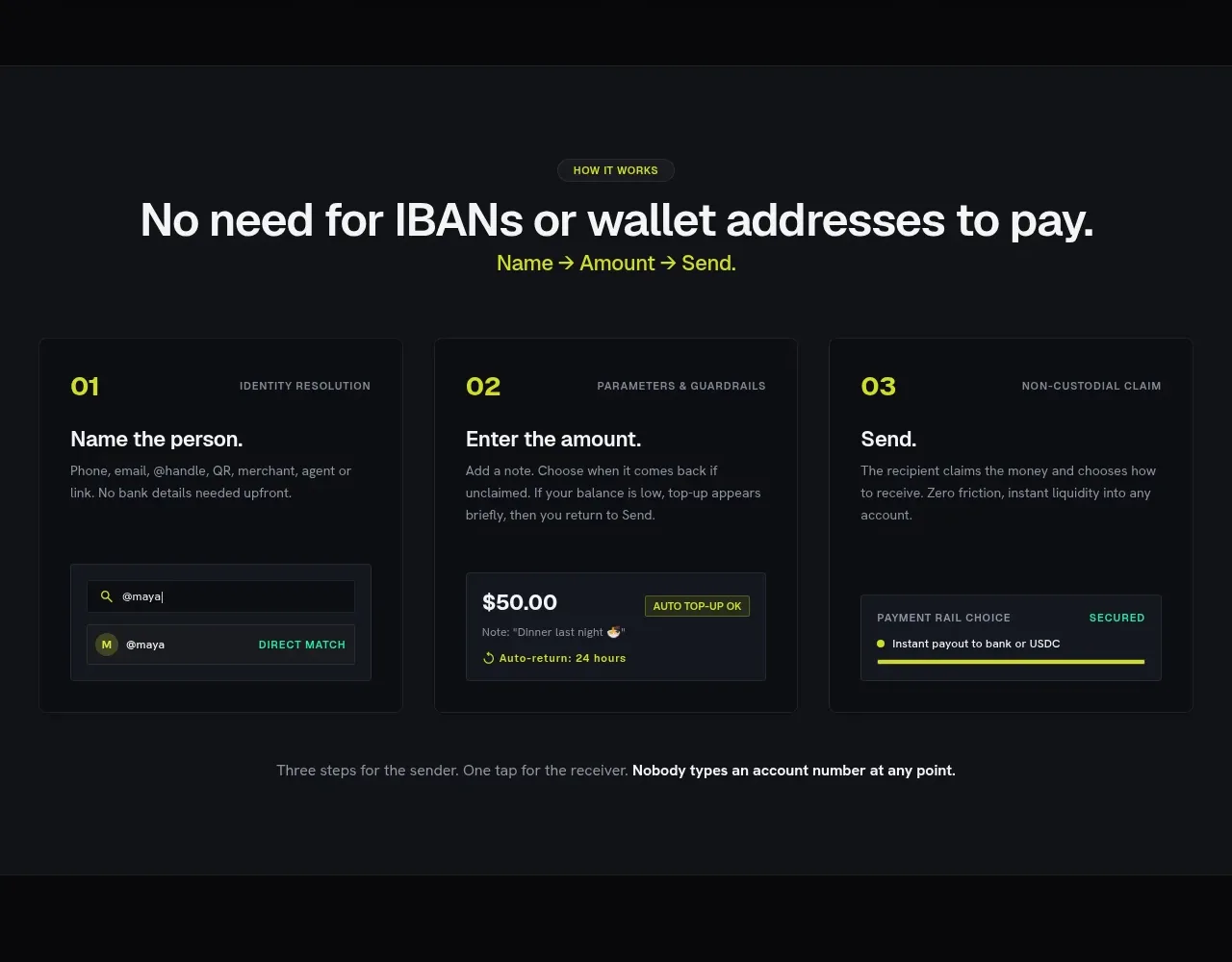 Three-step payment flow
Payflip · Feature grid
Three-step payment flow
Payflip · Feature grid