kage
kage
tiun.io

Design analysis
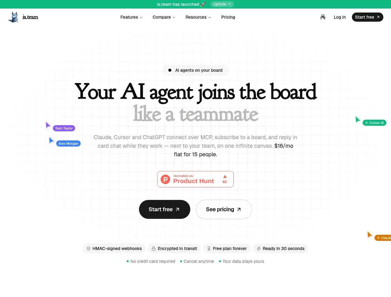
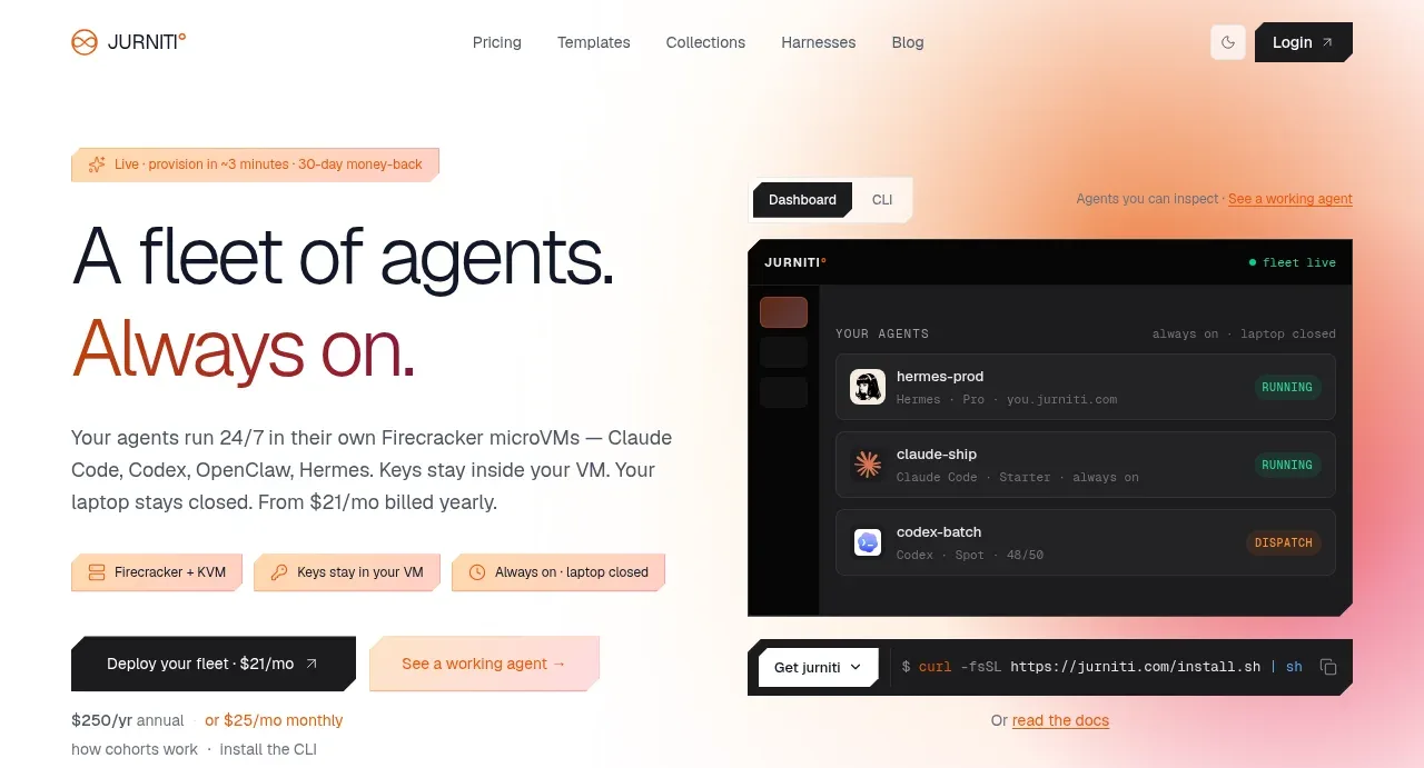
The hero combines a social-proof badge, oversized centered headline, concise supporting copy, and two contrasting actions over an almost-black field with a subtle violet glow.
Prompt preview
## Reference images

Study these alongside the description below: hierarchy, rhythm, spacing, colour. Build for the product you are asked about, using this design language.

- Component: https://kage-design-assets.t3.tigrisfiles.io/components/tiun/82cad29c-5bdb-4fc9-91ef-0bee36475f7f-1789538797-1.webp
- Full page it was cut from: https://kage-design-assets.t3.tigrisfiles.io/screenshots/tiun/82cad29c-5bdb-4fc9-91ef-0bee36475f7f-1789538671428-full.webp
- Component on Kage: https://kage.design/component/tiun-hero

## Before you start
Ask what the user's product does, what outcome it creates, and what its brand colors and primary conversion goal are. Apply the following structure to that product.

Create a centered hero directly below the navigation. Stack a small credibility badge, a large two-line headline, one short explanatory paragraph, and a primary plus secondary CTA. Use a near-black background (#050505), white headline text (#F5F5F5), muted gray supporting text (#8A8A8A), and a restrained violet atmospheric glow (#7C3AED) behind or below the headline. Constrain the text to roughly 900px on desktop, use a fluid headline around 44–68px with tight line-height, and provide 24–40px vertical gaps between hierarchy levels. Make the primary CTA a white pill with dark text and the secondary CTA a dark pill with a subtle border. Keep the mood technical, quiet, and premium; avoid visual clutter.

Never: use the reference logo, product name, exact copy, illustrations, or imagery.