kage
kage
tiun.io
Design analysis
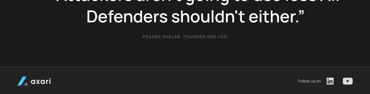
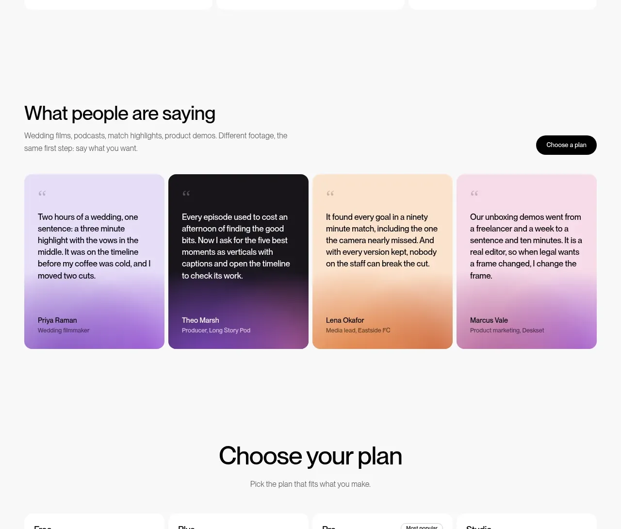
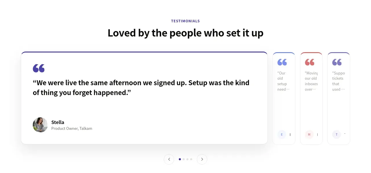
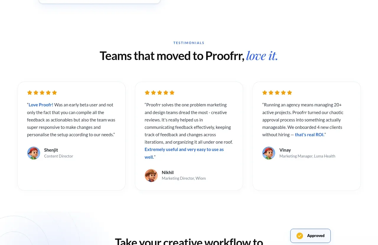
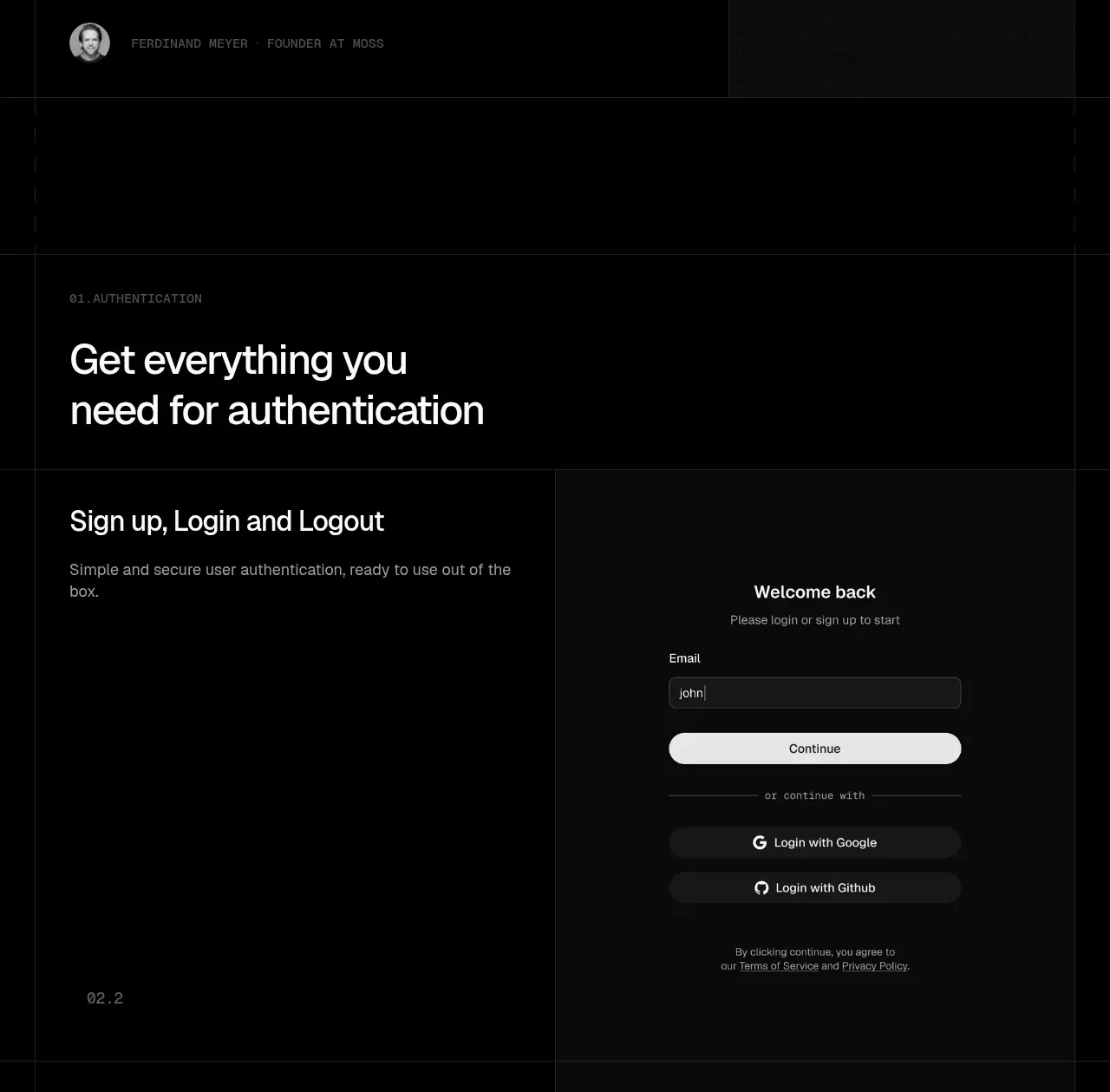
Two offset testimonial cards use large quote text, muted attribution, and dark bordered surfaces to reinforce trust from technical users.
Prompt preview
## Reference images

Study these alongside the description below: hierarchy, rhythm, spacing, colour. Build for the product you are asked about, using this design language.

- Component: https://kage-design-assets.t3.tigrisfiles.io/components/tiun/82cad29c-5bdb-4fc9-91ef-0bee36475f7f-1789538799-5.webp
- Full page it was cut from: https://kage-design-assets.t3.tigrisfiles.io/screenshots/tiun/82cad29c-5bdb-4fc9-91ef-0bee36475f7f-1789538671428-full.webp
- Component on Kage: https://kage.design/component/tiun-testimonials

## Before you start
Ask who the user's most credible customers or users are and what authentic outcomes they can describe. Use only approved, original testimonial content.

Create a testimonial section with two asymmetrical dark cards, one wider quote card and one offset card. Use near-black surfaces (#080808), subtle borders (#1C1C1C), and a restrained gray brand or avatar treatment. Quote text should be 18–24px, white, with comfortable line-height; attribution should be 10–12px uppercase or compact metadata in #777777. Keep cards spacious, with 32–48px padding and 16–24px radius. On smaller screens, stack the cards while preserving the visual difference in width through spacing and alignment.

Never: use the reference logo, product name, exact copy, illustrations, or imagery.