 kage
kage
together.ai
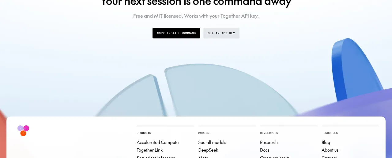
Design analysis
A centered conversion block uses a concise headline, supporting line, and two actions before transitioning into a large decorative footer background.
Prompt preview
## Reference images

Study these alongside the description below: hierarchy, rhythm, spacing, colour. Build for the product you are asked about, using this design language.

- Component: https://kage-design-assets.t3.tigrisfiles.io/components/together-link/c83e90db-1751-48ac-9cb1-70c29bd77b17-1791612070-7.webp
- Full page it was cut from: https://kage-design-assets.t3.tigrisfiles.io/screenshots/together-link/c83e90db-1751-48ac-9cb1-70c29bd77b17-1791612038251-full.webp
- Component on Kage: https://kage.design/component/together-link-cta

## Before you start
Ask what single next action the user's product wants visitors to take and what secondary action should support it, then adapt this CTA.

Create a spacious centered CTA band with a strong one-line headline, a brief muted sentence, and two compact buttons. Use a nearly white background with a very subtle cool tint, generous top and bottom padding, and a clear visual break from the FAQ. Make the primary action near-black `#090909` with white text and the secondary action a pale gray or aqua treatment. Use a 32–40px heading, 14–16px supporting copy, 8px button radius, and 12px button gap. Keep the content centered and make the buttons full-width or stacked on mobile. The CTA should feel decisive without adding extra navigation or competing visual elements.

Never: use logos, product names, copy, illustrations, or imagery from the reference.
More components
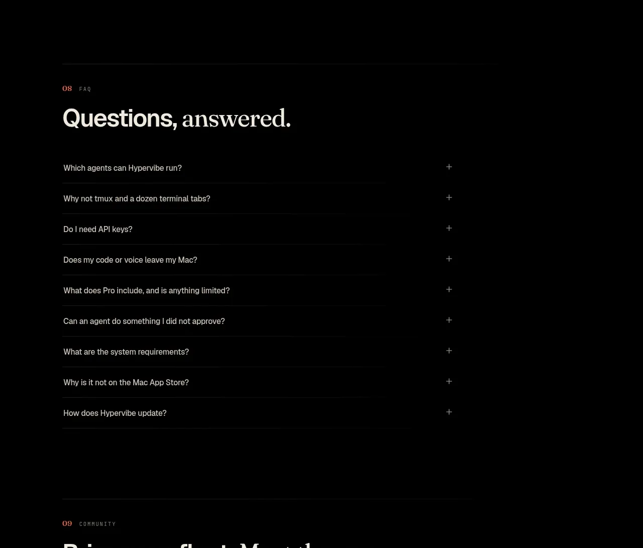
 Community invitation
Hypervibe · Call to action
Community invitation
Hypervibe · Call to action
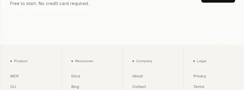
 Trust and final conversion
Lune · Call to action
Trust and final conversion
Lune · Call to action
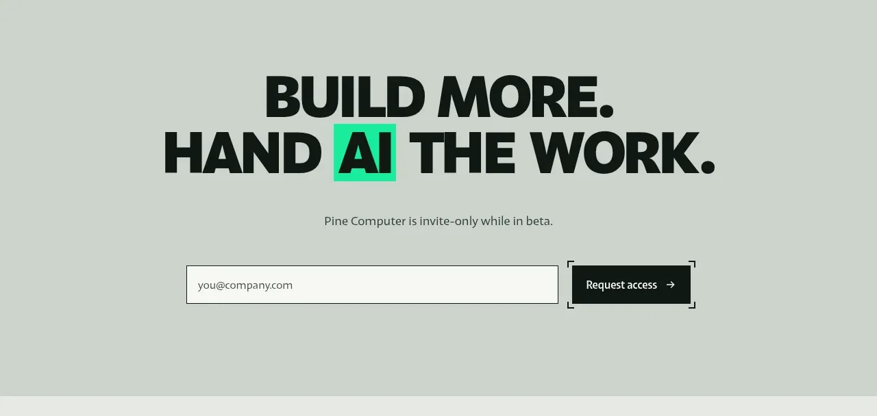
 Request-access conversion block
Pine Computer · Call to action
Request-access conversion block
Pine Computer · Call to action
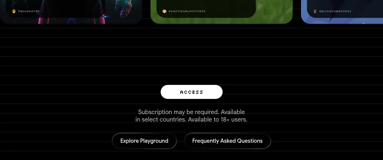
 Access conversion block
Playground by Google Labs · Call to action
Access conversion block
Playground by Google Labs · Call to action
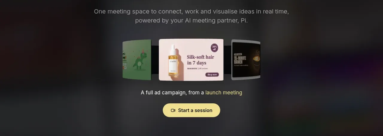
 Closing product call to action
HeyPi · Call to action
Closing product call to action
HeyPi · Call to action
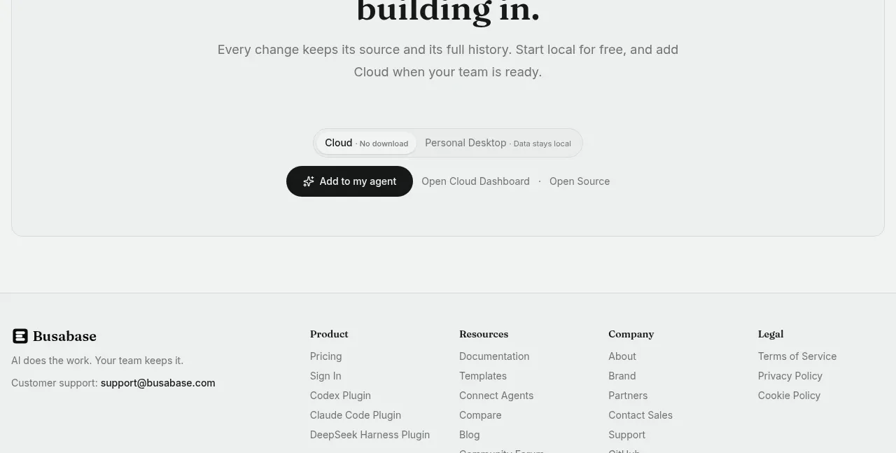
 Final conversion call to action
Busabase · Call to action
Final conversion call to action
Busabase · Call to action