 kage
kage
together.ai

Design analysis
A compact black announcement strip sits above a white navigation bar with product navigation, sales contact, and a dark sign-in action.
Prompt preview
## Reference images

Study these alongside the description below: hierarchy, rhythm, spacing, colour. Build for the product you are asked about, using this design language.

- Component: https://kage-design-assets.t3.tigrisfiles.io/components/together-link/c83e90db-1751-48ac-9cb1-70c29bd77b17-1791612068-0.webp
- Full page it was cut from: https://kage-design-assets.t3.tigrisfiles.io/screenshots/together-link/c83e90db-1751-48ac-9cb1-70c29bd77b17-1791612038251-full.webp
- Component on Kage: https://kage.design/component/together-link-navigation

## Before you start
Ask what the user's product, brand, audience, and navigation destinations are, then apply the following principles to that product rather than reproducing the reference.

Build a responsive header with a very slim dark announcement bar above a clean white navigation row. Keep the content centered in a max-width container, use a small geometric sans-serif type scale, and create strong hierarchy between primary links, a modest contact link, and one high-contrast sign-in/action button. Use near-black `#090909`, white `#ffffff`, and a restrained coral/orange accent around `#f05a3c`; use subtle bottom shadow or border, 8px button radius, and generous horizontal padding. Collapse links into a menu on small screens while preserving the announcement and primary action. Keep hover states understated with color or underline transitions.

Never: use logos, product names, copy, illustrations, or imagery from the reference.
More components

 Minimal top navigation
Agibot · Navigation
Minimal top navigation
Agibot · Navigation

 Top navigation
Hypervibe · Navigation
Top navigation
Hypervibe · Navigation
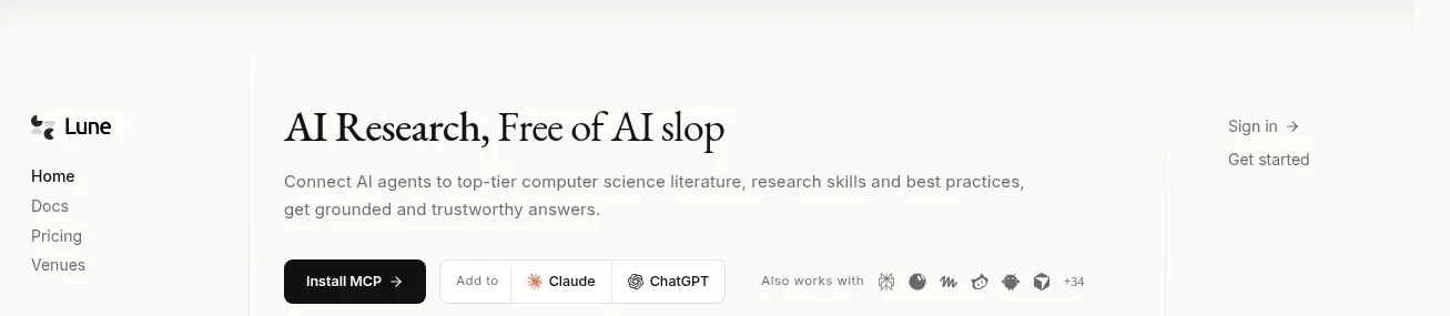
 Editorial research product navigation
Lune · Navigation
Editorial research product navigation
Lune · Navigation

 Minimal product navigation
Pine Computer · Navigation
Minimal product navigation
Pine Computer · Navigation

 Top experiment navigation
Playground by Google Labs · Navigation
Top experiment navigation
Playground by Google Labs · Navigation
 Sticky section navigation
Playground by Google Labs · Navigation
Sticky section navigation
Playground by Google Labs · Navigation