 kage
kage
together.ai

Design analysis
This section works by pairing a clear category switcher with a focused two-column detail panel: a short list of capabilities on the left and a strong product visual on the right. The pale blue canvas, generous spacing, soft borders, and single bright active state make a complex platform feel easy to scan.
Prompt preview
## Reference images

Study these alongside the description below: hierarchy, rhythm, spacing, colour. Build for the product you are asked about, using this design language.

- Component: https://kage-design-assets.t3.tigrisfiles.io/components/together-ai/60591018-8706-471e-a3f2-ad3109f52987-1789073939-4.webp
- Full page it was cut from: https://kage-design-assets.t3.tigrisfiles.io/screenshots/together-ai/60591018-8706-471e-a3f2-ad3109f52987-1789073908-full.webp
- Component on Kage: https://kage.design/component/together-tabs

# Before you start
Ask what the user's product does, who it is for, and what visual brand system it already uses. Then apply the principles below to create an original version for that product rather than reproducing this reference.

## Build a category-led product showcase
Create a responsive section that explains several related product capabilities through top-level tabs. The section should feel like a calm, premium SaaS platform overview: structured, spacious, lightly technical, and easy to scan.

### Layout and alignment
- Use a full-width section with a very pale cool-blue background, approximately `#EAF7FF`, and generous vertical padding of around 72–112px on desktop.
- Constrain the content to a centered max-width of roughly 1160–1240px.
- Place a centered heading and supporting sentence above the tabs. Keep the heading compact and confident; make the supporting line narrower and visually quieter.
- Add a three-item horizontal tab bar below the introduction. Each tab should have equal width, a white or near-white surface, and consistent height around 64px. Align labels centrally.
- Mark the active tab with a soft cyan fill around `#BDEFF3` and a narrow cyan accent strip at its left edge, approximately `#58D8DE`. Keep inactive tabs white with subtle separation rather than heavy outlines.
- Under the tabs, use a large rounded content card with a white or very pale surface, approximately `#FFFFFF`, and a radius around 8–12px.
- Inside the card, use a two-column layout: approximately 48% text/list content on the left and 52% visual content on the right, with a generous internal gap.
- On mobile, stack the columns. Make tabs horizontally scrollable or convert them into a compact segmented control, ensuring the active option remains obvious.

### Typography hierarchy
- Use a modern geometric or humanist sans-serif with rounded forms. If the product has an existing font, use it consistently.
- Section heading: bold, approximately 36–42px desktop, with tight line-height around 1.05.
- Supporting text: 16px, medium gray such as `#8D9299`, with comfortable line-height.
- Active feature title: 20–22px, semibold or bold, near-black `#101014`.
- Feature description: 16px, regular, dark gray around `#565A60`, with a readable line-height around 1.45.
- Secondary feature rows: 18–20px, medium weight, muted dark gray. Tab labels should be 22–26px and visually prominent without overpowering the main heading.

### Feature list behavior
- Let the left column show one expanded feature and several collapsed rows beneath it.
- Give the expanded feature a small rounded icon tile, a title, descriptive copy, and a compact black call-to-action button.
- Separate collapsed rows with thin horizontal rules around `#E7E7E7`; use consistent vertical padding of about 18–22px.
- Each collapsed row should include a small neutral icon tile and a label. Use simple line icons that represent the concept, but create icons appropriate to the user's product.
- On interaction, clicking a row should expand it, update the active state, and replace the supporting visual. Use a short ease-out transition; avoid dramatic animation.
- The call-to-action should be compact, black or brand-dark, with white uppercase or concise label text, approximately 92px wide by 36px high, and a 3–5px radius.

### Visual panel
- Reserve the right column for a product UI preview, dashboard crop, diagram, or other relevant artifact from the user's product.
- Place the visual inside a rounded frame with a soft cyan/aqua background or gradient, using approximate colors `#A7DDE1`, `#C7F4F2`, and a restrained pink accent such as `#E88DB9` only if it suits the brand.
- The preview should feel layered: a large surface in the back and, if appropriate, a smaller dark code or data panel overlapping it. Keep the composition clipped within the rounded frame.
- Use a subtle shadow and soft corners; do not make the visual dominate the explanatory content.
- On smaller screens, maintain a useful aspect ratio around 4:3 and place the visual below the feature list.

### Surface, borders, and spacing
- Prefer white surfaces against the pale blue section background.
- Use 1px borders in `#EEF0F1` or very subtle shadows rather than high-contrast outlines.
- Use radii between 6px and 12px; keep the tab bar and content card visually related.
- Establish a consistent spacing scale based on 8px: 8, 16, 24, 32, 48, and 64px.
- Keep the content card comfortably padded, around 32–36px desktop, and reduce to 20–24px on mobile.
- Maintain generous whitespace above the heading and between the introduction, tabs, and card.

### Accessibility and responsive details
- Implement tabs with semantic tab roles and keyboard navigation where appropriate.
- Provide visible focus states that meet contrast requirements.
- Ensure inactive and active states are distinguishable without relying on color alone.
- Respect reduced-motion preferences.
- Make all labels, buttons, and interactive rows large enough to use comfortably on touch devices.

## Never
- Never copy the reference's logos, product names, brand wording, feature names, screenshots, code, or exact marketing copy.
- Never reuse the reference's illustrations or imagery; create product-appropriate visuals or neutral placeholders instead.
- Never reproduce the exact layout dimensions, tab labels, icon set, or color treatment if they do not fit the user's brand.
- Never make the visual panel decorative at the expense of explaining the product capability.
- Never use inaccessible low-contrast text, ambiguous tab states, or interactions that only work with a mouse.
More components

 Directory filters and sorting
The Brains · Tabs & steps
Directory filters and sorting
The Brains · Tabs & steps

 Enterprise use cases
bestproxy.com · Tabs & steps
Enterprise use cases
bestproxy.com · Tabs & steps
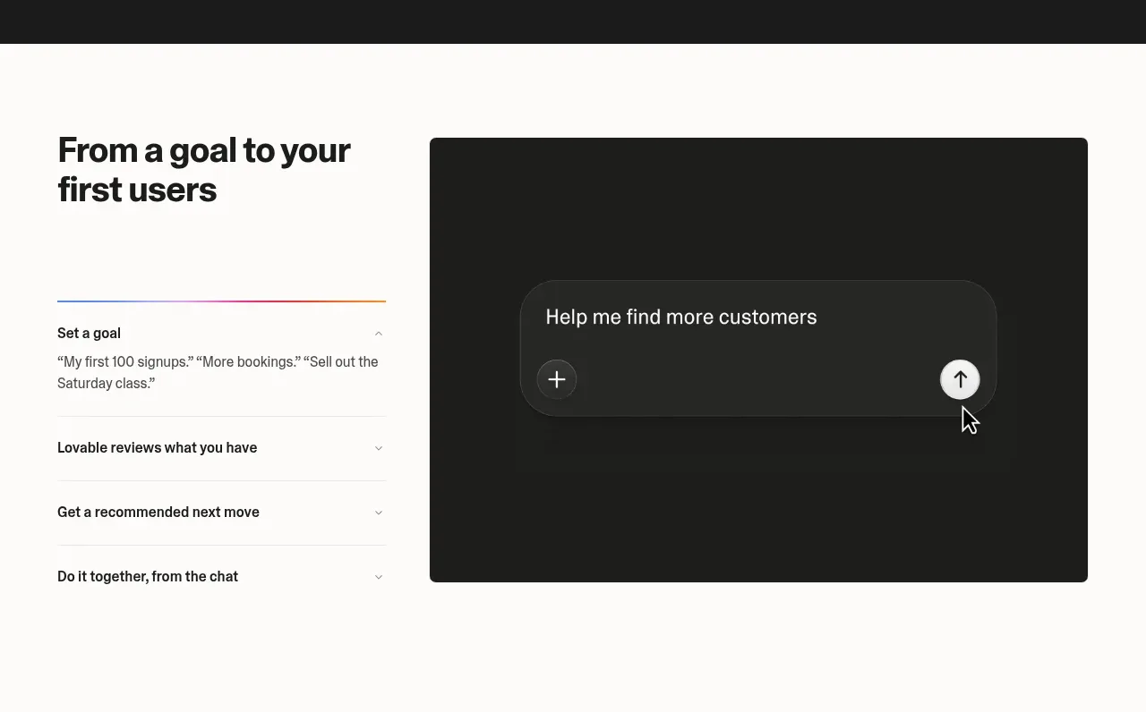
 Goal-to-first-users assistant
Lovable Growth Tools · Tabs & steps
Goal-to-first-users assistant
Lovable Growth Tools · Tabs & steps
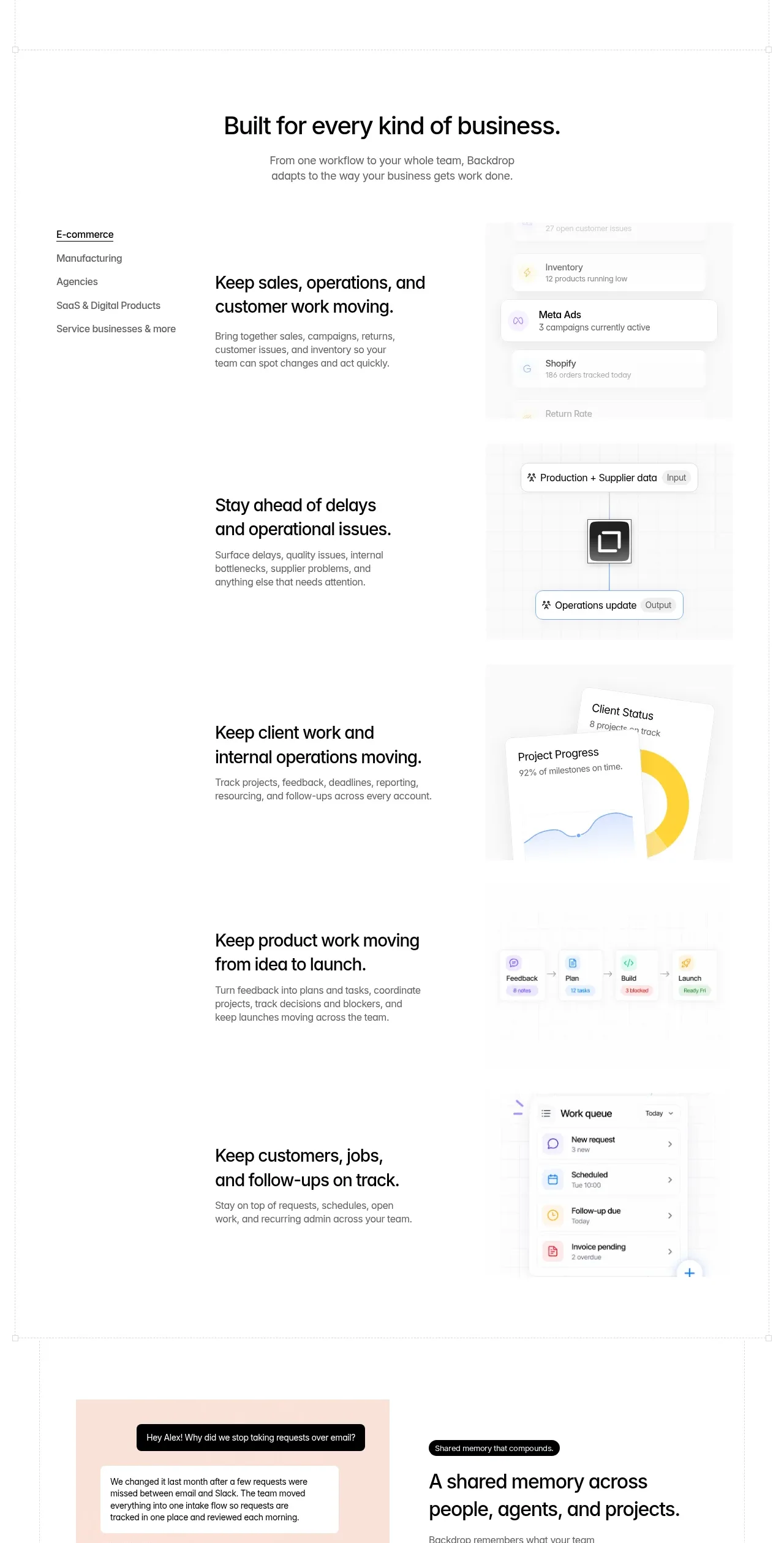
 Business use cases tabs
Backdrop · Tabs & steps
Business use cases tabs
Backdrop · Tabs & steps
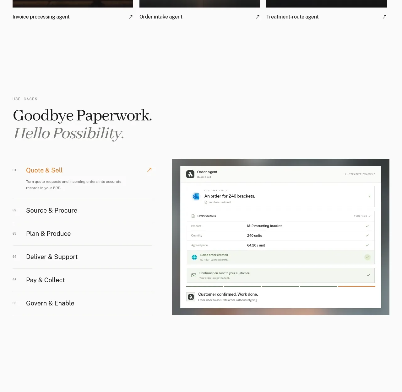
 Workflow stages with product preview
Lleverage · Tabs & steps
Workflow stages with product preview
Lleverage · Tabs & steps
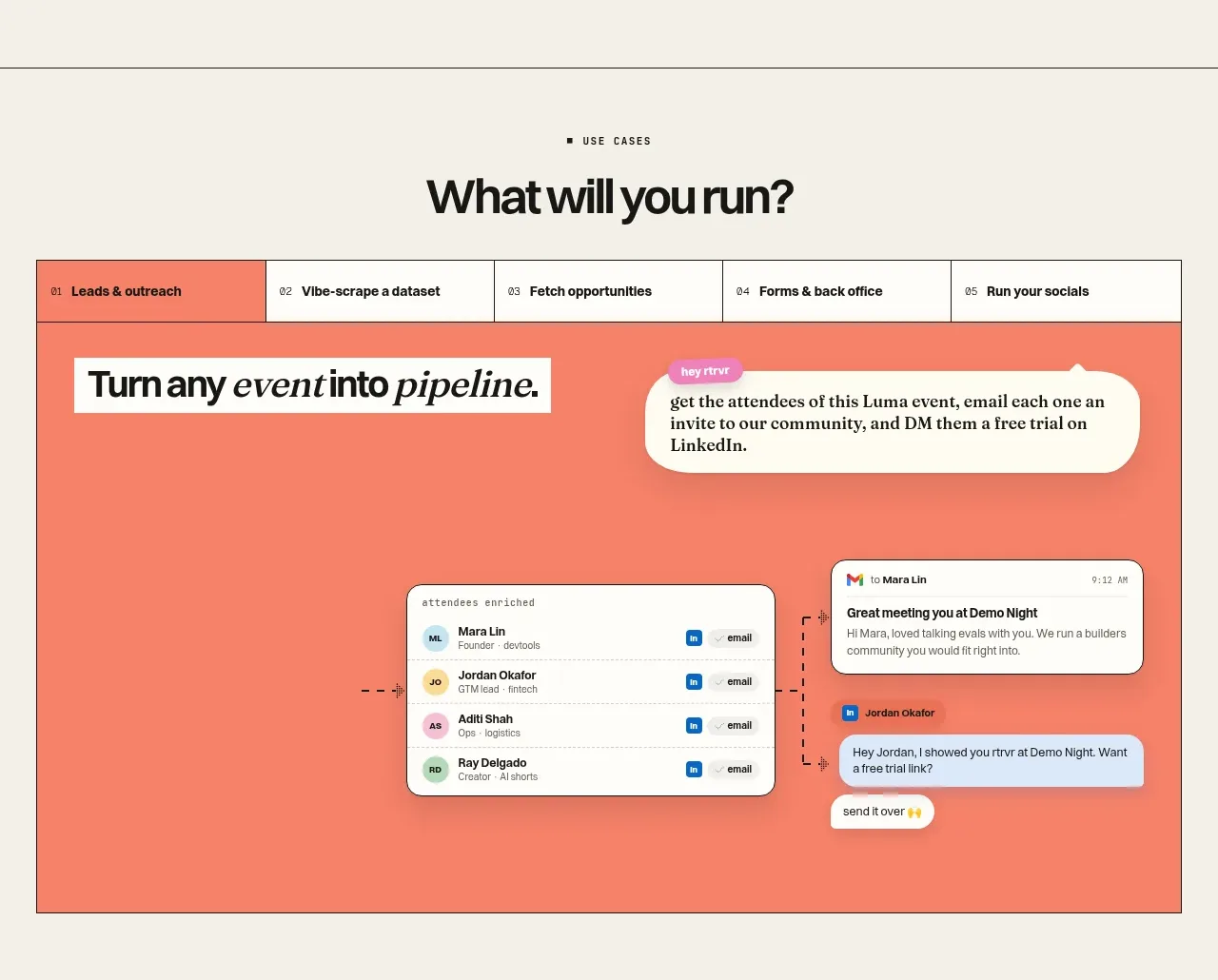
 Use-case selector and interactive showcase
Retriever AI · Tabs & steps
Use-case selector and interactive showcase
Retriever AI · Tabs & steps