 kage
kage
tonebird.ai
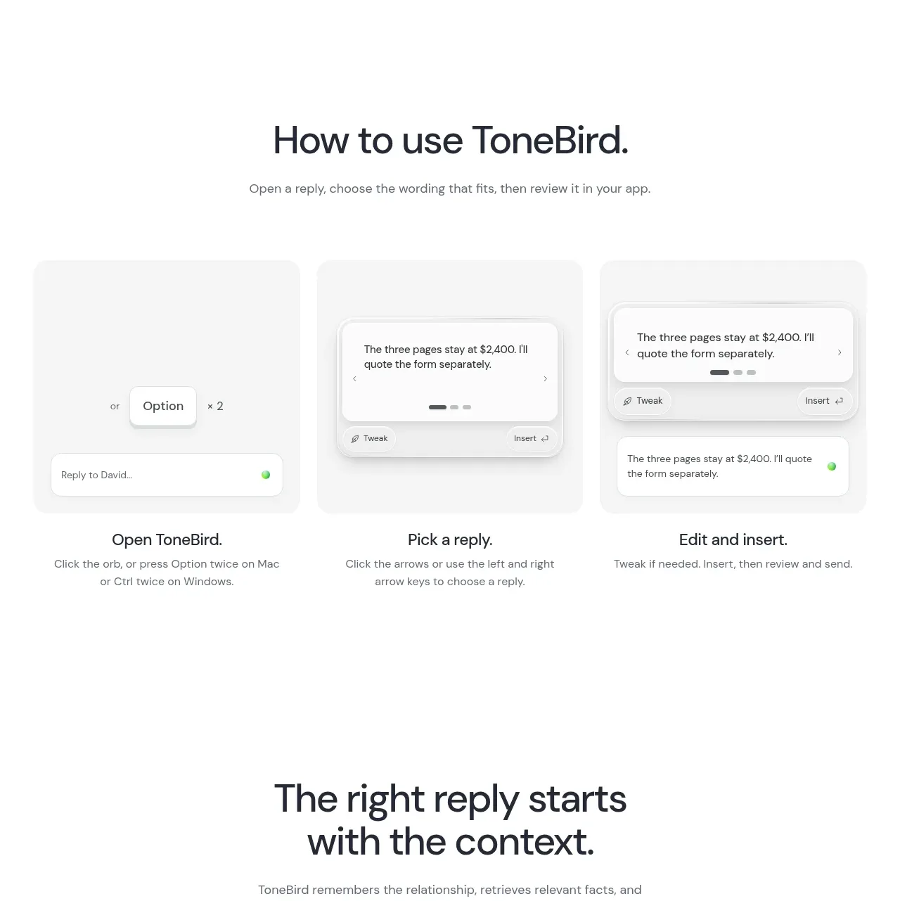
Design analysis
Three equal cards explain the basic interaction in sequence, pairing compact UI demonstrations with short instructional captions.
Prompt preview
## Reference images

Study these alongside the description below: hierarchy, rhythm, spacing, colour. Build for the product you are asked about, using this design language.

- Component: https://kage-design-assets.t3.tigrisfiles.io/components/tonebird/16d0d272-e4c0-4394-9450-270e8dcbe6b2-1790229838-3.webp
- Full page it was cut from: https://kage-design-assets.t3.tigrisfiles.io/screenshots/tonebird/16d0d272-e4c0-4394-9450-270e8dcbe6b2-1790229760726-full.webp
- Component on Kage: https://kage.design/component/tonebird-feature-grid

## Before you start
Ask what the user's core workflow is and what three actions best explain it. Build an original educational sequence.

Create a centered section with a clear heading, one-line supporting copy, and a three-column card grid. Each card should have a pale neutral preview area above a concise step title and one or two lines of guidance. Use equal card widths, consistent 16–20px gaps, and a strong baseline alignment. Keep the heading around 30–38px, card titles 15–17px, and explanatory text 12–14px in #707778. Use #f7f8f7 preview surfaces, 12–16px radii, subtle #edf0ef borders, and very light shadows. Make the cards responsive by stacking them on narrow screens. If the previews are interactive, add obvious focus states without making the instructional copy compete with them.

Never: copy logos, product names, copy, illustrations, or imagery from the reference.
More components

 Spend visibility and daily-cost breakdown
Subscrr · Feature grid
Spend visibility and daily-cost breakdown
Subscrr · Feature grid
 Reminders and simple setup flow
Subscrr · Feature grid
Reminders and simple setup flow
Subscrr · Feature grid

 Security and permissions cards
NotchPop · Feature grid
Security and permissions cards
NotchPop · Feature grid
 Focused feature cards
NotchPop · Feature grid
Focused feature cards
NotchPop · Feature grid
 Interactive product demonstration
NotchPop · Feature grid
Interactive product demonstration
NotchPop · Feature grid
 Quiet information cards
NotchPop · Feature grid
Quiet information cards
NotchPop · Feature grid