 kage
kage
tonebird.ai
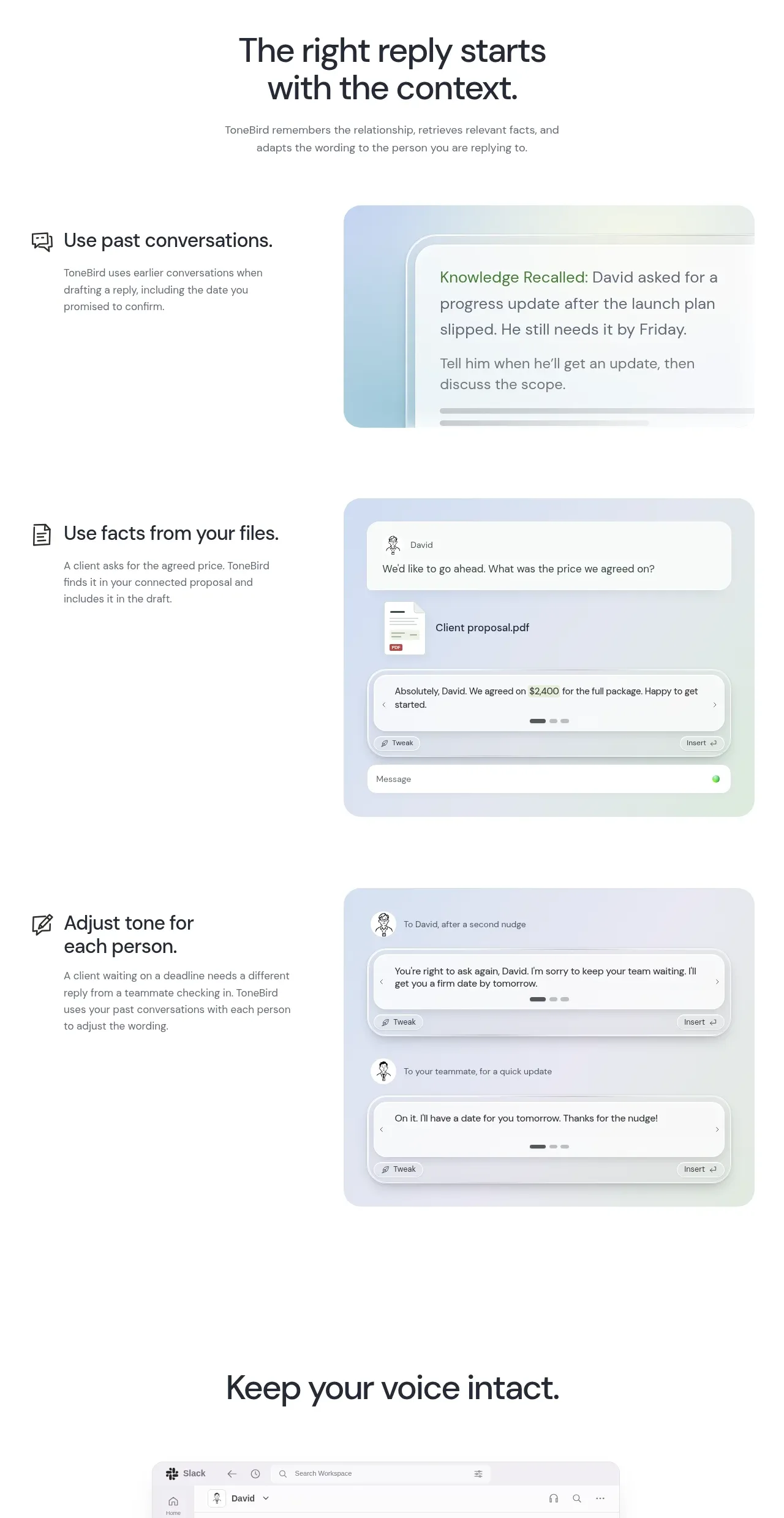
Design analysis
A long feature section alternates concise explanatory text with large UI demonstrations, showing memory, file facts, and tone adjustment as separate capabilities.
Prompt preview
## Reference images

Study these alongside the description below: hierarchy, rhythm, spacing, colour. Build for the product you are asked about, using this design language.

- Component: https://kage-design-assets.t3.tigrisfiles.io/components/tonebird/16d0d272-e4c0-4394-9450-270e8dcbe6b2-1790229838-4.webp
- Full page it was cut from: https://kage-design-assets.t3.tigrisfiles.io/screenshots/tonebird/16d0d272-e4c0-4394-9450-270e8dcbe6b2-1790229760726-full.webp
- Component on Kage: https://kage.design/component/tonebird-feature-grid-2

## Before you start
Ask which capabilities require explanation, what evidence users need to trust them, and what visual artifacts can demonstrate each one. Use that information to create original feature rows.

Build a vertically stacked feature showcase introduced by a centered heading and short paragraph. Each row should use a two-column layout: a compact text block with a small icon, title, and supporting copy on one side, and a large rounded product visualization on the other. Alternate or vary alignment to create rhythm while preserving a common grid. Use generous 80–130px row spacing, 44–50px section heading type, 20–24px feature titles, and 13–15px body copy. Keep text #202329, body text #737b7b, and visualization backgrounds in pale blue/green/lilac washes such as #eaf4f5, #edf0fa, or #edf6ef. Give visual panels 18–24px radii, thin translucent borders, and soft layered shadows. The UI should communicate the capability through believable states, not decorative clutter.

Never: copy logos, product names, copy, illustrations, or imagery from the reference.
More components

 Spend visibility and daily-cost breakdown
Subscrr · Feature grid
Spend visibility and daily-cost breakdown
Subscrr · Feature grid
 Reminders and simple setup flow
Subscrr · Feature grid
Reminders and simple setup flow
Subscrr · Feature grid

 Security and permissions cards
NotchPop · Feature grid
Security and permissions cards
NotchPop · Feature grid
 Focused feature cards
NotchPop · Feature grid
Focused feature cards
NotchPop · Feature grid
 Interactive product demonstration
NotchPop · Feature grid
Interactive product demonstration
NotchPop · Feature grid
 Quiet information cards
NotchPop · Feature grid
Quiet information cards
NotchPop · Feature grid