 kage
kage
tonebird.ai
Design analysis
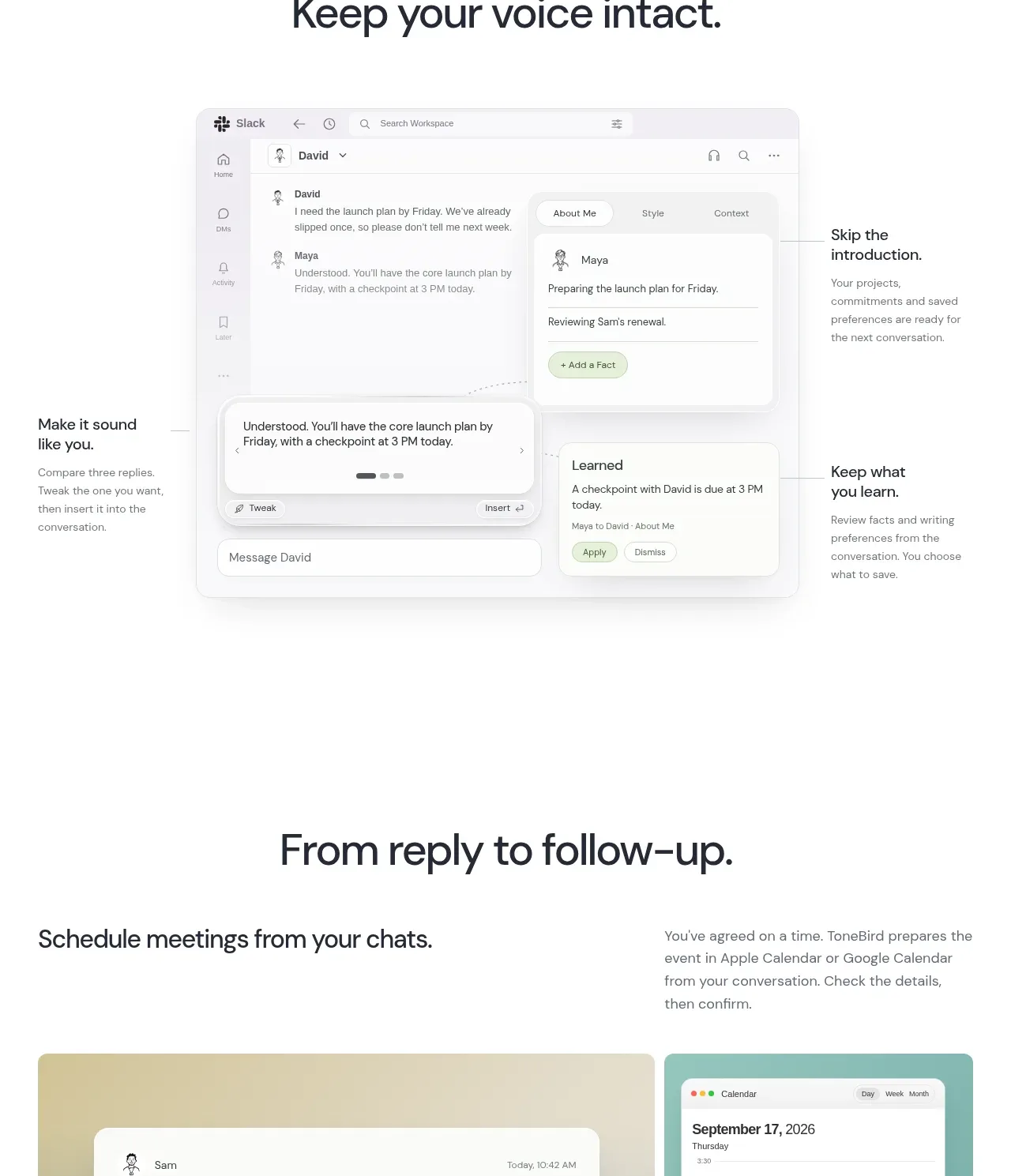
A focused section demonstrates preserving the user's voice through one central editor composition surrounded by small explanatory callouts.
Prompt preview
## Reference images

Study these alongside the description below: hierarchy, rhythm, spacing, colour. Build for the product you are asked about, using this design language.

- Component: https://kage-design-assets.t3.tigrisfiles.io/components/tonebird/16d0d272-e4c0-4394-9450-270e8dcbe6b2-1790229839-5.webp
- Full page it was cut from: https://kage-design-assets.t3.tigrisfiles.io/screenshots/tonebird/16d0d272-e4c0-4394-9450-270e8dcbe6b2-1790229760726-full.webp
- Component on Kage: https://kage.design/component/tonebird-feature-grid-3

## Before you start
Ask what makes the user's product feel personal and what settings or context users control. Turn that into an original central demonstration.

Use a centered heading and a large, carefully framed product composition below it. Place the main UI mockup in the middle and add two or more small callout blocks around it that explain control, context, or personalization. Keep the composition airy, with callouts aligned to a shared grid rather than floating randomly. Use a 34–44px heading, 13–15px callout copy, white UI surfaces, pale #f2f6f4 or #eef3fa backgrounds, 16–20px radii, and soft shadows. Callouts may include tiny icons or connector lines, but keep them secondary. On mobile, convert the composition into a vertical sequence and remove connector lines if they reduce clarity.

Never: copy logos, product names, copy, illustrations, or imagery from the reference.
More components

 Spend visibility and daily-cost breakdown
Subscrr · Feature grid
Spend visibility and daily-cost breakdown
Subscrr · Feature grid
 Reminders and simple setup flow
Subscrr · Feature grid
Reminders and simple setup flow
Subscrr · Feature grid

 Security and permissions cards
NotchPop · Feature grid
Security and permissions cards
NotchPop · Feature grid
 Focused feature cards
NotchPop · Feature grid
Focused feature cards
NotchPop · Feature grid
 Interactive product demonstration
NotchPop · Feature grid
Interactive product demonstration
NotchPop · Feature grid
 Quiet information cards
NotchPop · Feature grid
Quiet information cards
NotchPop · Feature grid