 kage
kage
tonebird.ai
Design analysis
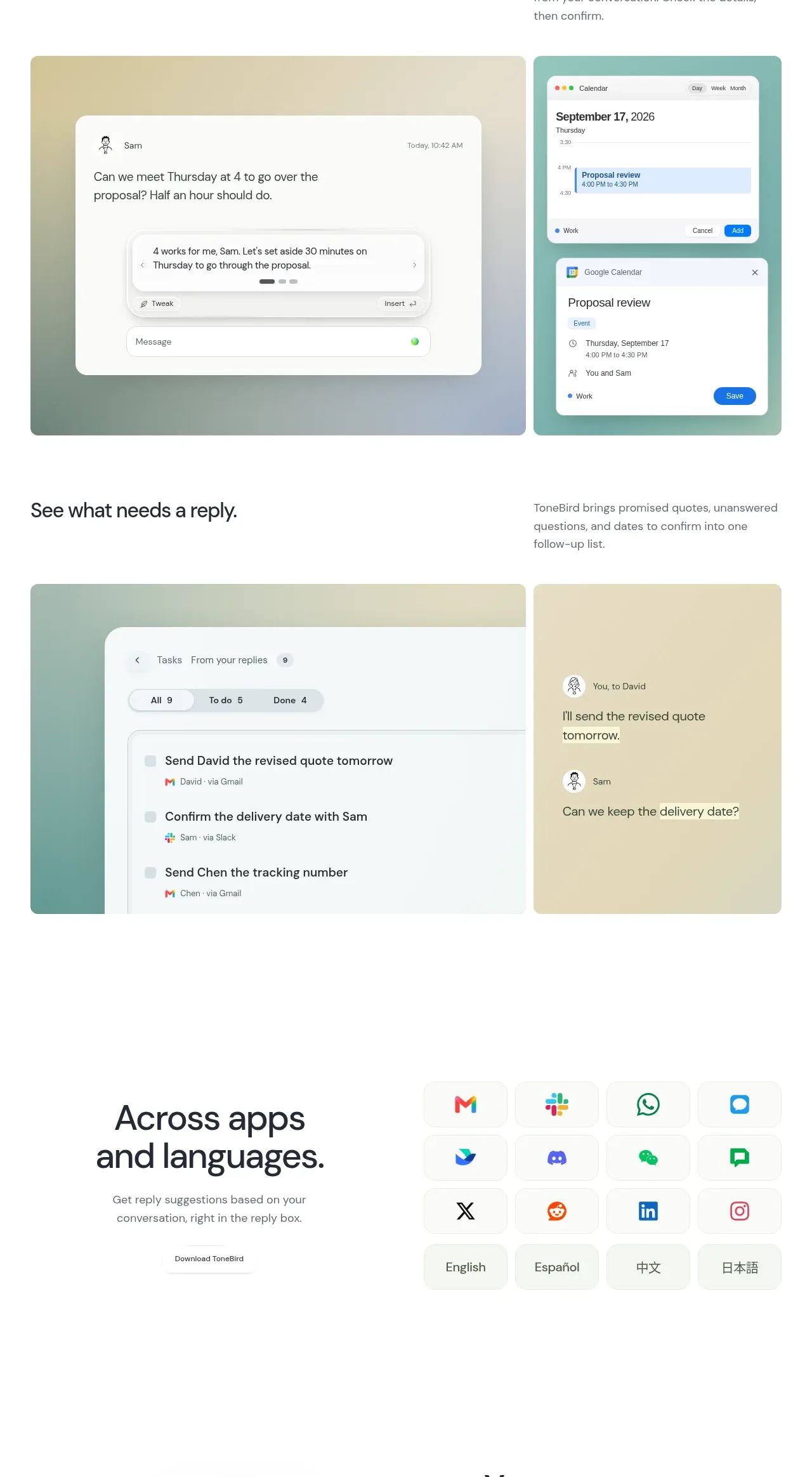
Two large visual stories show how a conversation becomes a scheduled meeting and then a follow-up task, using paired panels and concise explanatory text.
Prompt preview
## Reference images

Study these alongside the description below: hierarchy, rhythm, spacing, colour. Build for the product you are asked about, using this design language.

- Component: https://kage-design-assets.t3.tigrisfiles.io/components/tonebird/16d0d272-e4c0-4394-9450-270e8dcbe6b2-1790229839-6.webp
- Full page it was cut from: https://kage-design-assets.t3.tigrisfiles.io/screenshots/tonebird/16d0d272-e4c0-4394-9450-270e8dcbe6b2-1790229760726-full.webp
- Component on Kage: https://kage.design/component/tonebird-feature-grid-4

## Before you start
Ask what downstream actions your product can initiate and what evidence users need before trusting automation. Build an original two-part workflow section.

Create a section with a centered title followed by two vertically stacked feature stories. Each story should begin with a short text explanation and then show a wide, rounded visual panel containing the relevant conversation and destination workflow. Use paired sub-panels when two apps or states must be compared, with a clear visual relationship between them. Keep 32–40px section titles, 18–22px subheadings, and 13–15px explanatory text. Use warm, muted gradients such as #f0e3b4 and #d8eee7 sparingly behind crisp white UI cards; use 16–20px radii and low-contrast borders. Make the sequence scannable and show confirmation or user control wherever automation occurs.

Never: copy logos, product names, copy, illustrations, or imagery from the reference.
More components

 Spend visibility and daily-cost breakdown
Subscrr · Feature grid
Spend visibility and daily-cost breakdown
Subscrr · Feature grid
 Reminders and simple setup flow
Subscrr · Feature grid
Reminders and simple setup flow
Subscrr · Feature grid

 Security and permissions cards
NotchPop · Feature grid
Security and permissions cards
NotchPop · Feature grid
 Focused feature cards
NotchPop · Feature grid
Focused feature cards
NotchPop · Feature grid
 Interactive product demonstration
NotchPop · Feature grid
Interactive product demonstration
NotchPop · Feature grid
 Quiet information cards
NotchPop · Feature grid
Quiet information cards
NotchPop · Feature grid