 kage
kage
tonebird.ai
Design analysis
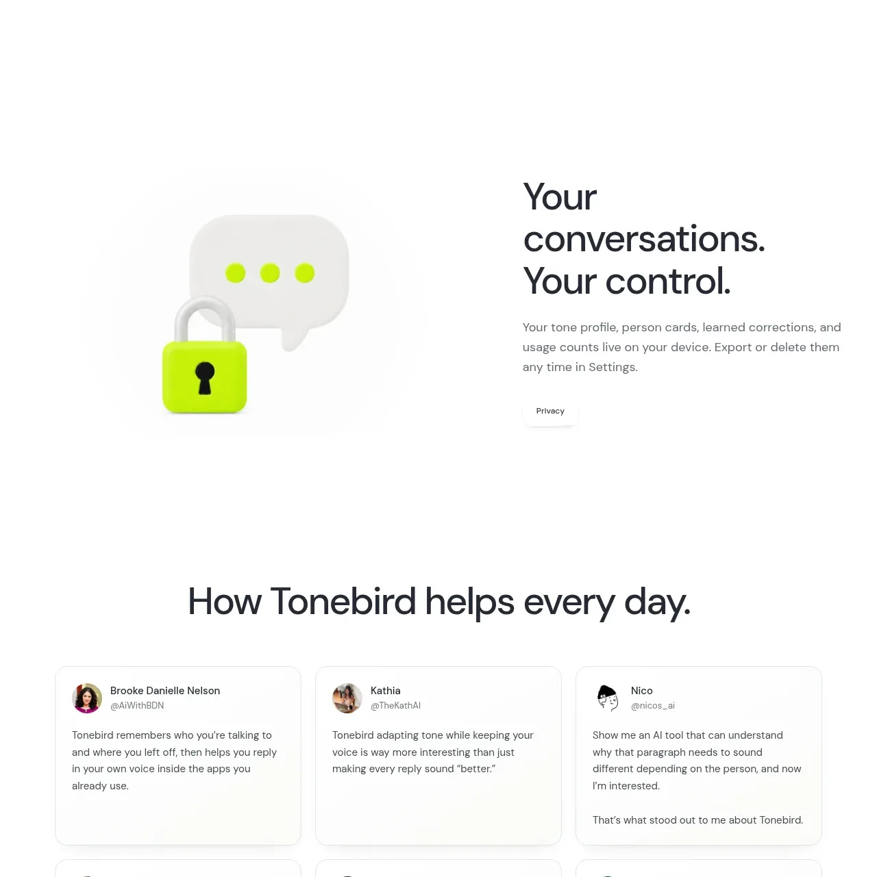
A split layout pairs a concise integration message with a tidy matrix of app icons and language pills, making breadth feel concrete without a dense logo wall.
Prompt preview
## Reference images

Study these alongside the description below: hierarchy, rhythm, spacing, colour. Build for the product you are asked about, using this design language.

- Component: https://kage-design-assets.t3.tigrisfiles.io/components/tonebird/16d0d272-e4c0-4394-9450-270e8dcbe6b2-1790229839-7.webp
- Full page it was cut from: https://kage-design-assets.t3.tigrisfiles.io/screenshots/tonebird/16d0d272-e4c0-4394-9450-270e8dcbe6b2-1790229760726-full.webp
- Component on Kage: https://kage.design/component/tonebird-feature-grid-5

## Before you start
Ask which integrations and languages matter for the user's audience and which should be emphasized. Use only the relevant categories in an original layout.

Build a two-column section with a strong left-aligned heading and short copy, and a right-side matrix of compact integration tiles. Below or beside the matrix, add pill-shaped language or mode selectors. Use a restrained 30–40px heading, 13–15px body copy, and generous whitespace. Tiles should be white or #fafcfb with 1px #edf0ef borders, 12–16px radii, subtle shadows, and consistent 52–68px sizing. Use recognizable icon colors only when the user has permission to show them; otherwise use abstract app glyphs. Add hover/focus elevation and make the matrix scroll or wrap gracefully on mobile.

Never: copy logos, product names, copy, illustrations, or imagery from the reference.
More components

 Spend visibility and daily-cost breakdown
Subscrr · Feature grid
Spend visibility and daily-cost breakdown
Subscrr · Feature grid
 Reminders and simple setup flow
Subscrr · Feature grid
Reminders and simple setup flow
Subscrr · Feature grid

 Security and permissions cards
NotchPop · Feature grid
Security and permissions cards
NotchPop · Feature grid
 Focused feature cards
NotchPop · Feature grid
Focused feature cards
NotchPop · Feature grid
 Interactive product demonstration
NotchPop · Feature grid
Interactive product demonstration
NotchPop · Feature grid
 Quiet information cards
NotchPop · Feature grid
Quiet information cards
NotchPop · Feature grid