kage
kage
tonebird.ai
Design analysis
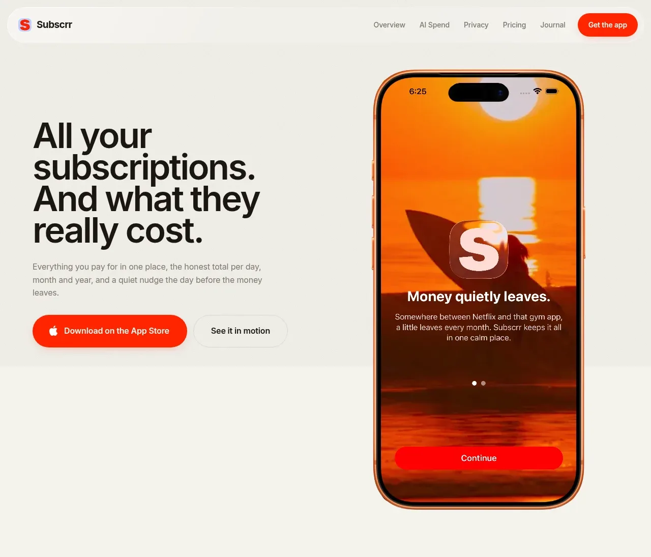
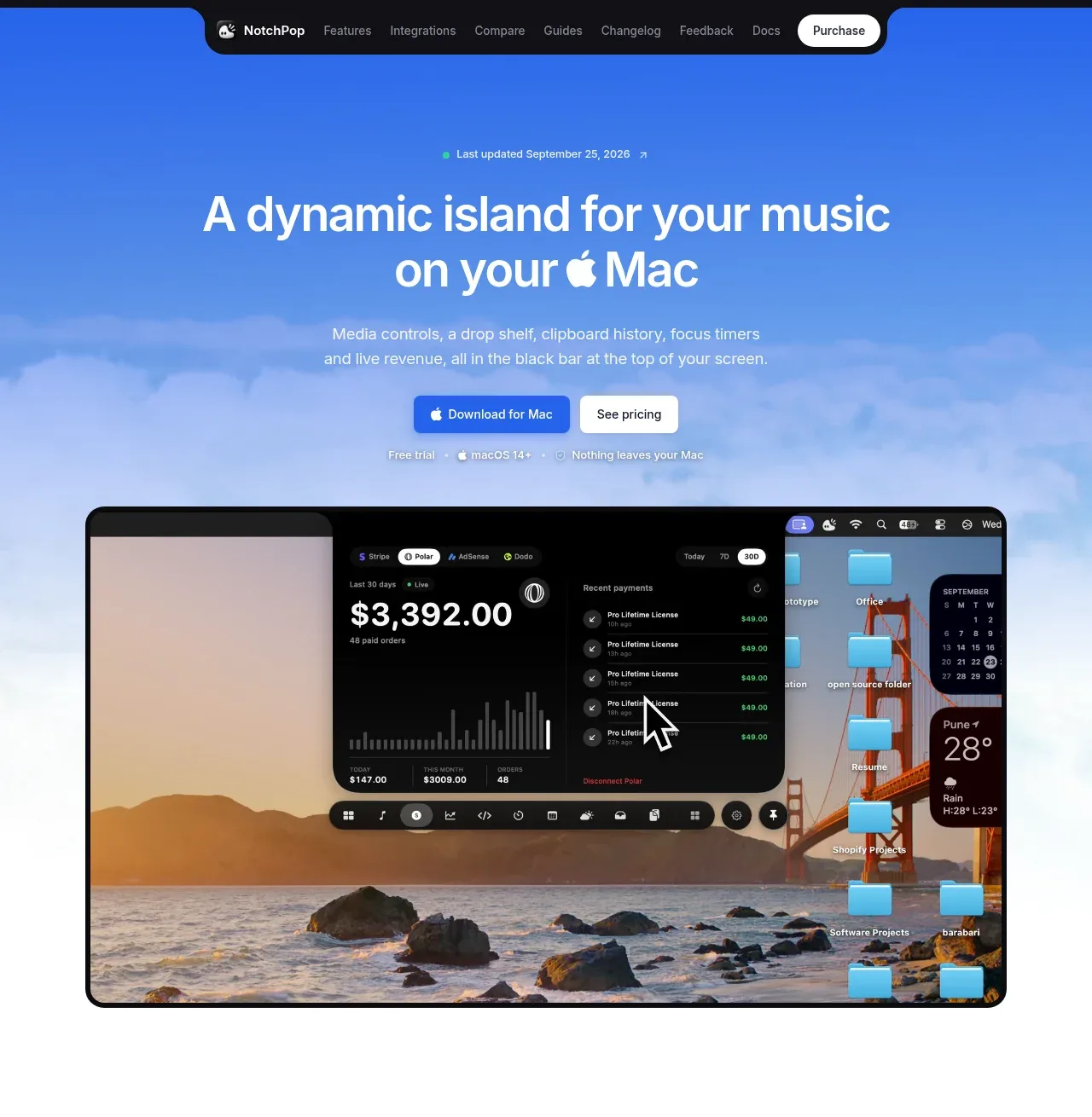
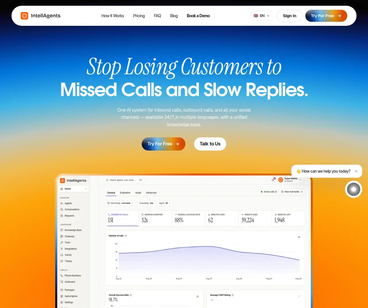
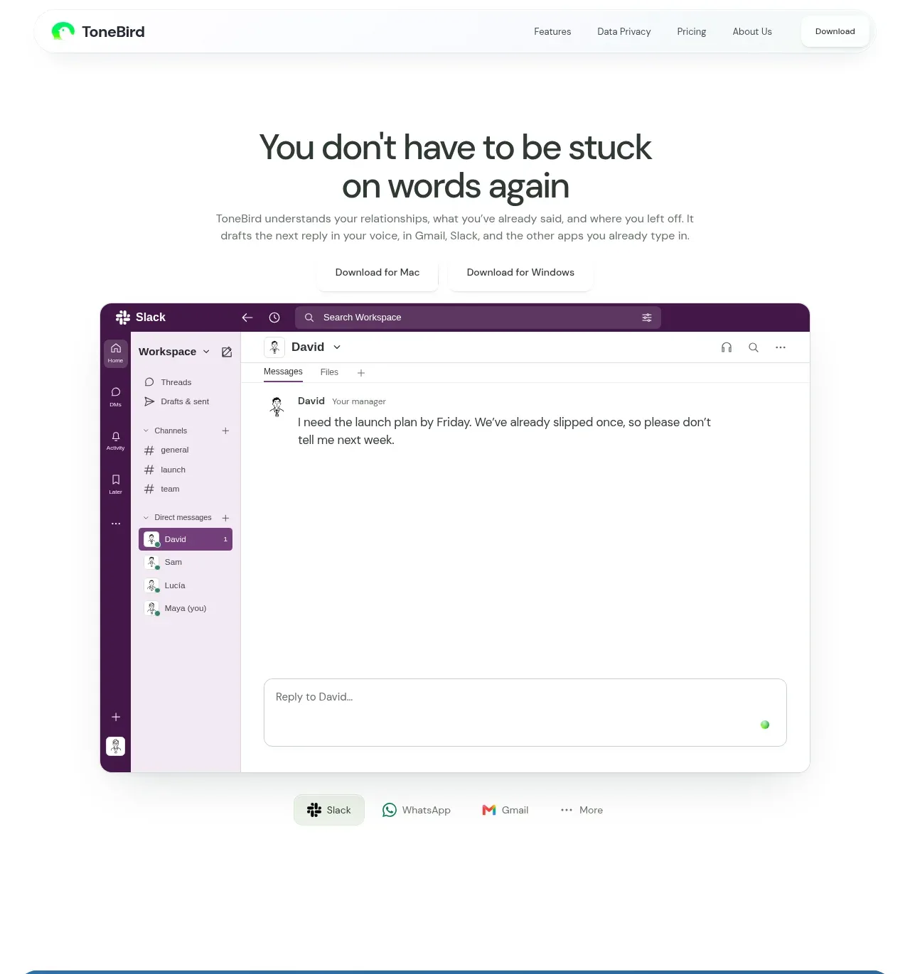
The hero leads with a centered, plainspoken promise, supporting explanation, download links, and a large floating application preview that makes the product immediately concrete.
Prompt preview
## Reference images

Study these alongside the description below: hierarchy, rhythm, spacing, colour. Build for the product you are asked about, using this design language.

- Component: https://kage-design-assets.t3.tigrisfiles.io/components/tonebird/16d0d272-e4c0-4394-9450-270e8dcbe6b2-1790229837-1.webp
- Full page it was cut from: https://kage-design-assets.t3.tigrisfiles.io/screenshots/tonebird/16d0d272-e4c0-4394-9450-270e8dcbe6b2-1790229760726-full.webp
- Component on Kage: https://kage.design/component/tonebird-hero

## Before you start
Ask what the user's product does, who needs it, and what action the hero should drive. Then create an original hero using these principles.

Use a centered hero on a white canvas with a short, high-contrast headline, one concise explanatory paragraph, and two low-friction download or signup links. Place a large rounded product UI preview beneath the copy, centered and slightly elevated with a soft shadow. Keep the visual hierarchy calm: approximately 42–52px headline on desktop, 14–16px supporting copy, and 12–13px utility actions. Use #202329 text, #687073 secondary text, white surfaces, and only the product's own accent color for small controls. Give the preview a 14–18px radius, a faint #e7eceb border, and diffuse shadow. Maintain generous vertical whitespace and ensure the preview is readable without overwhelming the headline. On mobile, stack the actions and scale the preview without cropping important content.

Never: copy logos, product names, copy, illustrations, or imagery from the reference.