 kage
kage
tonebird.ai
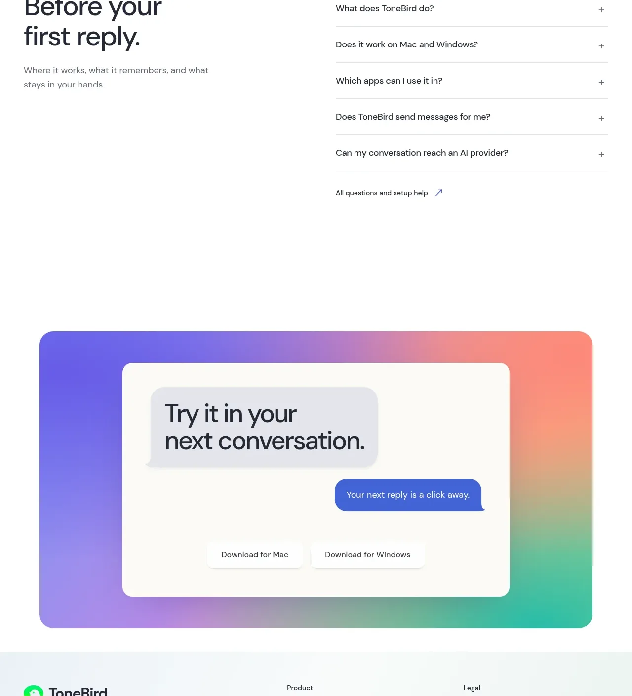
Design analysis
A bold pricing introduction leads into four rounded plan cards arranged in a two-by-two grid, with a billing toggle and clear usage/contact metrics.
Prompt preview
## Reference images

Study these alongside the description below: hierarchy, rhythm, spacing, colour. Build for the product you are asked about, using this design language.

- Component: https://kage-design-assets.t3.tigrisfiles.io/components/tonebird/16d0d272-e4c0-4394-9450-270e8dcbe6b2-1790229841-10.webp
- Full page it was cut from: https://kage-design-assets.t3.tigrisfiles.io/screenshots/tonebird/16d0d272-e4c0-4394-9450-270e8dcbe6b2-1790229760726-full.webp
- Component on Kage: https://kage.design/component/tonebird-pricing-table

## Before you start
Ask for the user's actual plans, pricing model, billing cadence, limits, and preferred conversion action. Build a transparent pricing section around those facts.

Use a left-aligned section heading and a short explanatory paragraph above a responsive four-tier grid. Each plan card should show plan name, price or custom label, billing note, a few meaningful limits, and a clear action. Use a two-by-two desktop grid with consistent 16–20px gaps, 18–22px corner radii, and ample card padding. A pale blue-to-lilac or brand-appropriate wash can distinguish the cards, but preserve strong text contrast. Use 28–36px prices, 16–18px plan names, and 12–14px metadata. Add a clearly labeled monthly/annual toggle below or above the cards; make the selected state obvious and keyboard accessible. Highlight only one recommended plan, never hide essential pricing details, and stack cards on mobile.

Never: copy logos, product names, copy, illustrations, or imagery from the reference.
More components
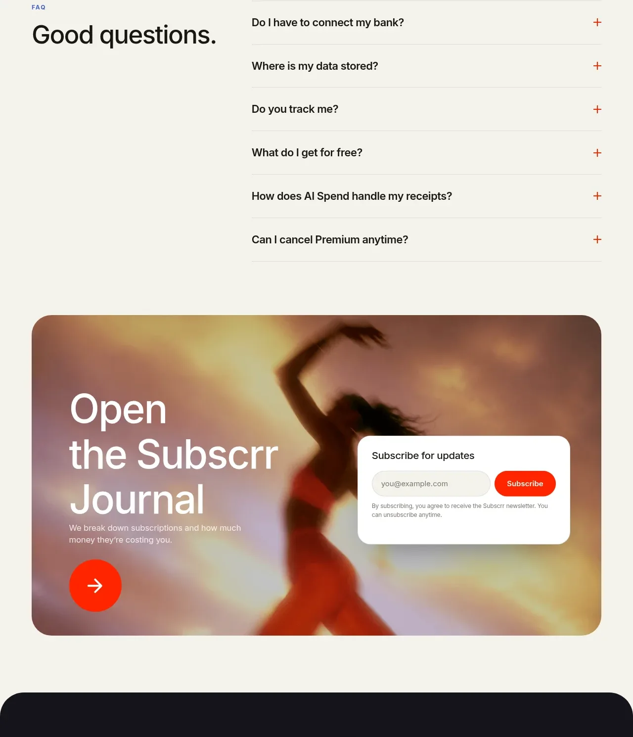
 Free and premium pricing comparison
Subscrr · Pricing table
Free and premium pricing comparison
Subscrr · Pricing table
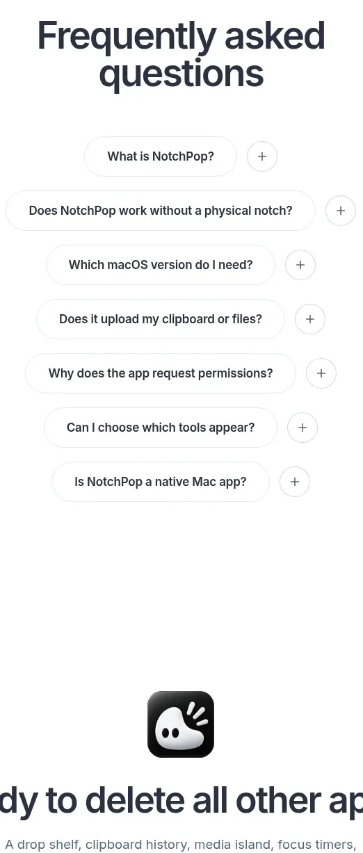
 One-time purchase pricing
NotchPop · Pricing table
One-time purchase pricing
NotchPop · Pricing table
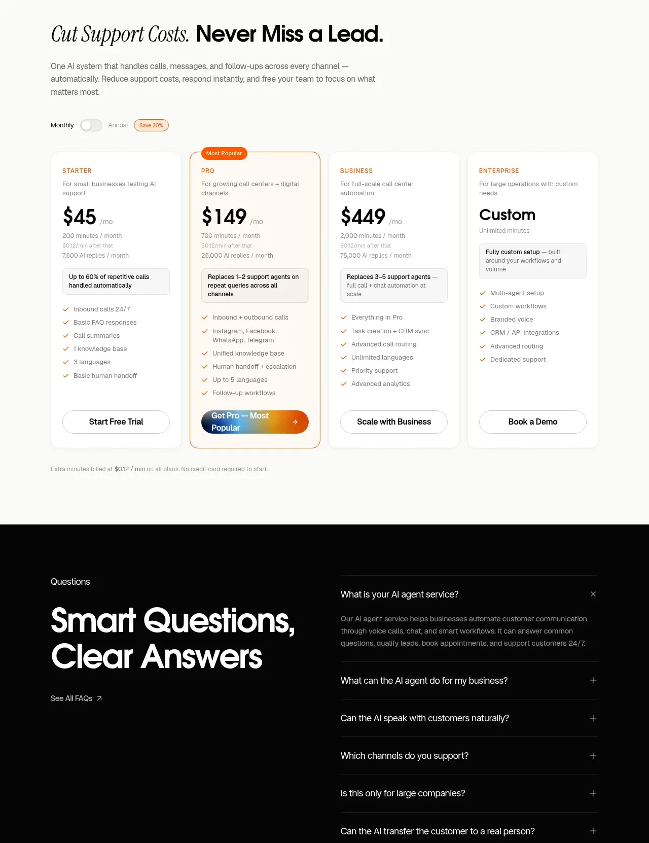
 Support plan pricing
IntellAgents.io · Pricing table
Support plan pricing
IntellAgents.io · Pricing table
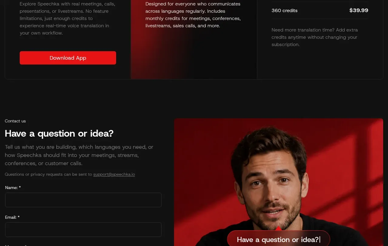
 Trial and subscription plans
Speechka · Pricing table
Trial and subscription plans
Speechka · Pricing table
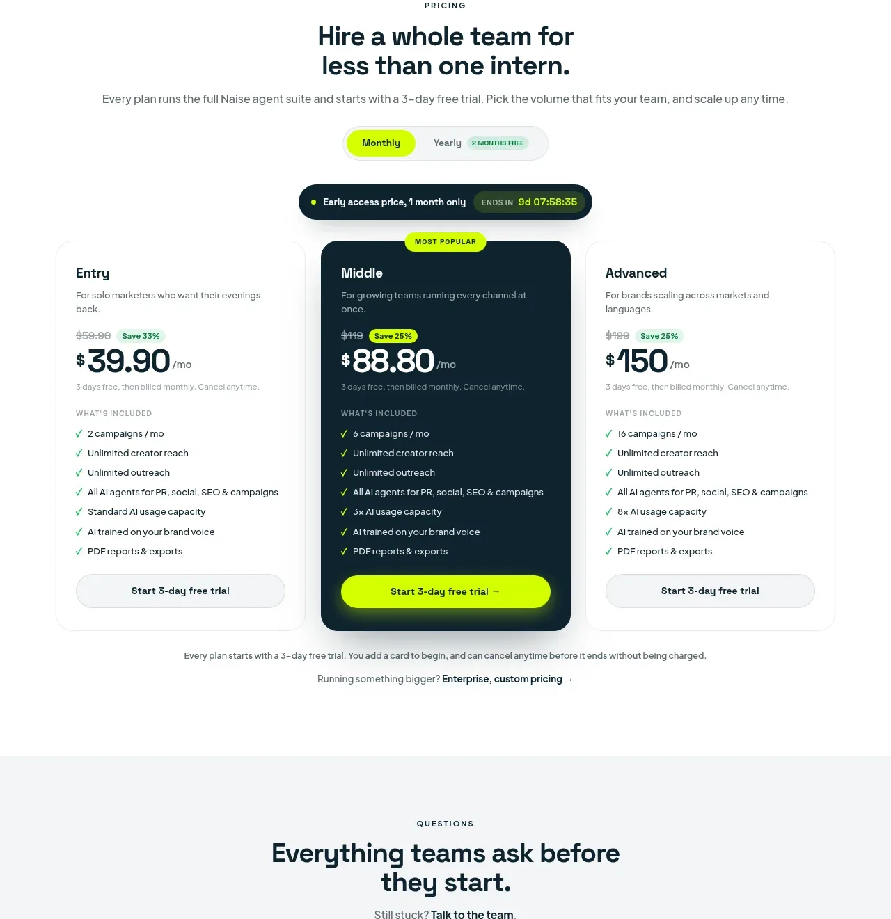
 Three-tier pricing plans
Naise AI · Pricing table
Three-tier pricing plans
Naise AI · Pricing table
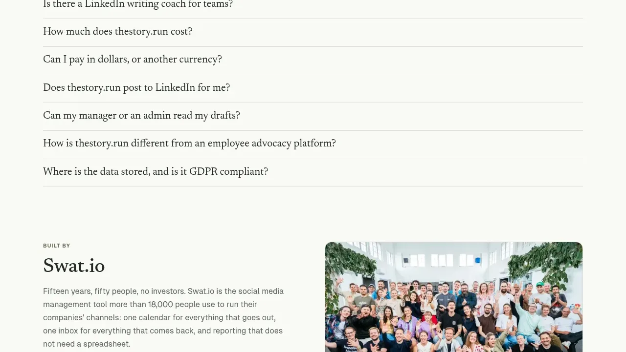
 Simple usage-based pricing
thestory.run · Pricing table
Simple usage-based pricing
thestory.run · Pricing table