kage
kage
trigger.dev

Design analysis
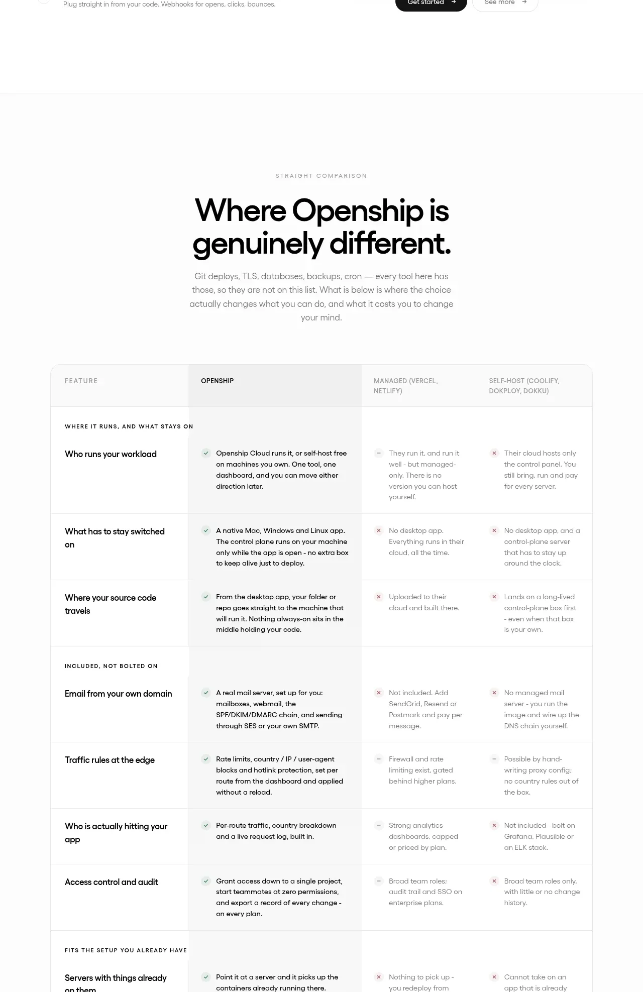
A restrained dark-mode feature matrix that turns a long list of capabilities into an easily scan-able three-column grid. Subtle row surfaces, tight spacing, and low-contrast borders create structure without competing with the surrounding product sections.
Prompt preview
## Reference images

Study these alongside the description below: hierarchy, rhythm, spacing, colour. Build for the product you are asked about, using this design language.

- Component: https://kage-design-assets.t3.tigrisfiles.io/components/trigger-dev/b9ca49c4-30e6-4b69-8f7d-3e7049f90280-1789073777-7.webp
- Full page it was cut from: https://kage-design-assets.t3.tigrisfiles.io/screenshots/trigger-dev/b9ca49c4-30e6-4b69-8f7d-3e7049f90280-1789073735-full.webp
- Component on Kage: https://kage.design/component/trigger-table

## Before you start
Ask the user what their product does, who it is for, and what brand direction they want. Then apply the principles below to create an original feature-list section for that product—not a copy of the reference.

## Build this section
Create a dark, full-width feature matrix for a modern software product. The section should present many short capabilities in a calm, highly scannable three-column layout.

### Layout and alignment
- Place the component inside a wide centered container, roughly 1180–1240px max-width, with 24–32px horizontal padding on small screens and generous vertical padding.
- Use a three-column CSS grid on desktop with equal or near-equal column widths and a 10–14px gap between columns.
- Treat each feature as a compact horizontal tile rather than a traditional table row. Keep the tile content left-aligned and vertically centered.
- Allow columns to contain different numbers of items; do not force empty cells to display visible placeholders.
- On tablet, use two columns; on mobile, collapse to one column while preserving readable grouping and spacing.
- The section should feel like part of a larger page: use a subtle top or bottom divider and leave enough surrounding whitespace to separate it from adjacent sections.

### Typography hierarchy
- Use a neutral modern sans-serif, with a system or geometric fallback stack.
- Feature labels should be 15–16px, regular weight, with comfortable line height around 1.4.
- Use muted light-gray text rather than bright white for secondary, catalogue-like content.
- If the product needs a section heading, use a concise 28–40px semibold heading above the matrix, with a short muted description; do not add unnecessary copy.

### Colour and surfaces
- Use a near-black page background around #101114 or #111216.
- Use tile surfaces only slightly lighter, around #15171B to #191B20, so the grid is visible through tonal contrast rather than heavy decoration.
- Use primary text around #C7C9CE and secondary text around #858991.
- Keep borders extremely subtle: #1D2025 or rgba(255,255,255,0.06).
- Avoid saturated accent colours unless the user's brand requires one; this component works best as a quiet neutral inventory of capabilities.

### Borders, radius, and spacing
- Give tiles a small 2–4px radius or a nearly square corner treatment; avoid pill shapes.
- Use approximately 14–18px horizontal padding and 11–14px vertical padding per tile.
- Keep the grid rhythm compact, with 8–12px vertical gaps.
- Use a 1px border only when needed for definition, and avoid shadows or use an almost imperceptible dark shadow.
- Ensure long labels wrap gracefully without causing awkward overflow.

### Interaction and accessibility
- If feature tiles are informational, leave them visually static and do not imply they are buttons.
- If tiles link to documentation or detail pages, add a subtle hover state: slightly lighter surface, brighter text, and a short 150–200ms transition.
- Use visible keyboard focus styles with a 2px outline in a brand-appropriate muted accent.
- Keep contrast accessible and use semantic lists or table-like markup appropriate to the content rather than relying only on visual grid positioning.

## Never
- Never reuse logos, product names, feature labels, copy, illustrations, imagery, code samples, or brand-specific language from the reference.
- Never reproduce the exact item ordering, dimensions, spacing measurements, or surrounding page sections.
- Never make the component look like a literal copied table; adapt the structure to the user's product and brand.
- Never add decorative imagery or gradients just to fill space.