kage
kage
navige.ai
Design analysis
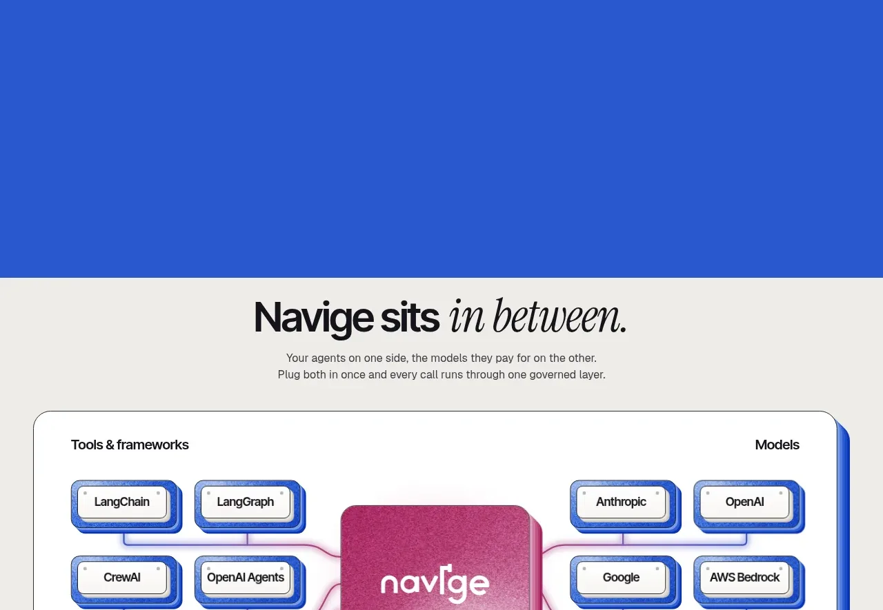
A framed architecture diagram shows tools and frameworks on one side, models on the other, and a central governed layer between them.
Prompt preview
## Reference images

Study these alongside the description below: hierarchy, rhythm, spacing, colour. Build for the product you are asked about, using this design language.

- Component: https://kage-design-assets.t3.tigrisfiles.io/components/navige/e3ee1ee4-7855-4062-a956-cf327122240e-1792130701-7.webp
- Full page it was cut from: https://kage-design-assets.t3.tigrisfiles.io/screenshots/navige/e3ee1ee4-7855-4062-a956-cf327122240e-1792130598253-full.webp
- Component on Kage: https://kage.design/component/navige-table

## Before you start
Ask which systems, providers, and frameworks the user's product connects, and what the central value layer is. Apply the principles below to that product rather than reproducing this reference.

Create an integration architecture section with a centered heading and short explanation above a large white rounded diagram container. Divide the container into left and right labeled columns and a central highlighted service layer. Represent items as small stacked or bordered tiles connected by fine lines, with the center visually dominant. Use warm white #f5f4ef, cobalt #2457d6, pale lavender #d9def4, and rose #c13b7a. Give the outer container 24px radius, a crisp 1px neutral border, and a blue offset shadow; use 12–14px tile text and 16–20px internal spacing. Add a small follow-up statement and optional text link below.

Make every tile focusable, expose relationships to screen readers, and allow a responsive stacked layout on narrow screens.

Never: use logos, product names, copy, illustrations, or imagery from the reference.