kage
kage
agentshrine.com

Design analysis
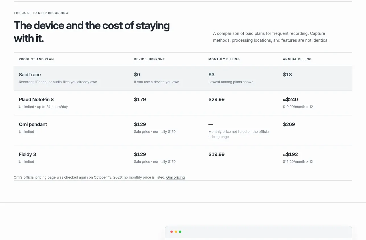
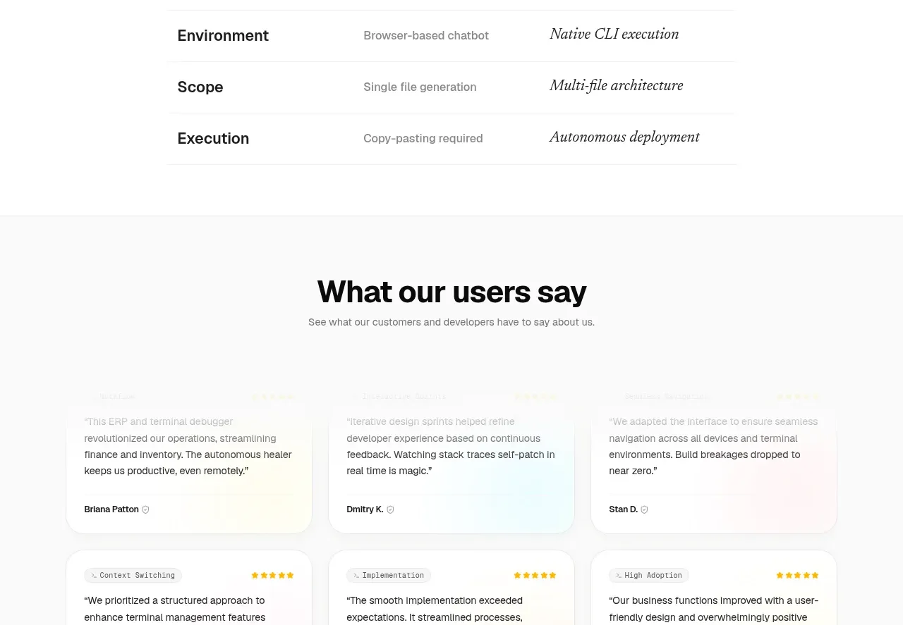
A modest roadmap section uses a centered heading and a two-column list of upcoming ideas. Hairline row separators make the content scannable without turning it into a heavy dashboard.
Prompt preview
## Reference images

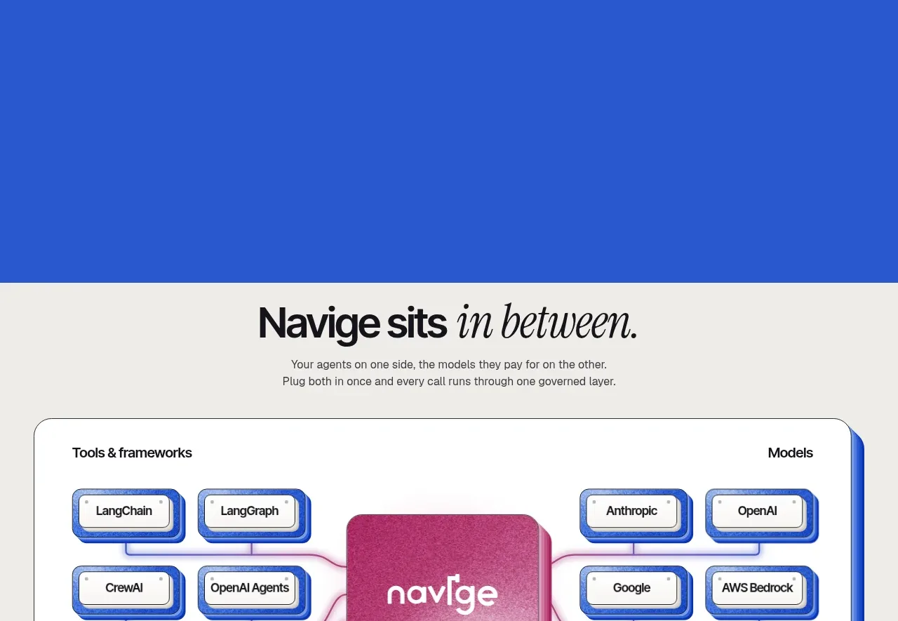
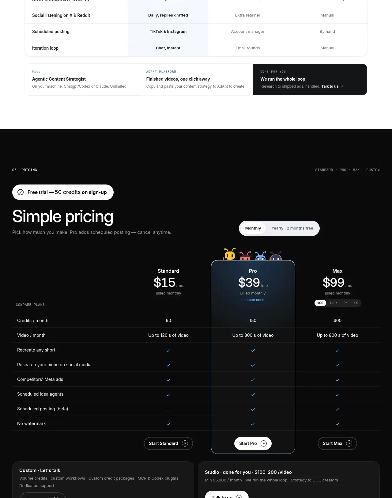
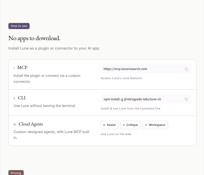
Study these alongside the description below: hierarchy, rhythm, spacing, colour. Build for the product you are asked about, using this design language.

- Component: https://kage-design-assets.t3.tigrisfiles.io/components/shrine/ff477ea2-1694-4783-bdc4-4322fec31da4-1792130652-6.webp
- Full page it was cut from: https://kage-design-assets.t3.tigrisfiles.io/screenshots/shrine/ff477ea2-1694-4783-bdc4-4322fec31da4-1792130580085-full.webp
- Component on Kage: https://kage.design/component/shrine-table

## Before you start
Ask what future capabilities or milestones matter to the user's product, who needs to read them, and what tone the brand should use. Then build an original roadmap section.

- Center a short heading above a narrow, readable table or list; do not let the roadmap span the entire viewport.
- Use two columns: a bold milestone or feature name and a lighter explanation or status. Keep row heights comfortable and consistent.
- Use subtle dotted or solid horizontal dividers, no heavy cell fills, and enough vertical padding to make scanning effortless.
- Set headings in a strong display or semibold face and descriptions in a neutral sans-serif with muted contrast.
- On mobile, stack each row's label and description or allow a carefully designed responsive layout rather than forcing tiny columns.
- If statuses are interactive, provide clear labels and keyboard behavior, but keep the visual hierarchy focused on the roadmap content.

Never: use the reference's logo, product name, copy, illustrations, imagery, or exact visual assets.