kage
kage
audimate.ai

Design analysis
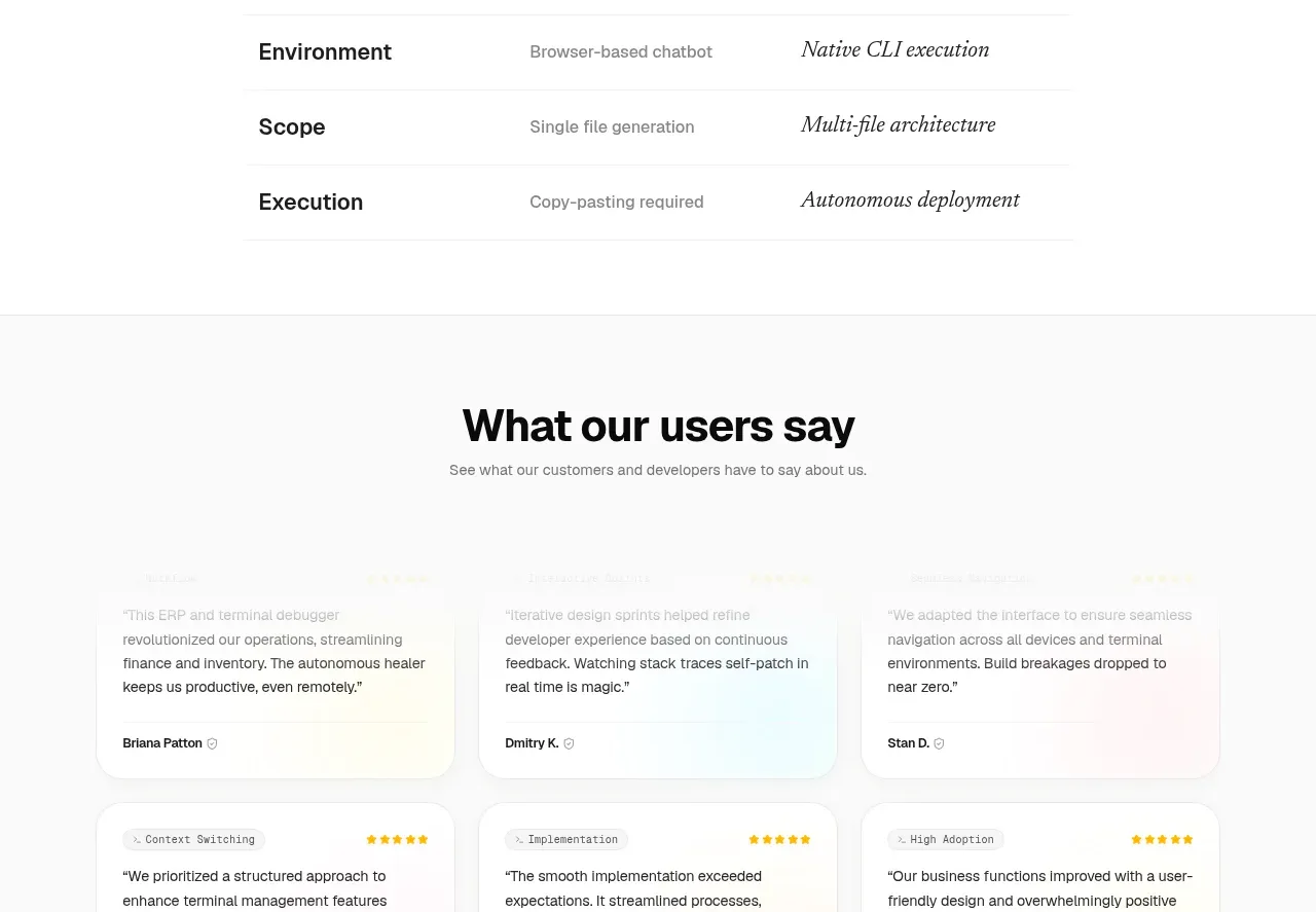
A rounded comparison table contrasts familiar manual work with the assistant-enabled outcome across several practical tasks.
Prompt preview
## Reference images

Study these alongside the description below: hierarchy, rhythm, spacing, colour. Build for the product you are asked about, using this design language.

- Component: https://kage-design-assets.t3.tigrisfiles.io/components/audimate/f5eee044-0aa0-46f8-a989-58039412e614-1792130731-6.webp
- Full page it was cut from: https://kage-design-assets.t3.tigrisfiles.io/screenshots/audimate/f5eee044-0aa0-46f8-a989-58039412e614-1792130546049-full.webp
- Component on Kage: https://kage.design/component/audimate-table

## Before you start
Ask what the user's product and brand are, then apply the principles below to that product rather than reproducing the reference.

Build a comparison section with a centered headline and a compact three-column table. Use a dark rounded container (#121214) with a thin border, generous cell padding, and four concise rows comparing the current approach, the product-assisted approach, and the resulting benefit. Keep the first column as the task label, the middle column muted, and the final column brighter and more decisive. Use subtle horizontal dividers, 14–16px body text, and a responsive stacked layout on narrow screens. Ensure the table has semantic headers and readable contrast.

Never: use the reference's logo, product name, copy, illustrations, imagery, or exact visual identity.