 kage
kage
trycase.dev
Design analysis
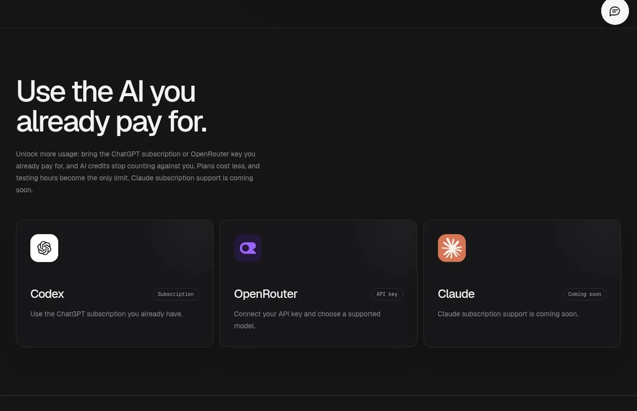
A short explanatory heading introduces a practical benefit, followed by three evenly sized provider cards. Consistent card anatomy makes the available integrations immediately scannable.
Prompt preview
## Reference images

Study these alongside the description below: hierarchy, rhythm, spacing, colour. Build for the product you are asked about, using this design language.

- Component: https://kage-design-assets.t3.tigrisfiles.io/components/trycase/bc7fc0fa-2eda-4dd0-a163-94201d1f5c68-1789452163-2.webp
- Full page it was cut from: https://kage-design-assets.t3.tigrisfiles.io/screenshots/trycase/bc7fc0fa-2eda-4dd0-a163-94201d1f5c68-1789452104312-full.webp
- Component on Kage: https://kage.design/component/trycase-feature-grid

## Before you start
Ask the user which product capabilities, integrations, or plans should be featured and what their brand colors are. Use the following design logic to create an original section for their product.

Build a dark integrations or capability section with an intro and a three-card grid.

- Use a near-black background around `#111111`; separate the section with a faint horizontal rule around `#262626`.
- Keep the intro aligned to the same container as the cards. Use a large 42–56px heading with compact line wrapping and a muted 14px explanatory paragraph beneath it.
- Create three equal cards in a responsive grid with 16–20px gaps. Each card should be approximately 180px tall on desktop and have a dark charcoal surface around `#171717`, a 1px border around `#2a2a2a`, and a 10–12px radius.
- Give each card a small neutral or brand-colored icon tile, a clear title, a compact status/category pill, and one sentence of supporting copy.
- Use strong white card titles, muted gray body copy, and restrained badges around `#202020`; reserve saturated colors for meaningful provider or capability identity.
- Add subtle hover elevation or border-color change, while preserving a simple stacked layout on mobile.

### Never
- Never reuse the reference provider names, icons, logos, copy, or exact card content.
- Never use random gradients or excessive shadows to make ordinary cards look complex.
- Never make status pills more prominent than the card title.







