 kage
kage
trycase.dev
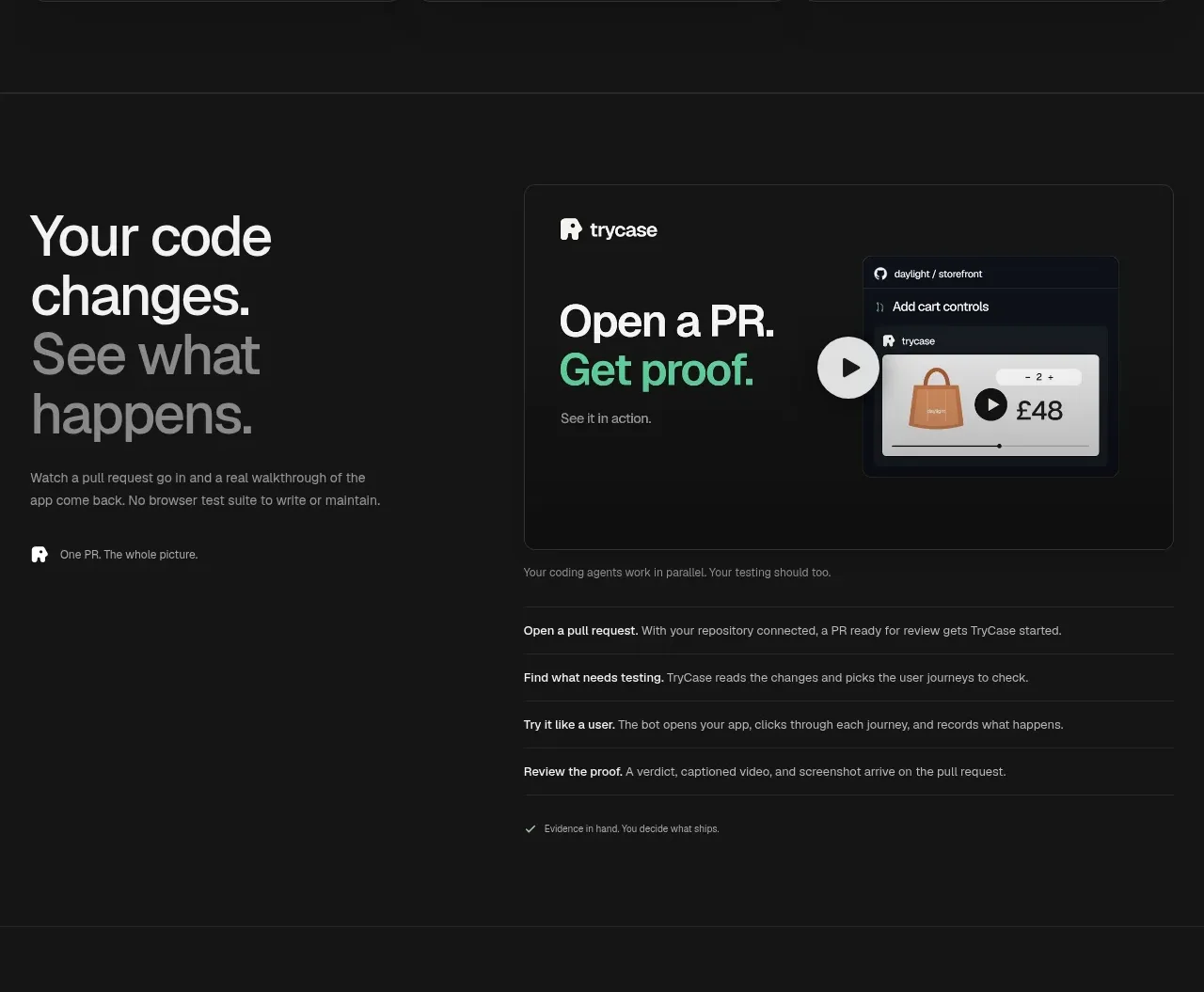
Design analysis
This section explains the product workflow through a bold editorial statement, a proof-oriented demo card, and a numbered sequence of concise actions. The split layout makes the process understandable without requiring a long paragraph.
Prompt preview
## Reference images

Study these alongside the description below: hierarchy, rhythm, spacing, colour. Build for the product you are asked about, using this design language.

- Component: https://kage-design-assets.t3.tigrisfiles.io/components/trycase/bc7fc0fa-2eda-4dd0-a163-94201d1f5c68-1789452163-3.webp
- Full page it was cut from: https://kage-design-assets.t3.tigrisfiles.io/screenshots/trycase/bc7fc0fa-2eda-4dd0-a163-94201d1f5c68-1789452104312-full.webp
- Component on Kage: https://kage.design/component/trycase-feature-grid-2

## Before you start
Ask the user what workflow their product automates, what evidence or output proves success, and which steps need explanation. Apply these principles to that workflow with original content.

Create a dark workflow-explanation section that combines a large statement, a product proof panel, and a concise step list.

- Use a two-column top layout inside a centered max-width container: editorial heading and copy on the left, a demonstration/proof card on the right.
- Set the main heading around 44–56px with tight line height. Use one muted or accent-colored line to distinguish the outcome without turning it into a gradient headline.
- Add a short paragraph in `#8f8f8f` and an optional tiny attribution or evidence label with an icon beneath it.
- Style the proof panel as a charcoal bordered card around `#151515`, border `#292929`, radius 10–12px, with a small product label, an outcome title, a compact embedded UI/video frame, and a circular play control if media is available.
- Under the top split, place 4–5 full-width workflow rows separated by thin rules. Each row should have a short bold lead-in and one explanatory sentence; use comfortable vertical padding rather than dense tables.
- Add a tiny confirmation/evidence note at the end, and make media controls keyboard accessible. On mobile, stack the proof card below the heading and keep the rows readable.

### Never
- Never use the reference product's screenshots, logo, copy, name, or exact workflow.
- Never make the demo panel imply functionality that the user's product does not have.
- Never turn the steps into a dense technical manual; preserve scanability.







