kage
kage
trycase.dev
Design analysis
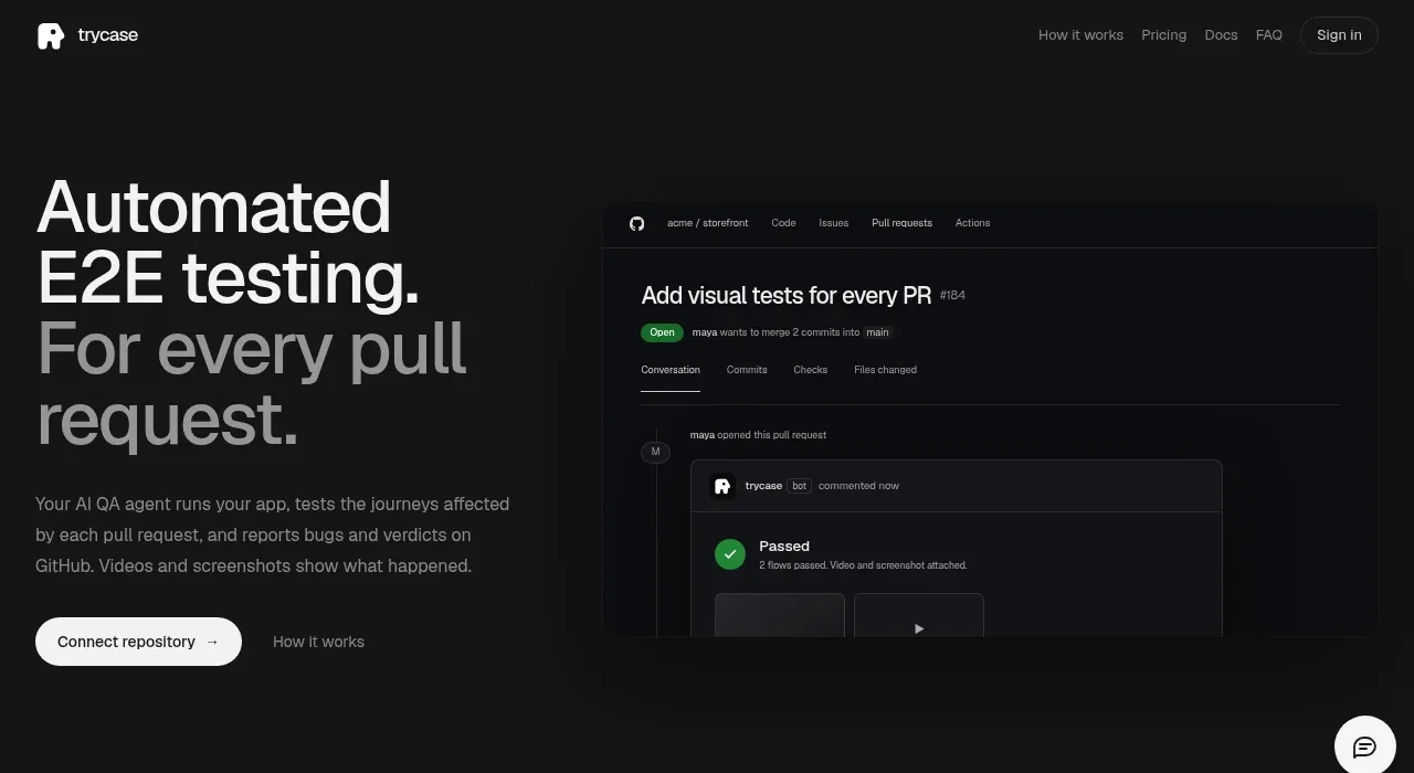
The hero pairs an oversized, high-contrast promise with concise supporting copy and a primary repository action. A large dark product visual on the right demonstrates the outcome instead of relying on abstract claims.
Prompt preview
## Reference images

Study these alongside the description below: hierarchy, rhythm, spacing, colour. Build for the product you are asked about, using this design language.

- Component: https://kage-design-assets.t3.tigrisfiles.io/components/trycase/bc7fc0fa-2eda-4dd0-a163-94201d1f5c68-1789452163-1.webp
- Full page it was cut from: https://kage-design-assets.t3.tigrisfiles.io/screenshots/trycase/bc7fc0fa-2eda-4dd0-a163-94201d1f5c68-1789452104312-full.webp
- Component on Kage: https://kage.design/component/trycase-hero

## Before you start
Ask the user what their product does, who the target customer is, and what brand direction they want. Then adapt this structure and hierarchy to that product; do not copy the reference wording or visual assets.

Create a dark two-column hero for a technical SaaS product.

- Use a full-width near-black section around `#111111`, with a centered max-width layout and generous top and bottom whitespace.
- Place the headline on the left at roughly 48–64px desktop, 1.0–1.08 line height, with a short emphasized phrase in a softer gray or brand accent. Keep the text column narrow enough to create a strong line break.
- Add a concise 2–3 line supporting paragraph in muted gray around `#929292`, 14–16px, followed by one high-priority rounded CTA and a quiet secondary text link.
- Put a large product screenshot or interface mockup on the right, cropped naturally at the section edge. Use a charcoal panel around `#0d0f12`, thin borders around `#24262a`, subtle shadow, and restrained highlights.
- Use a small brand accent such as coral/pink `#e34867` only for focus or key emphasis; do not let it dominate the dark composition.
- Vertically center the columns, keep the hero visually calm, and stack the layout on mobile with the visual below the CTA.
- Make the primary CTA clearly actionable, with visible hover/focus states and adequate contrast.

### Never
- Never use the reference product name, headline, logo, screenshot, copy, or illustration.
- Never fabricate a busy dashboard just to fill space; use the user's real product or a neutral structural mockup.
- Never overload the hero with multiple competing CTAs.