 kage
kage
turso.tech

Design analysis
A dark, two-option comparison section that helps visitors choose between a self-hosted path and a managed path. Strong hierarchy, restrained borders, teal accents, and bottom-aligned actions make the alternatives easy to scan without feeling like a pricing table.
Prompt preview
## Reference images

Study these alongside the description below: hierarchy, rhythm, spacing, colour. Build for the product you are asked about, using this design language.

- Component: https://kage-design-assets.t3.tigrisfiles.io/components/turso-tech/a01fe972-4603-42df-a7fd-1b66e57f2913-1789073740-9.webp
- Full page it was cut from: https://kage-design-assets.t3.tigrisfiles.io/screenshots/turso-tech/a01fe972-4603-42df-a7fd-1b66e57f2913-1789073707-full.webp
- Component on Kage: https://kage.design/component/turso-tabs

## Before you start
Ask the user what their product is, who it is for, and what brand or visual identity it uses. Then apply the principles below to create a version for their product rather than reproducing the reference.

## Build a dual-path comparison tabs section
Create a responsive section that presents two related product or adoption paths side by side. It should help a visitor quickly understand the distinction between the options and choose the next step. Treat the visible panels as tab-like choice cards: the active option should be clearly indicated, while the layout can also support two cards shown together on larger screens.

### Layout and alignment
- Use a full-width dark section with a subtle top divider.
- Constrain content to roughly 1120–1180px and center it horizontally.
- Place a large, centered heading above the options, with a maximum width around 620–700px. Allow the heading to wrap into two balanced lines on desktop.
- Add generous vertical space between the heading and the cards, approximately 44–56px.
- Arrange two equal-width cards in a two-column grid with a 24–28px gap. On narrow screens, stack them vertically.
- Keep all card content left-aligned. Use consistent internal padding of approximately 28px on desktop and 22–24px on mobile.
- Give each card a flexible minimum height so the descriptive text and call-to-action sit in a stable, predictable position. Use flex column layout with the action pushed toward the bottom.
- If implementing actual tabs, make the tab controls keyboard accessible, use semantic buttons, expose the active state with `aria-selected`, and crossfade or gently switch the associated panel without shifting the overall layout.

### Typography hierarchy
- Use a clean modern sans-serif with a slightly technical/product feel.
- Main heading: bold, approximately 36–40px on desktop, 30–34px on mobile, line-height around 1.05–1.15, with tight tracking.
- Card title: semibold or bold, approximately 19–21px, line-height around 1.2.
- Description: regular, approximately 15–16px, line-height around 1.55–1.65. Keep it comfortably readable and muted rather than competing with the title.
- Action link: semibold, approximately 14–16px, with a small right arrow or equivalent directional affordance.

### Colour and surface treatment
- Use an almost-black navy background around `#0D1115` or `#0E1216`.
- Use near-white text around `#F3F5F4` for the main heading and card titles.
- Use a cool muted gray around `#7C8588` for descriptions.
- Use a mint/teal accent around `#5FE0B5` to communicate active state and action affordances.
- Use a very subtle blue-gray border around `#202A2D` or `#263034`; the border should be visible enough to define the cards but remain low contrast.
- Avoid gradients, heavy shadows, decorative noise, or bright filled card backgrounds unless they are necessary for the user's brand.

### Borders, radius, and details
- Use a restrained 1px border on the cards.
- Apply a modest corner radius around 12–14px; keep the shape architectural rather than bubbly.
- Mark the active tab/card with a thin mint underline or bottom accent beneath the label, approximately 1–2px thick. The underline should be shorter than the full card width and aligned to the label or tab content.
- Keep card backgrounds close to the page background, with only a barely perceptible surface contrast.
- Use a thin horizontal divider at the top of the section to establish structure.

### Interaction and responsive behaviour
- On hover, brighten the card border slightly and shift the action text toward the accent colour; keep transitions subtle, around 160–220ms.
- On focus-visible, show a clear mint outline or high-contrast ring around the tab/card control.
- Make the entire selectable card or tab trigger easy to target, while preserving a distinct clickable action if the design calls for one.
- On mobile, reduce heading size and padding, stack the options, and preserve generous breathing room. Avoid horizontal overflow.
- Ensure sufficient contrast and do not rely on colour alone to identify the active choice; combine colour with the underline, weight, or an explicit active indicator.

### Content guidance
- Use original, product-specific labels and descriptions supplied by the user. Keep labels short and parallel in structure.
- Make the first option feel suitable for users who want control, flexibility, or local/self-managed use; make the second suitable for users who want convenience, scale, or a managed service. Adapt those meanings to the user's product.
- Keep each description to roughly 2–3 concise lines on desktop and give each option one clear action.

## Never
- Never use logos, product names, copy, illustrations, icons, or imagery from the reference.
- Never reproduce the reference text or create a visual copy of the original page.
- Never make the component depend on a specific brand, product category, or exact content.
- Never use inaccessible tabs, unlabelled controls, colour-only active states, or interactions that break on mobile.
More components

 Directory filters and sorting
The Brains · Tabs & steps
Directory filters and sorting
The Brains · Tabs & steps
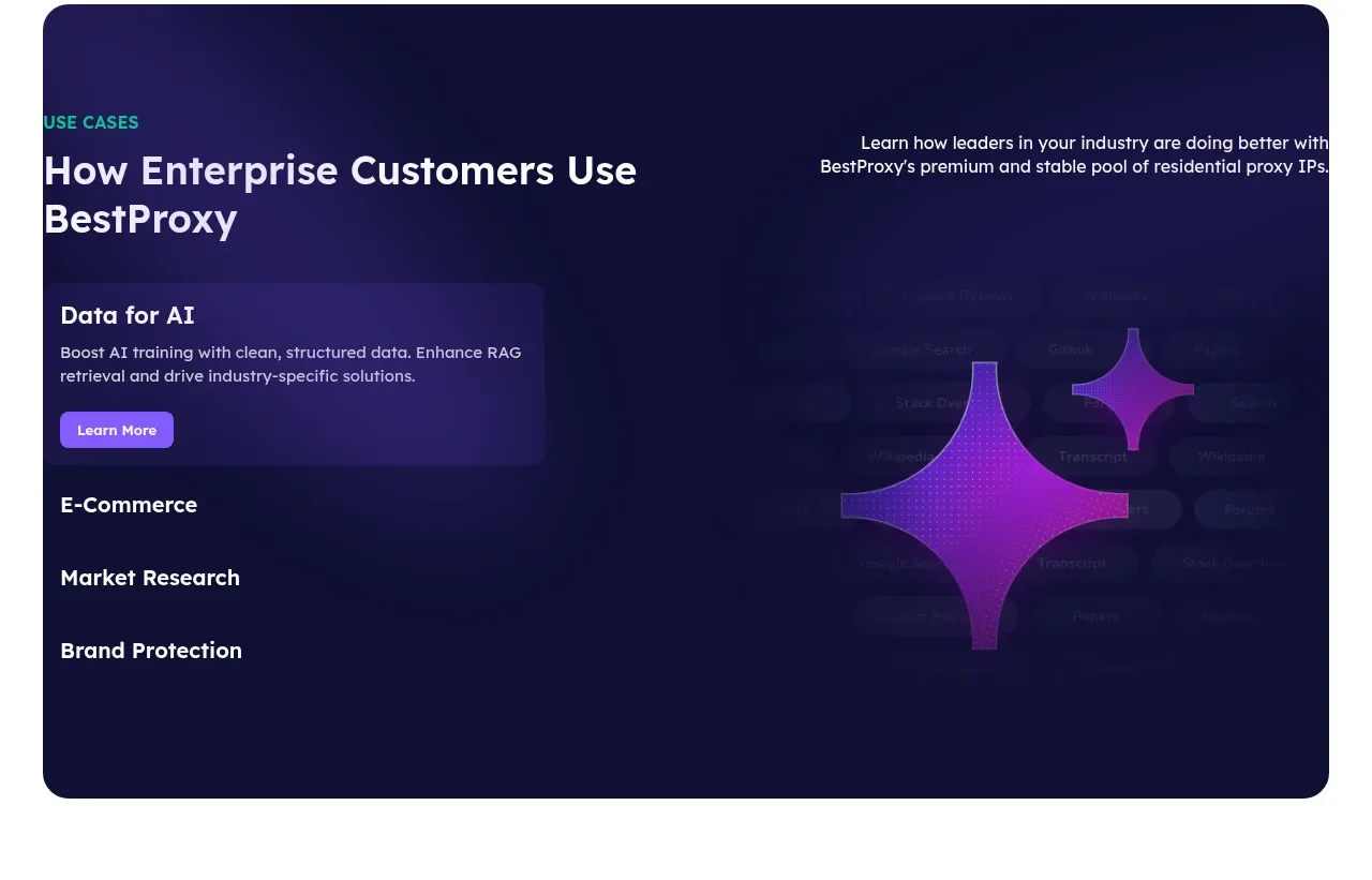
 Enterprise use cases
bestproxy.com · Tabs & steps
Enterprise use cases
bestproxy.com · Tabs & steps
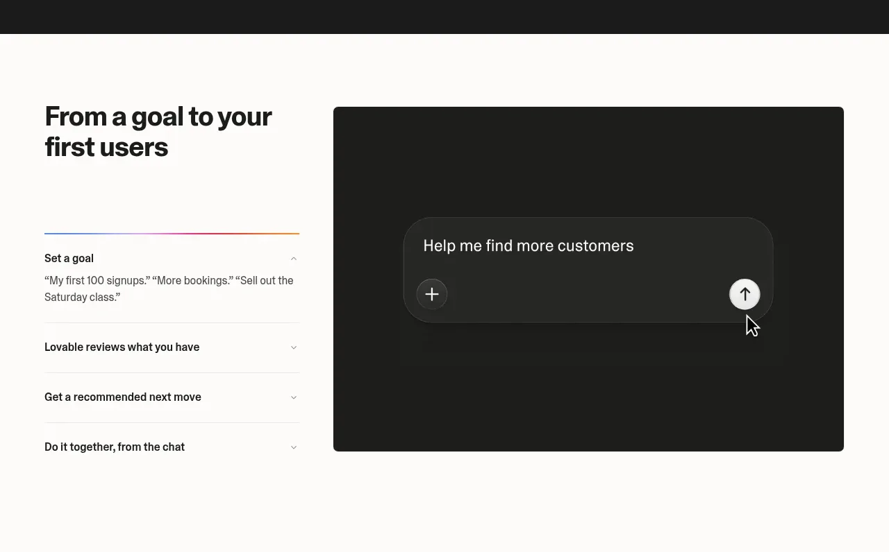
 Goal-to-first-users assistant
Lovable Growth Tools · Tabs & steps
Goal-to-first-users assistant
Lovable Growth Tools · Tabs & steps
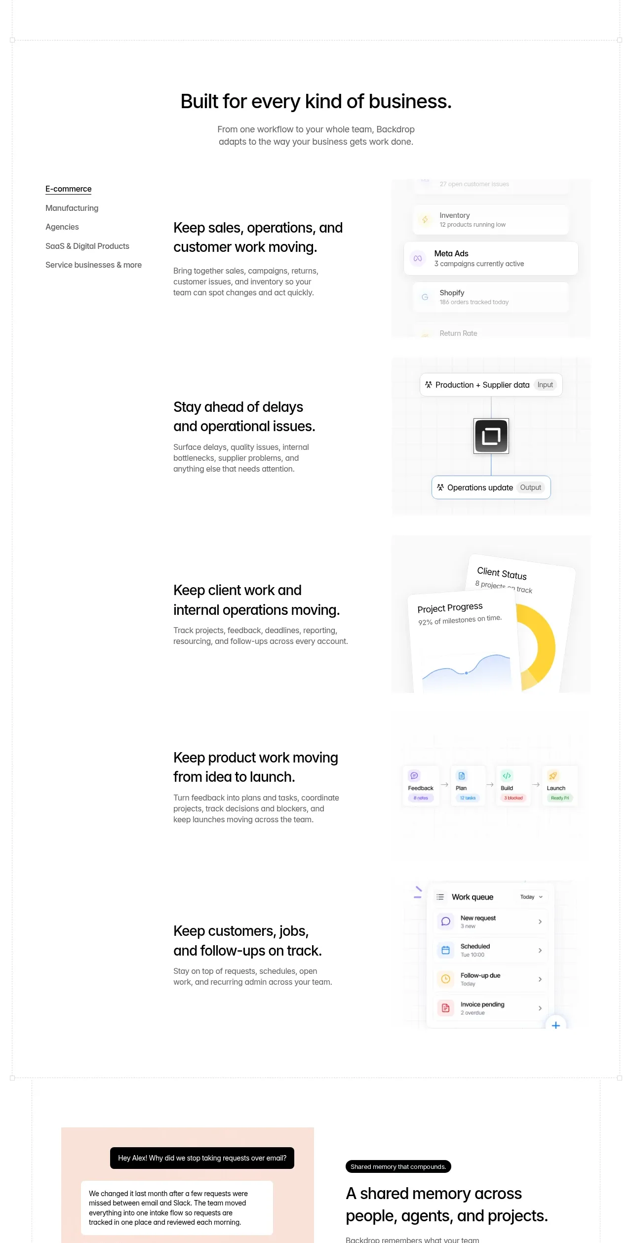
 Business use cases tabs
Backdrop · Tabs & steps
Business use cases tabs
Backdrop · Tabs & steps
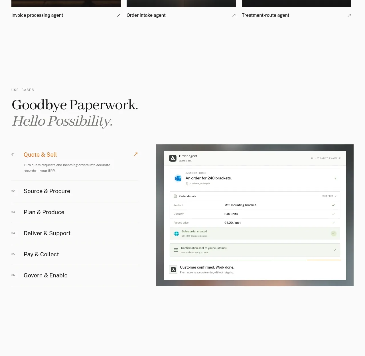
 Workflow stages with product preview
Lleverage · Tabs & steps
Workflow stages with product preview
Lleverage · Tabs & steps
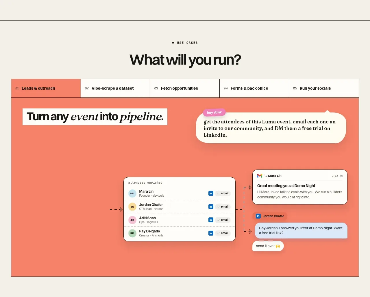
 Use-case selector and interactive showcase
Retriever AI · Tabs & steps
Use-case selector and interactive showcase
Retriever AI · Tabs & steps