 kage
kage
ultracite.ai
Design analysis
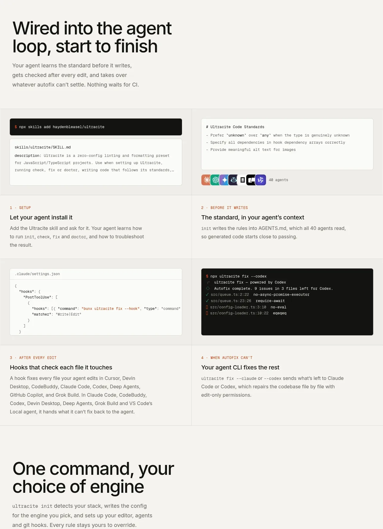
A workflow section explains how the product participates before, during, and after an agent edit. A two-column sequence alternates practical copy with command/configuration snippets and creates a clear start-to-finish narrative.
Prompt preview
## Reference images

Study these alongside the description below: hierarchy, rhythm, spacing, colour. Build for the product you are asked about, using this design language.

- Component: https://kage-design-assets.t3.tigrisfiles.io/components/ultracite-v8/2cfe6d77-9aac-44fd-bb06-05dad12091d2-1792303307-5.webp
- Full page it was cut from: https://kage-design-assets.t3.tigrisfiles.io/screenshots/ultracite-v8/2cfe6d77-9aac-44fd-bb06-05dad12091d2-1792303236925-full.webp
- Component on Kage: https://kage.design/component/ultracite-v8-feature-grid-2

## Before you start
Ask what the user's product workflow looks like from setup through completion, which integrations matter, and what actions happen automatically. Turn that workflow into an original step-based section.

Create a feature grid introduced by a large two-line heading and a short paragraph. Below, use a two-column, two-row sequence of four steps. Each step has a small uppercase ordinal label, a concise title, explanatory copy, and—where useful—a terminal or configuration snippet above or beside the text. Make the reading order explicit: install or configure, establish context, run after each edit, then handle the exceptional case. Use borders and generous cell padding to make the grid feel like a product blueprint.

Keep the palette warm and technical: background #f7f7f4, code blocks #121211 or #fcfcfa, text #171716, muted copy #696963, and orange #ff4b1f for active accents. Use 1px #deded9 rules, 8px code radius, monospace at 12px, and an editorial sans-serif hierarchy with a 48–58px headline. Preserve alignment between columns and let cards expand naturally for longer copy. On mobile, collapse to a single numbered sequence with code blocks full width.

### Never
- Never use the reference's logos, product names, copy, illustrations, or imagery.
- Never make the steps generic slogans without showing what the product actually does.
- Never force four columns or tiny code into a mobile layout.
More components

 Data-to-action engine
Salience · Feature grid
Data-to-action engine
Salience · Feature grid
 Actionable alert workflow
Salience · Feature grid
Actionable alert workflow
Salience · Feature grid
 Three-step implementation flow
Salience · Feature grid
Three-step implementation flow
Salience · Feature grid
 Trust proof and core outcomes
Salience · Feature grid
Trust proof and core outcomes
Salience · Feature grid
 What analytics misses
Salience · Feature grid
What analytics misses
Salience · Feature grid

 Workflow features and capabilities
CrewTower Mod for Claude Code · Feature grid
Workflow features and capabilities
CrewTower Mod for Claude Code · Feature grid