 kage
kage
ultracite.ai
Design analysis
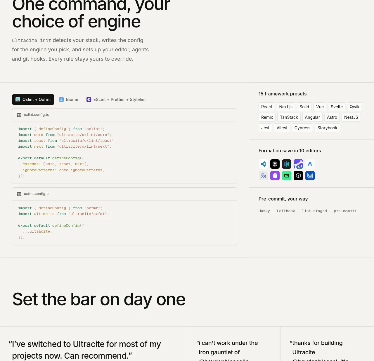
This section pairs a setup-oriented heading with a large code/configuration area and a right-hand inventory of framework presets, editors, and pre-commit options. It communicates breadth while keeping the implementation concrete.
Prompt preview
## Reference images

Study these alongside the description below: hierarchy, rhythm, spacing, colour. Build for the product you are asked about, using this design language.

- Component: https://kage-design-assets.t3.tigrisfiles.io/components/ultracite-v8/2cfe6d77-9aac-44fd-bb06-05dad12091d2-1792303307-6.webp
- Full page it was cut from: https://kage-design-assets.t3.tigrisfiles.io/screenshots/ultracite-v8/2cfe6d77-9aac-44fd-bb06-05dad12091d2-1792303236925-full.webp
- Component on Kage: https://kage.design/component/ultracite-v8-feature-grid-3

## Before you start
Ask which frameworks, editors, providers, and integrations the user's product supports, and which should be emphasized. Build a fresh integration section using those real capabilities.

Create a two-part integration section. Begin with a large heading and a short paragraph describing the simplicity of one setup command. Below, place a broad code area on the left with small provider tabs or pills and two stacked configuration panels. On the right, use compact grouped lists for supported frameworks, editor integrations, and pre-commit options. Make the groups scannable with small labels and wrapped pills rather than oversized cards.

Use a warm neutral background #f7f7f4, white code panels #fcfcfa, near-black #161615, and orange #ff4b1f for the selected tab or key action. Use 1px #deded9 borders, 6–8px radii, 12px monospace, and 12–14px labels. Keep the left code column wider than the inventory column—roughly two-thirds to one-third—and align their top edges. Tabs should have visible selected, hover, focus, and keyboard states; long lists should wrap without truncation. Stack the columns on mobile.

### Never
- Never use the reference's logos, product names, copy, illustrations, or imagery.
- Never list integrations that are not actually supported.
- Never make every option look selected at once.
More components

 Data-to-action engine
Salience · Feature grid
Data-to-action engine
Salience · Feature grid
 Actionable alert workflow
Salience · Feature grid
Actionable alert workflow
Salience · Feature grid
 Three-step implementation flow
Salience · Feature grid
Three-step implementation flow
Salience · Feature grid
 Trust proof and core outcomes
Salience · Feature grid
Trust proof and core outcomes
Salience · Feature grid
 What analytics misses
Salience · Feature grid
What analytics misses
Salience · Feature grid

 Workflow features and capabilities
CrewTower Mod for Claude Code · Feature grid
Workflow features and capabilities
CrewTower Mod for Claude Code · Feature grid