 kage
vibeide.dev
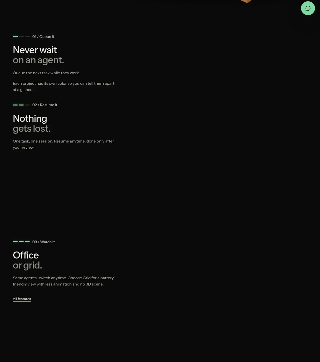
Design analysis
Three vertically spaced feature moments explain queueing, resuming, and switching views with short labels and deliberately open dark space for product storytelling.
Prompt preview
## Reference images

Study these alongside the description below: hierarchy, rhythm, spacing, colour. Build for the product you are asked about, using this design language.

- Component: https://kage-design-assets.t3.tigrisfiles.io/components/vibeide/07b340e8-2f64-4d74-b3e0-eba165a9aca9-1793080888-2.webp
- Full page it was cut from: https://kage-design-assets.t3.tigrisfiles.io/screenshots/vibeide/07b340e8-2f64-4d74-b3e0-eba165a9aca9-1793080830929-full.webp
- Component on Kage: https://kage.design/component/vibeide-feature-grid

## Before you start
Ask what the user's product and brand are, then apply the principles below to that product rather than reproducing this reference.

Build a dark, editorial feature section with three stacked feature rows rather than dense cards. Each row has a tiny numbered eyebrow with a short mint progress rule, a bold 26–30px two-line benefit statement, and a concise muted description. Align all text to a consistent left content rail around 36px; reserve the broad right side for optional motion, screenshots, or intentionally quiet space. Give each row substantial vertical separation (roughly 180–260px), use #080909, #f2f2ef, #9d9c9b, and #82e0ae, with 1px #252827 dividers only where useful. Include a small underlined text link in the final row. On scroll, allow one row to become active without changing layout.

Never use the reference product name, copy, feature labels, screenshots, illustrations, or exact artwork.
More components
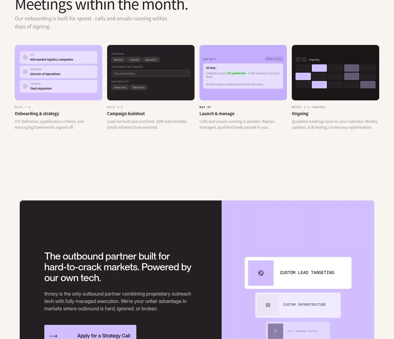
 Rapid onboarding timeline
throxy · Feature grid
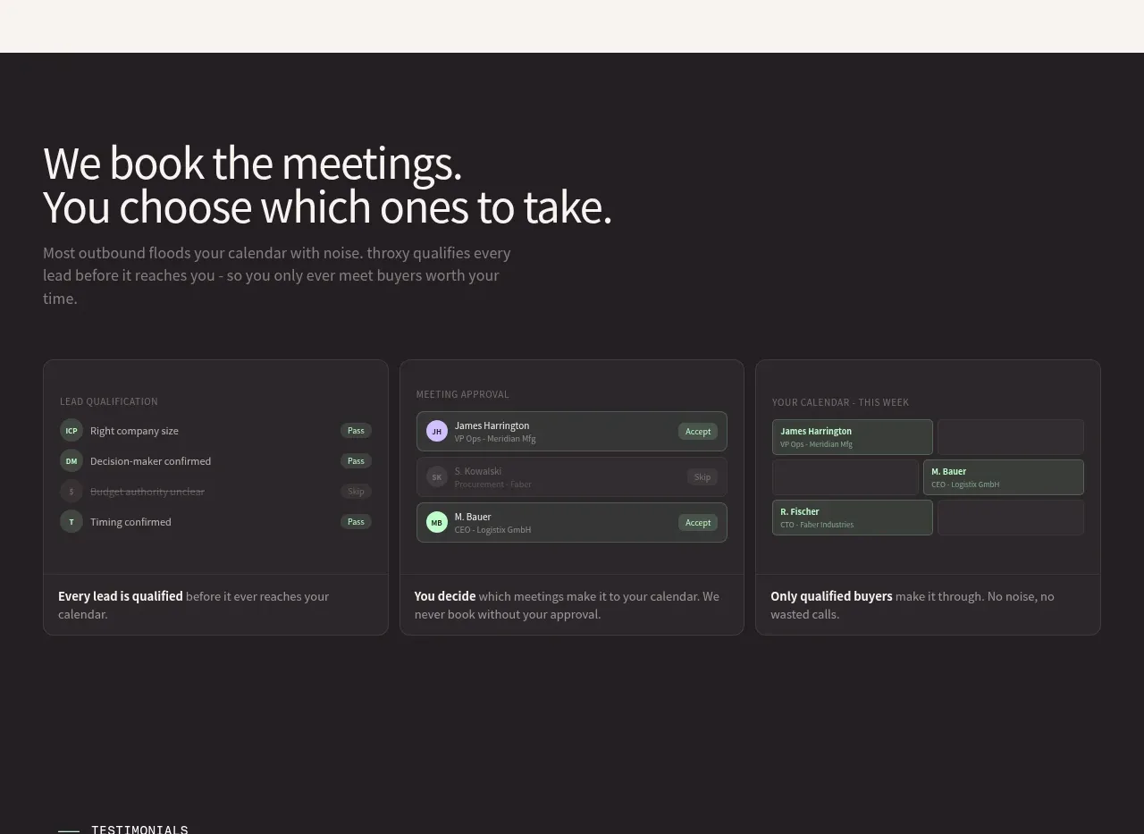 Qualification workflow cards
throxy · Feature grid
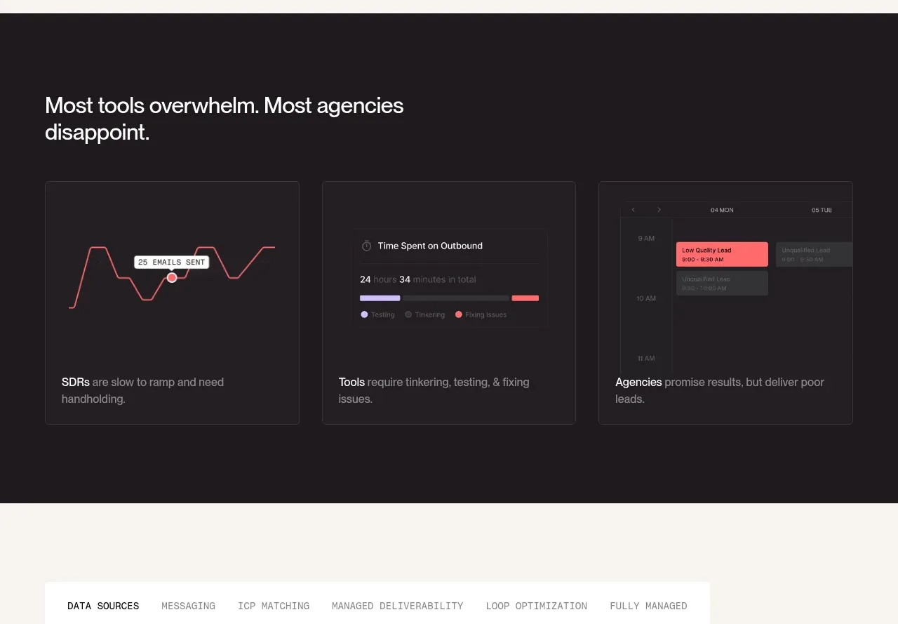 Why alternatives disappoint
throxy · Feature grid
 Outbound partner benefits
throxy · Feature grid
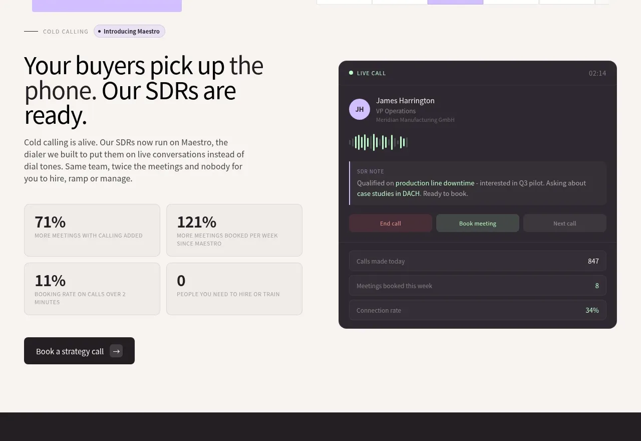 Cold-calling performance section
throxy · Feature grid
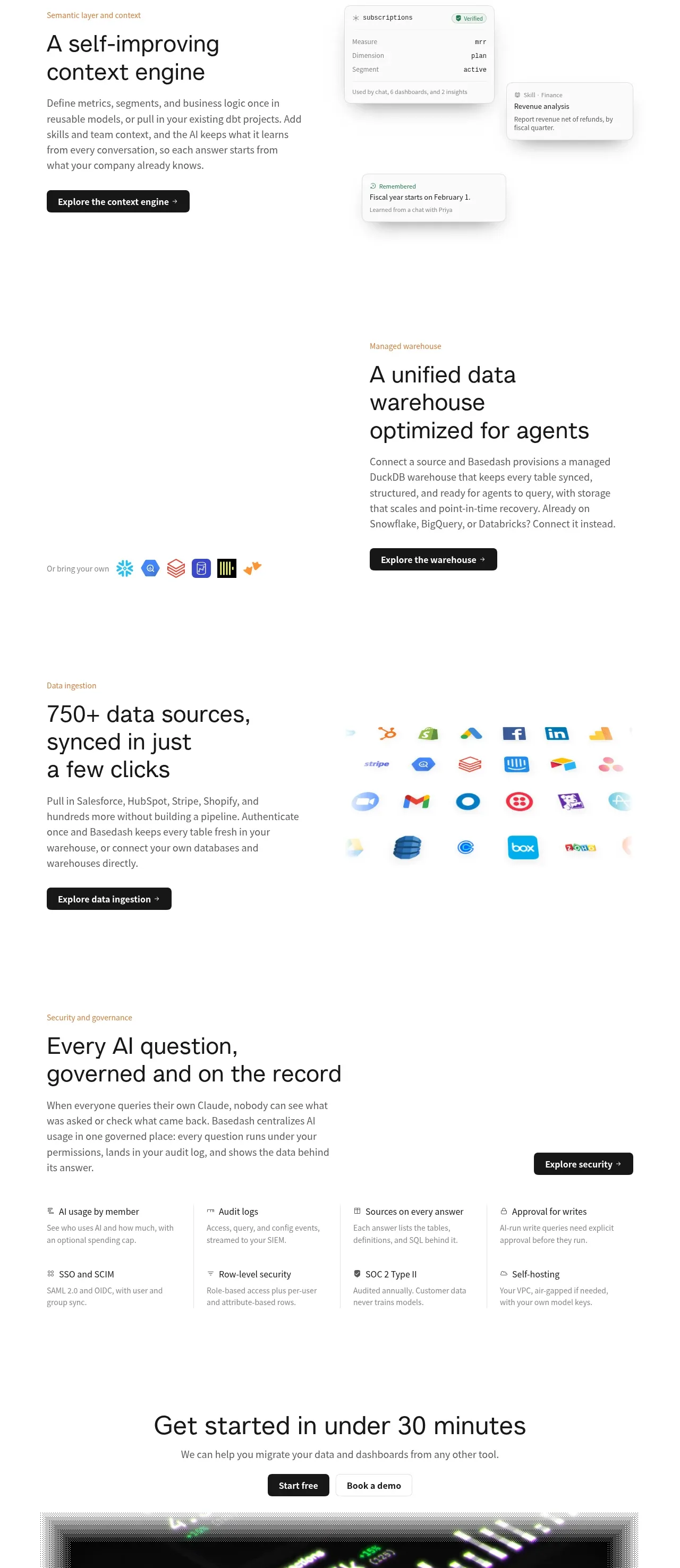
 Platform foundation features
Basedash View-only members · Feature grid