 kage
kage
wabi.ai

Design analysis
A short, centered closing message restates the next step with a single pill CTA, using substantial whitespace to create a calm conversion moment.
Prompt preview
## Reference images

Study these alongside the description below: hierarchy, rhythm, spacing, colour. Build for the product you are asked about, using this design language.

- Component: https://kage-design-assets.t3.tigrisfiles.io/components/wabi/178ae01c-68f8-4ebc-a83a-f929389d1aa9-1791439262-2.webp
- Full page it was cut from: https://kage-design-assets.t3.tigrisfiles.io/screenshots/wabi/178ae01c-68f8-4ebc-a83a-f929389d1aa9-1791439245752-full.webp
- Component on Kage: https://kage.design/component/wabi-cta

## Before you start
Ask what action the user's product wants visitors to take and what tone their brand should use. Then design an original CTA using the rules below.

Create a full-width, quiet conversion section with a centered heading, one concise supporting sentence, and a single prominent button. Use a medium-large sans-serif heading with a compact two-line maximum, followed by smaller muted copy and generous spacing before the action. Keep the section visually uncluttered and let whitespace carry the emphasis. Use a white or very lightly tinted background, near-black heading text `#202020`, muted copy `#777777`, and a pill button with a white fill, 1px border `#E5E5E5`, and soft diffuse shadow. Use a 999px radius, comfortable horizontal padding, and a hover state that increases contrast or shadow rather than introducing heavy color. Center everything on a narrow max-width and ensure the button remains easy to tap on mobile.

Never: copy the reference's CTA wording, product name, logo, exact typography, illustrations, or imagery.
More components
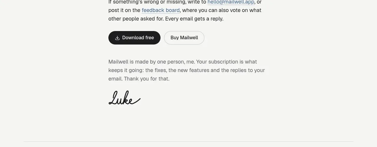
 Trial and purchase call to action
Mailwell · Call to action
Trial and purchase call to action
Mailwell · Call to action
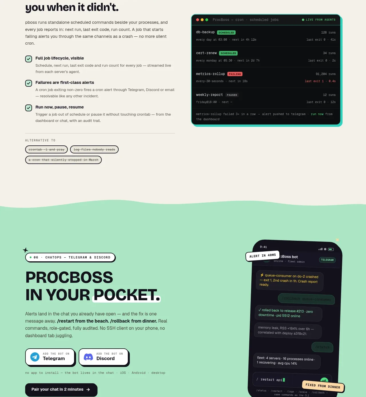
 Pocket alerts call to action
ProcBoss · Call to action
Pocket alerts call to action
ProcBoss · Call to action
 Dark final conversion band
ProcBoss · Call to action
Dark final conversion band
ProcBoss · Call to action
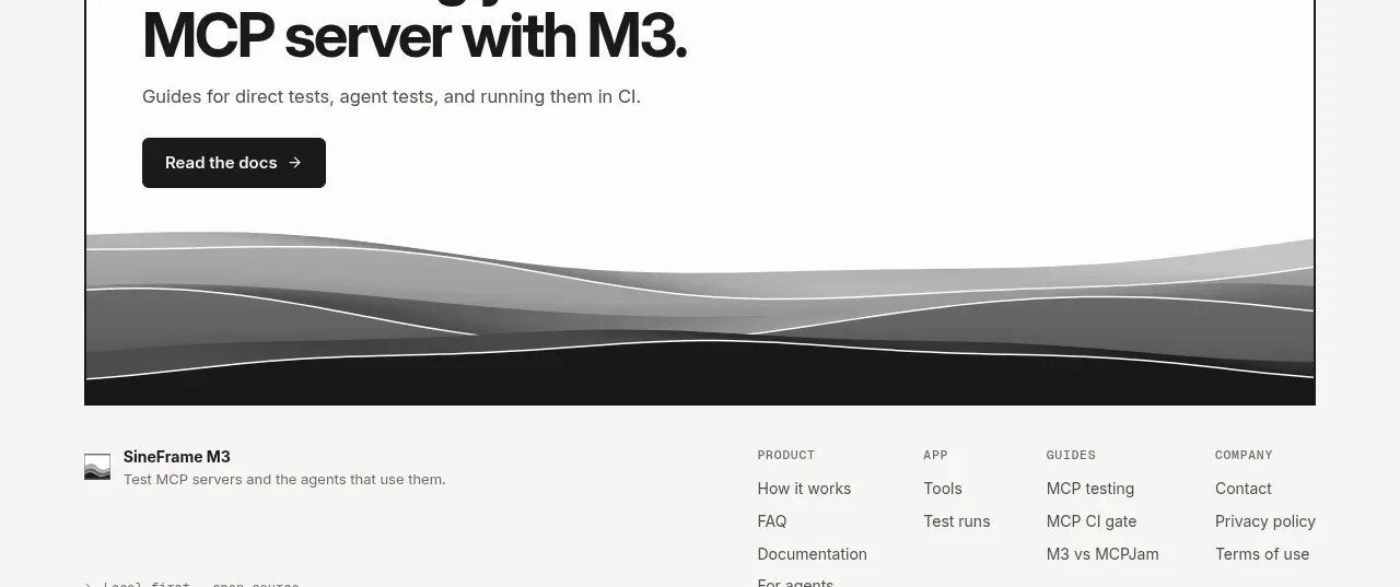
 Documentation call to action
SineFrame M3 · Call to action
Documentation call to action
SineFrame M3 · Call to action
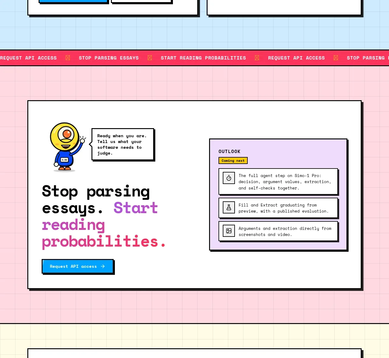
 Conversion call to action
Simo · Call to action
Conversion call to action
Simo · Call to action
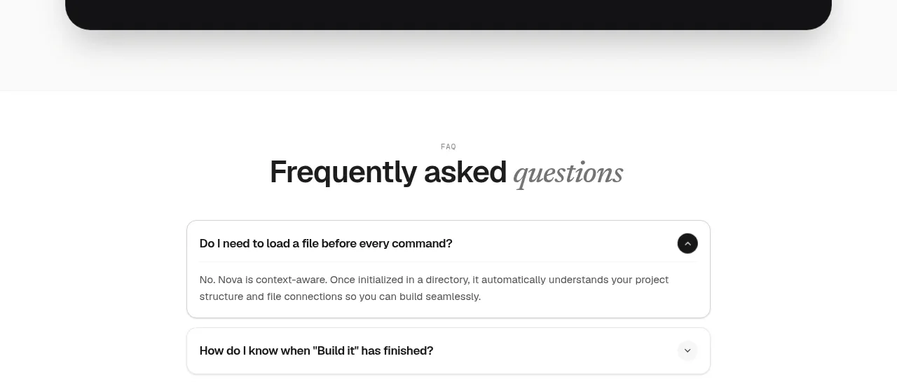
 Install command CTA
NOVA CLI v1.0 · Call to action
Install command CTA
NOVA CLI v1.0 · Call to action