kage
kage
wabi.ai
Design analysis
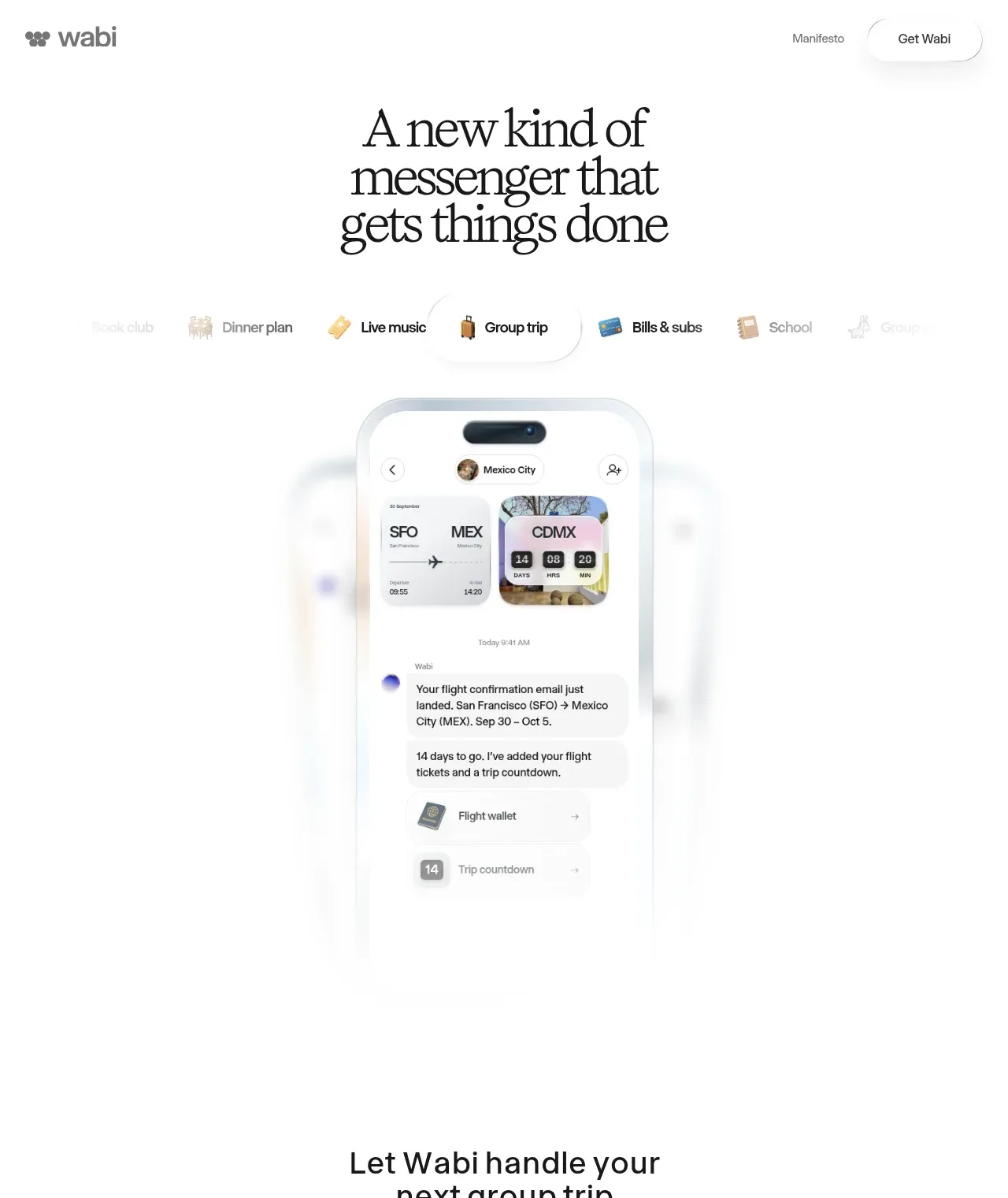
A large editorial headline introduces the product, followed by a horizontally scrolling set of use-case chips and a tall centered phone interface that acts as the primary proof of value.
Prompt preview
## Reference images

Study these alongside the description below: hierarchy, rhythm, spacing, colour. Build for the product you are asked about, using this design language.

- Component: https://kage-design-assets.t3.tigrisfiles.io/components/wabi/178ae01c-68f8-4ebc-a83a-f929389d1aa9-1791439261-1.webp
- Full page it was cut from: https://kage-design-assets.t3.tigrisfiles.io/screenshots/wabi/178ae01c-68f8-4ebc-a83a-f929389d1aa9-1791439245752-full.webp
- Component on Kage: https://kage.design/component/wabi-hero

## Before you start
Ask what the user's product does, who the audience is, and what brand language, colors, and imagery they want. Apply these principles to their product and create an original hero.

Build a spacious, centered hero that combines a distinctive editorial headline with a product demonstration. Place a large multi-line headline in the upper portion, using a high-contrast display serif or the user's equivalent expressive typeface; keep the line-height tight and the text column narrow enough to feel intentional. Below it, add a horizontally arranged use-case selector or category rail with several short labels and optional small icons. Make the active item visually clear using darker text, a white raised pill, subtle border, and soft shadow; allow the rail to fade toward the edges on smaller screens.

Under the selector, center a tall product preview such as a phone, dashboard, or conversation surface. Give the preview generous whitespace and use a soft radial fade or ambient glow so the visual dissolves into the page instead of ending harshly. The preview should demonstrate a believable workflow with layered cards, compact metadata, and a clear primary content area. Suggested colors: white `#FFFFFF`, near-black `#171717`, muted gray `#777777`, soft gray `#F5F5F3`, border `#E8E8E5`, and one restrained accent chosen for the user's brand. Use generous vertical spacing, rounded containers around 24–36px, and minimal decoration. The selector should support click/tap changes with a gentle fade or slide between demonstrations; keep motion subtle and accessible.

Never: copy the reference's headline, product name, logo, exact category labels, phone UI, illustrations, imagery, or other branded assets.