 kage
kage
warp.dev

Design analysis
This component works by combining a restrained technical visual language with three compact metric panels, each pairing a headline result, line chart, and diagnostic rows. Shared alignment, muted grid lines, and a single violet data accent make the comparison feel systematic while preserving a strong editorial hierarchy.
Prompt preview
## Reference images

Study these alongside the description below: hierarchy, rhythm, spacing, colour. Build for the product you are asked about, using this design language.

- Component: https://kage-design-assets.t3.tigrisfiles.io/components/warp-dev/0d3838c7-307f-484a-8c23-3188eaa6f6f5-1789060389-4.webp
- Full page it was cut from: https://kage-design-assets.t3.tigrisfiles.io/screenshots/warp-dev/0d3838c7-307f-484a-8c23-3188eaa6f6f5-1789060312-full.webp
- Component on Kage: https://kage.design/component/warp-chart

## Before you start
Ask the user what their product does, who the audience is, and what brand personality, colours, and typography they want to use. Then apply the principles below to create an original measurement dashboard section for that product—not a copy of the reference.

## Build this section
Create a wide analytics/chart section that communicates measurable progress across three related dimensions. It should feel like a technical instrument panel embedded in a marketing page: calm, precise, lightly editorial, and easy to scan.

### Layout and alignment
- Place the section on a warm off-white page with a very subtle technical grid or dotted-grid background.
- Use a centered content container with generous horizontal margins and a maximum width around 1120–1180px.
- Above the chart, add a small monospaced category label, a large headline, and one short explanatory sentence.
- Put the visualization inside one bordered rectangular panel.
- Add a narrow utility/header strip at the top of the panel. Include a small terminal-like control on the left, centered technical metadata, and a compact neutral control on the right. Keep these elements understated and non-functional unless the product needs interaction.
- Below the strip, divide the panel into three equal columns with thin vertical separators. On smaller screens, stack the columns vertically and replace vertical separators with horizontal rules.
- Each column should align its title, result badge/value, chart, and data table to the same left and right edges.
- Keep the chart area compact and give the tabular rows enough height to breathe without overpowering the graph.

### Typography hierarchy
- Use a clean grotesk or system sans-serif for the page heading, with a medium-to-bold weight and a large responsive size around 32–40px.
- Use a monospaced face for the category label, chart metadata, metric badges, axis labels, dates, and table values. This creates the feeling of logs, benchmarks, or developer tooling.
- Make panel titles compact and semibold, approximately 14–15px.
- Treat the primary metric as the strongest element inside each panel: use a bold monospaced value around 20–24px, preceded by a small outlined status badge.
- Use small, muted axis labels and table text around 11–13px. Use weight and colour—not excessive size—to distinguish pass/fail states and emphasized values.

### Colour and visual tone
- Use a warm near-white page background, approximately `#FBFBFA`.
- Use a very pale lavender-gray for the chart panel, approximately `#F7F6FD` or `#F5F4FB`.
- Use near-black ink for headings and primary text, approximately `#17171C`.
- Use soft gray for rules, axes, and secondary text, approximately `#C9C8CC`, `#8D8C95`, and `#A7A5AD`.
- Use one restrained violet accent for chart lines and status outlines, approximately `#7565C8` or `#6F5CC7`.
- Use muted green for successful states, approximately `#547A61`, and muted red for failures, approximately `#A05E5E`.
- Keep contrast sufficient for accessibility; do not rely on colour alone to convey status.

### Borders, grid, and shape language
- Use 1px solid borders with low-contrast gray or lavender-gray values.
- Keep corners nearly square: 0–3px radius for the outer panel, controls, badges, and table cells.
- Avoid shadows, glossy effects, gradients, and decorative card elevation.
- Draw charts with thin horizontal guide lines and a single thin violet polyline. Use four time points or another small, legible data series with a visible final movement.
- Keep the chart axes minimal: no heavy axis lines, no dense tick marks, and no filled area unless it is essential to the product.
- Make status badges compact outlined rectangles with monospaced uppercase text.

### Chart and table behaviour
- Show three different but related metrics, such as quality over time, cross-system comparison, and improvement activity. Adapt the metric names to the user's product.
- Each chart should include a small y-axis scale and a short sequence of x-axis dates or periods.
- Under each chart, include three concise diagnostic rows. Each row can contain a timestamp or label, a status, a result, and an optional identifier or cost/value.
- On hover, if interaction is appropriate, highlight the nearest data point and show a small tooltip with the period, metric, and value. Keep the interaction quiet and technical.
- Make the charts responsive and preserve readable labels; simplify or hide secondary table columns on narrow screens rather than allowing overflow.
- Ensure the SVG/canvas charts are accessible with adjacent text summaries or a visually hidden data table.

### Spacing
- Use a generous gap between the section heading and the panel, around 40–56px.
- Give the outer panel a compact utility strip around 30–36px tall.
- Use 18–24px internal padding per metric column.
- Maintain 12–16px between title, metric, and chart; use 8–12px between table rows.
- Align all three panels to a common baseline and keep the overall section rhythm quiet and deliberate.

## Never
- Never reuse the reference's logos, product names, brand identifiers, or proprietary wording.
- Never copy the reference's exact chart labels, metric values, dates, table content, or metadata.
- Never use the reference's illustrations, imagery, icons, or decorative assets; create simple CSS/SVG primitives where needed.
- Never reproduce the component as a pixel-perfect clone. Adapt the hierarchy, data concepts, and brand expression to the user's product.
- Never use excessive colour, rounded SaaS cards, drop shadows, 3D effects, or decorative chart clutter.
More components
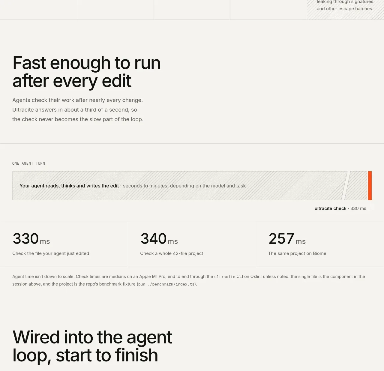
 Fast feedback timing comparison
Ultracite v8 · Chart
Fast feedback timing comparison
Ultracite v8 · Chart
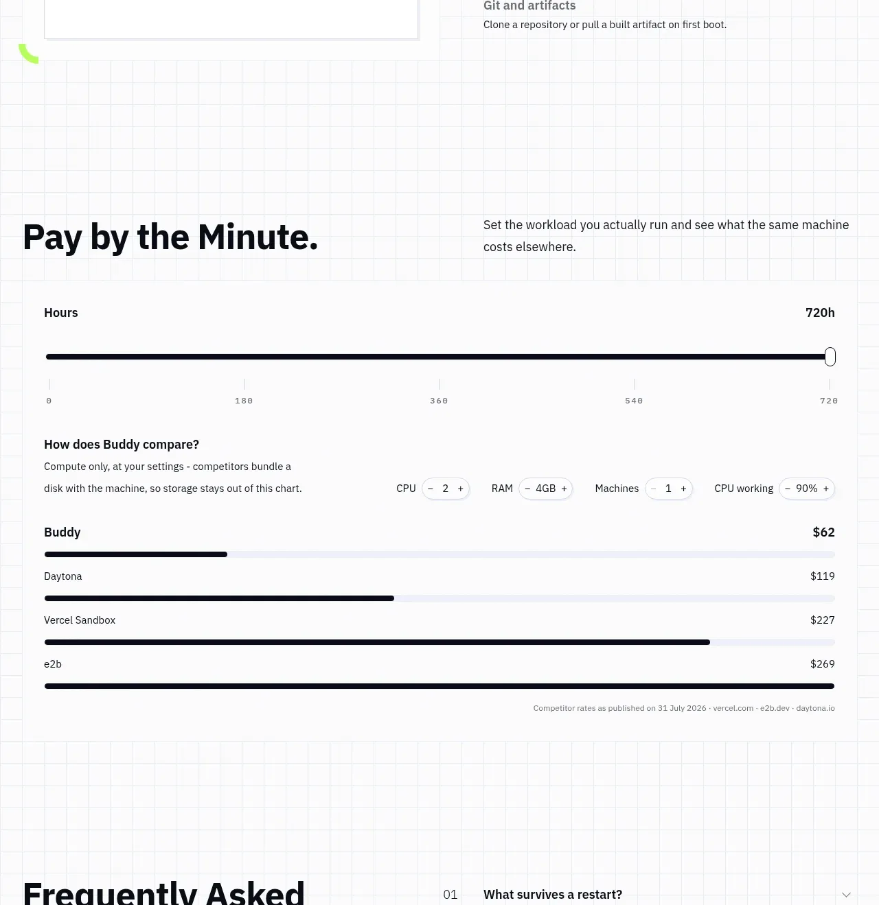
 Usage and cost comparison
AI Sandboxes by Buddy · Chart
Usage and cost comparison
AI Sandboxes by Buddy · Chart
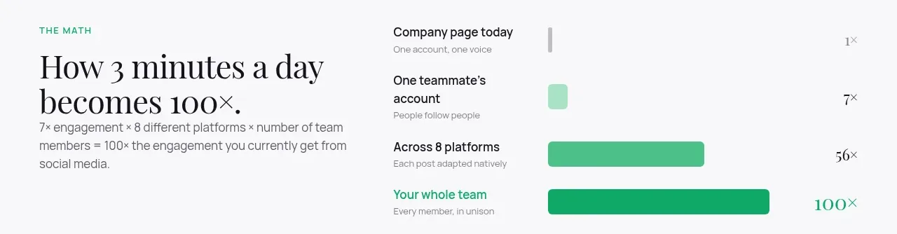
 Time-to-impact comparison
Agent Craft · Chart
Time-to-impact comparison
Agent Craft · Chart
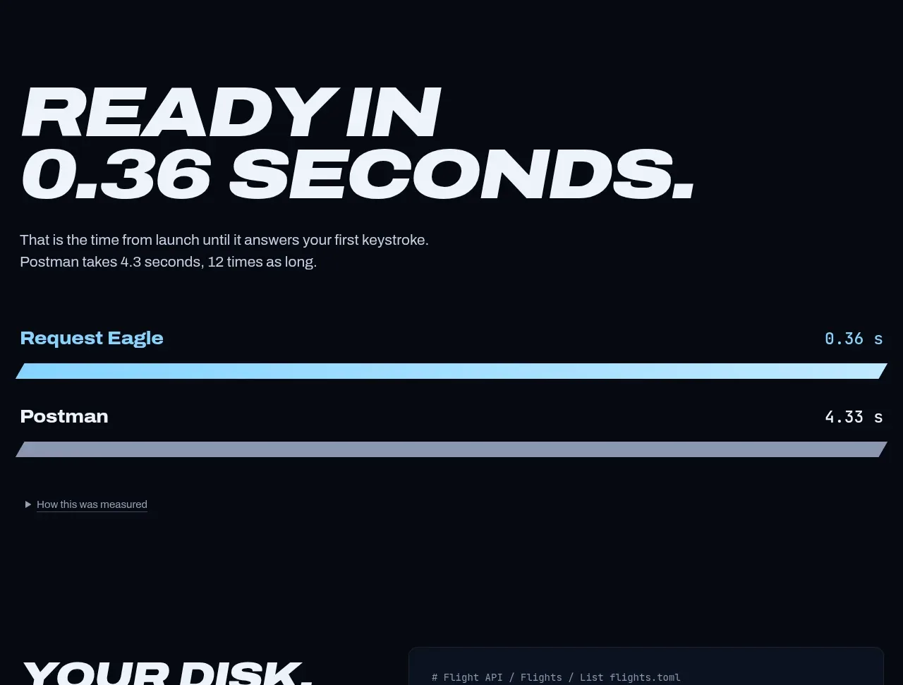
 Performance comparison chart
Request Eagle · Chart
Performance comparison chart
Request Eagle · Chart
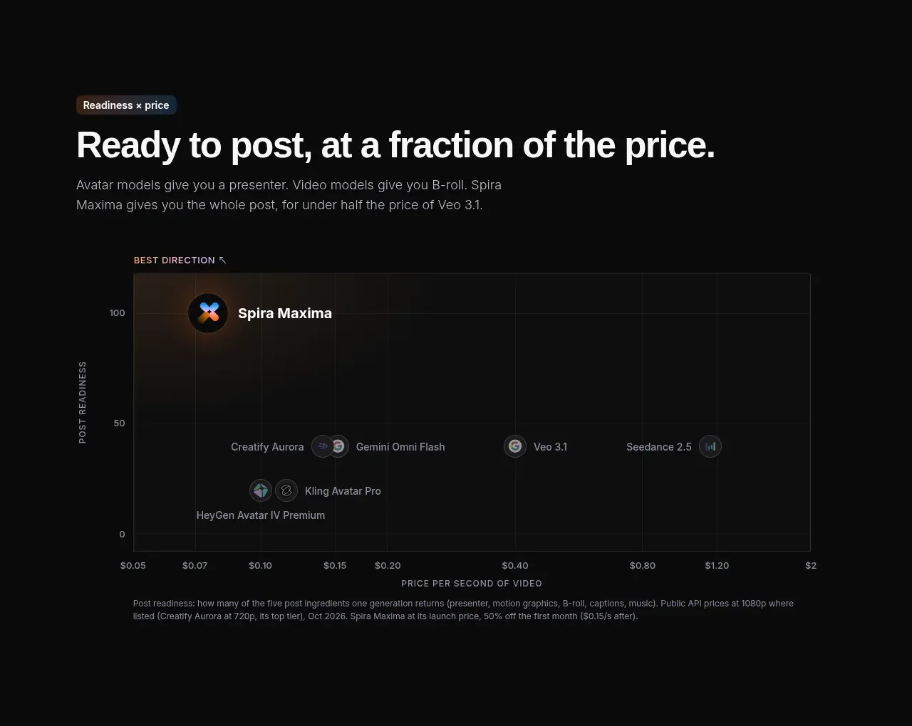
 Value positioning scatter chart
Spira Maxima · Chart
Value positioning scatter chart
Spira Maxima · Chart
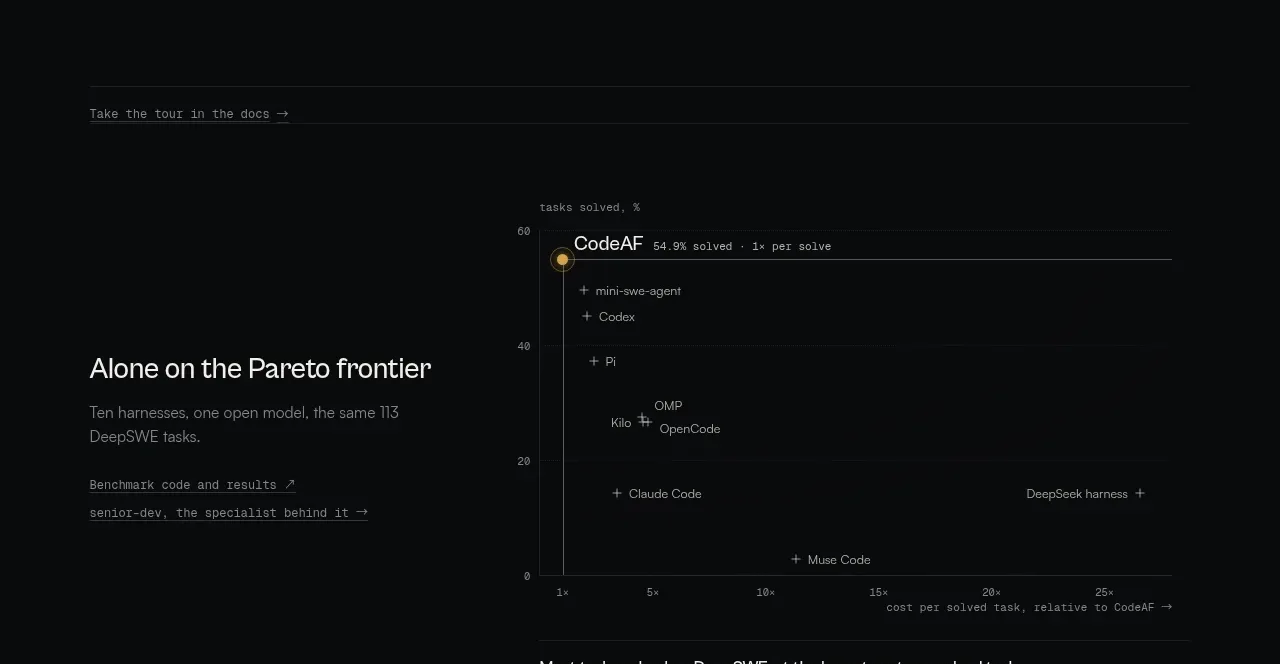
 Benchmark and Pareto proof
CodeAF · Chart
Benchmark and Pareto proof
CodeAF · Chart