 kage
kage
nimbleway.com
Design analysis
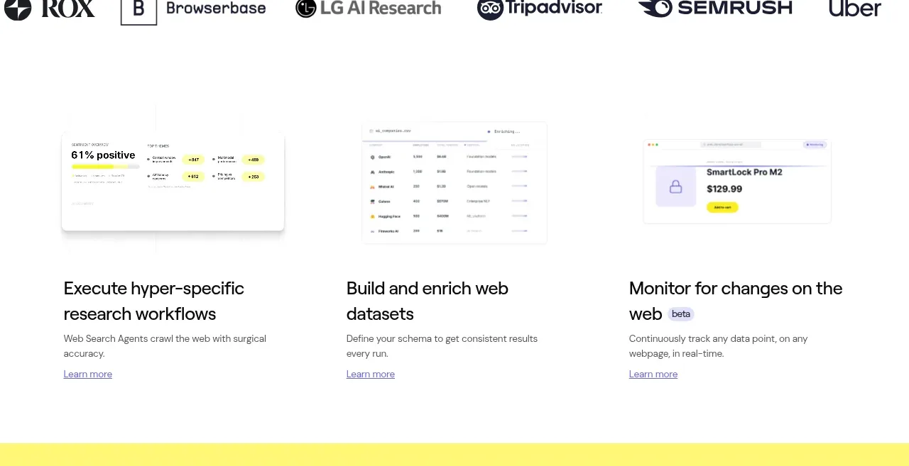
Three equal columns pair faint product previews with concise benefit-led headings, short descriptions, and understated learn-more links.
Prompt preview
## Reference images

Study these alongside the description below: hierarchy, rhythm, spacing, colour. Build for the product you are asked about, using this design language.

- Component: https://kage-design-assets.t3.tigrisfiles.io/components/web-search-agents-by-nimble/b9f88c51-9261-49a4-af5a-25ccd481000c-1789452128-3.webp
- Full page it was cut from: https://kage-design-assets.t3.tigrisfiles.io/screenshots/web-search-agents-by-nimble/b9f88c51-9261-49a4-af5a-25ccd481000c-1789452077081-full.webp
- Component on Kage: https://kage.design/component/web-search-agents-by-nimble-feature-grid

## Before you start
Ask what the user's product, audience, and brand identity are, then apply the principles below to that product rather than reproducing the reference.

Create a three-column capability section on white with a constrained max-width. Each column should have a lightweight framed product preview or abstract data panel at the top, followed by a 20–24px benefit-focused heading, a short 13–15px description, and a small text link with an understated underline. Align all columns to a consistent grid and baseline; use approximately 32–40px column gaps and 64–80px vertical padding. Keep previews pale and low-detail using #F8F8F8, #E9E9EE, and one small accent highlight, while typography uses #111217, #53545B, and a muted indigo link #6663A8. Use 12–16px corner radii, very subtle borders, and let cards remain open rather than overly boxed. Stack columns on mobile.

Never use the reference screenshots, product name, exact headings, exact descriptions, icons, or imagery.







